Help

Re: Making a record look **sexy**

1784 2
cancel
Showing results for 
Search instead for 
Did you mean: 
stuart_cliffe
5 - Automation Enthusiast

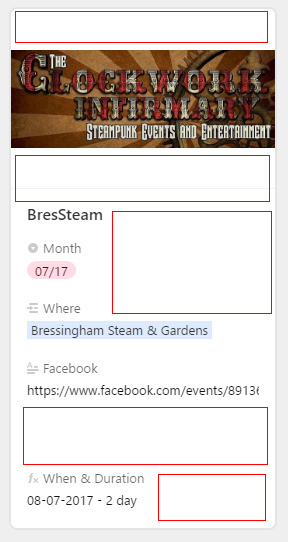
Apologies if this has been posted before but I need to generate a ‘sexy’ appearance for my meeting details.

The table layout is too much detail and spread too widely, the Calendar is fine for previewing dates, but the expanded (extended?) view you get is too Duplo - fields are too tall, so lots of scrolling for detail. Setting up a Form or a Kanban View has the same problem - the Form view is back to Duplo style, and the Kanban involves too much scrolling. I just want:

  • Title
  • Venue picture
  • Venue location
  • Date (and, ideally duration - ie start and finish times)
  • URLs for Web Facebook and Twitter links
  • Contact details
  • Other details like cost and timings

-All set out closely -but legibly- together like an address label or a ‘for sale’ block in a newspaper. No editing options required - this would be display only, driven by entries from other views.

This is just to set out a catalogue of what’s on offer, and allow folks to sign up if they’re interested. Has anyone achieved a ‘store’ layout like this? Any tips please?

11 Replies 11
Sydney_Brown
5 - Automation Enthusiast

What would be cool would be a type of page, table, or form whereby I could reference my tables and fields and use CSS to control the visual display. Hmmm.

Donald_Newlands
7 - App Architect
7 - App Architect

I’m not sure I want sexy data, but the “scrolling” problem is huge for me. On the Kanban cards and forms particularly, it’s very hard to put a useful amount of information on the screen with Airtable’s oversized field spacing. Airtable needs a “compact” mode, formatting and styles.

Much as I love Airtable, I was just about to get excited about rolling out Kanban with Airtable, and then I had an another “oh yeah, but…” moment when I looked at how completely unusable our kanban would be because of Airtable’s excessive use of white space and inflexible layouts :frowning: Attached is a screen shot of my Kanban with Google Chrome at 100%. With only 5 fields displayed per card (most of them empty and short) Airtable can only display about 1.5 cards in each list!? We use a kanban system and most of our on-screen lists (columns) are 5-10 items long with more data. It would be fantastic to be able to have kanban and database integrated in one product, but Airtable’s formatting is so inefficient that that the"kanban" view is useless for us. I hope that style sheets and templating options are something we’ll see soon.
-Donald
ce06d36c6db1100170cb6927cf8fd58f6e45de62.png

You can customize which fields are shown in the cards (from none to all), and even filter records if you need it. And of course you have the scroll that will be needed in most situations.

Eventos___Bodas_-_Airtable_y_Portal_Dance_-_Airtable.png

Elias,
Thanks. Yes, but there is no way to put a useful number of fields on a card without too much scrolling. I hope we’ll see more formatting options in Airtable before too long.
-Donald

Friedrich_Kirch
4 - Data Explorer
4 - Data Explorer

[quote=“Donald_Newlands, post:3, topic:2471”] …Airtable’s oversized field spacing. Airtable needs a “compact” mode

Definitively, this is a concern. On the mobile phone, I can see just 4 fields, of a record of 23! Spacing should be reduced by half.
In addition, Airtable should allow the placement of fields fields side by side; this would be very helpful. Like income - outcome, start date - end date, foreseen - accomplished etc., on the same line, like in two columns.

Note that I particularly like this solution (and, in fact, have gone to a custom front end for my own app using WordPress and the Airpress plugin), but to address the ‘one field per line’ issue I created a number of pre-merged lines using formula fields — e.g., ({start date} & " - " & {end date}), and the like.

And, of course, Airtable now hides empty fields in Kanban view. (See the topmost entry for April 2017 here. Wish that was the case (or at least an option) for gallery view as well.

In the most recent update they added a field expand view (for seeing extended text and also multiple records/entries on a field). Also there is the ‘Gallery’ View that’s been out for a few months.
1ef9768b95b67e739c97d8af952dbe9d3a26ff12.png

Screen Shot 2017-06-30 at 1.02.05 PM.png

My problem is as follows: a current project is for a group that lists all the cosplay events in the UK (plus a few other items) in one calendar. Information otherwise tends to be spread across one or more of the event website / facebook page / twitter. So the benefit for viewers is to have all the connection in one place - plus seeing all events in an area, one town, or even one venue over the course of a year.

I’ve used a Grid view for data entry - https://airtable.com/shrtkt2COpZF9zEW7 and plan a series of Kanban views for a higher-level view. This is an example - https://airtable.com/shrJLVClorNmYSkSA

Venue and Organiser are separate bases, because different cons can go to the same venue, and one organiser may arrange several conventions. Having look-up tables for past entries saves some work on each new con added to the main database.

This is a test Gallery view - https://airtable.com/shrJLVClorNmYSkSA

Example record -
ScreenClip [2].jpg

Where for the sake of illustration I highlighted the empty space - a formula field like “when and duration” allows me to concatenate some values like the start date and number of days (my compromise for not having a proper duration for the event). I can’t see how to get a new line into that field however so a series of formula fields would hit the same problem -
fieldname is the line above…
field content… with lots of empty space to the right side.

My point remains that there’s no concise, stylish way to display all the information we have available without lots of scrolling and huge white spaces. The presentation options for data need to be improved. (And, OK I need to learn how to extract data from my grid view and lay it out in display)

Any further suggestions much appreciated - the calendars are already out there, but I need to make them better! (Plus I put a lot of work into collating all this data on Cons and I don’t want to waste it!! :winking_face: )

To be honest… I think your gallery view link looks quite nice! Sure… not exactly ‘Sexy’ but if you embed the HTML share in a webpage, it could work pretty well.

Screen Shot 2017-07-03 at 9.50.23 AM.png

Anyhoo, I was also going to suggest a ‘URL’ field for the links so that you could just click and go without opening the record, but oddly enough they don’t. (FAIL by Airtable IMHO.)

As far as reading out data, there are TONS of resources on how to use your airtable as a traditional DB and have UI/HTML pages just read from it. I’m not trained in that, but here’s a link that I’ve read a few times and passed on to some of my company’s internal developers to use.

Thanks - I’ll have a look into that link, though it’s one of those where I recognise all of the words… but not necessarily the order they come in… (I’m not trained either!)

More work necessary I guess; still like someone says: ‘done is better than perfect’ - I’ll get this out there and see what reaction I get.

Thanks for your comments. :slightly_smiling_face: