
Scatter Plot in Interfaces


madisenbaldwin
Forum|alt.badge.img+7

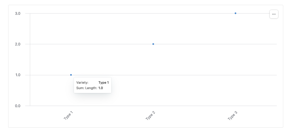
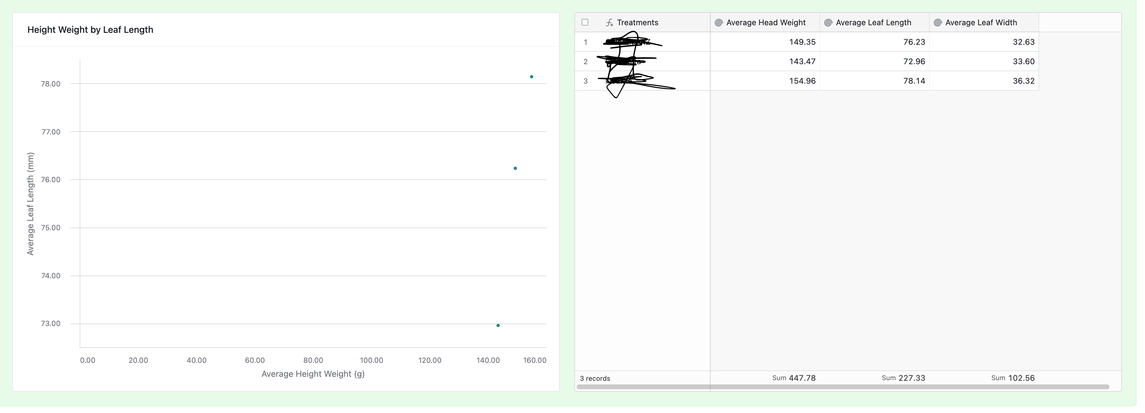
I can't seem to get labels to appear on my scatter plot even when hovering over the points. I am trying to plot leaf length and head weight for varieties, I'd like to be able to label the points with what variety they represent.

3 replies

TheTimeSavingCo
Forum|alt.badge.img+28

Hmm, I tried making this but aren't sure what your data looks like or what you'd like the end product to be:

Could you provide a screenshot of a bit of data and a mockup of the scatter plot with the labels you'd want based on said data?


madisenbaldwin
Forum|alt.badge.img+7
  • Author
  • Known Participant
  • 14 replies
  • November 13, 2024
TheTimeSavingCo wrote:

Hmm, I tried making this but aren't sure what your data looks like or what you'd like the end product to be:

Could you provide a screenshot of a bit of data and a mockup of the scatter plot with the labels you'd want based on said data?


Here is mock up of data and scatter plot. when i hover over those dots on the scatter plot, i would like to see the primary column thats been blacked out on the right. OR a key with colors assigned to items in the table with the name in the primary


TheTimeSavingCo
Forum|alt.badge.img+28
madisenbaldwin wrote:

Here is mock up of data and scatter plot. when i hover over those dots on the scatter plot, i would like to see the primary column thats been blacked out on the right. OR a key with colors assigned to items in the table with the name in the primary


Hmm yeah, I couldn't figure out how to do this either, sorry!  As a workaround perhaps you can look into something like QuickCharts to generate this for you or something, and you can display the generated chart image in the interface instead?


Reply