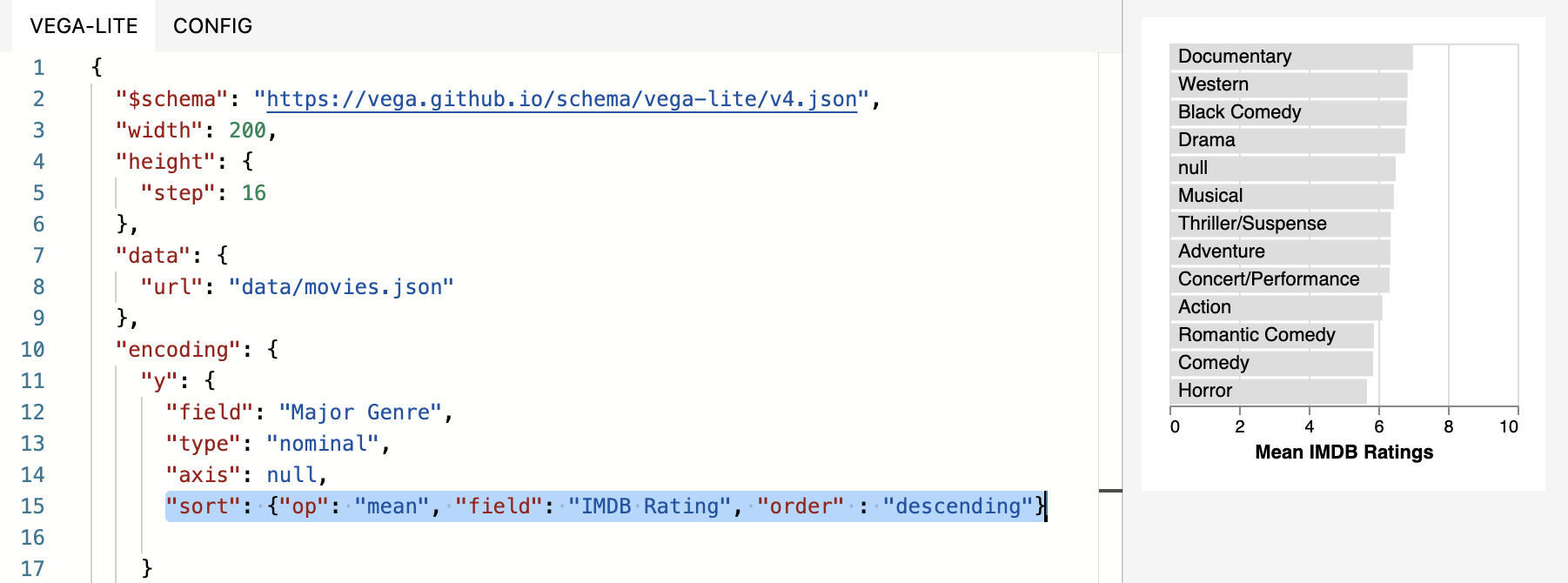
The problem with the “bar chart” (which is more accurately a column chart) is that for long labels, they get cut off. Anyone know of a way to generate an actual bar chart (horizontal bars) from a data series?

Solved
Horizontal bar chart?
Best answer by Bill_French
CW_Research wrote:
Nope, I tried that. You can see in the preview that the grey bars aren’t descending…
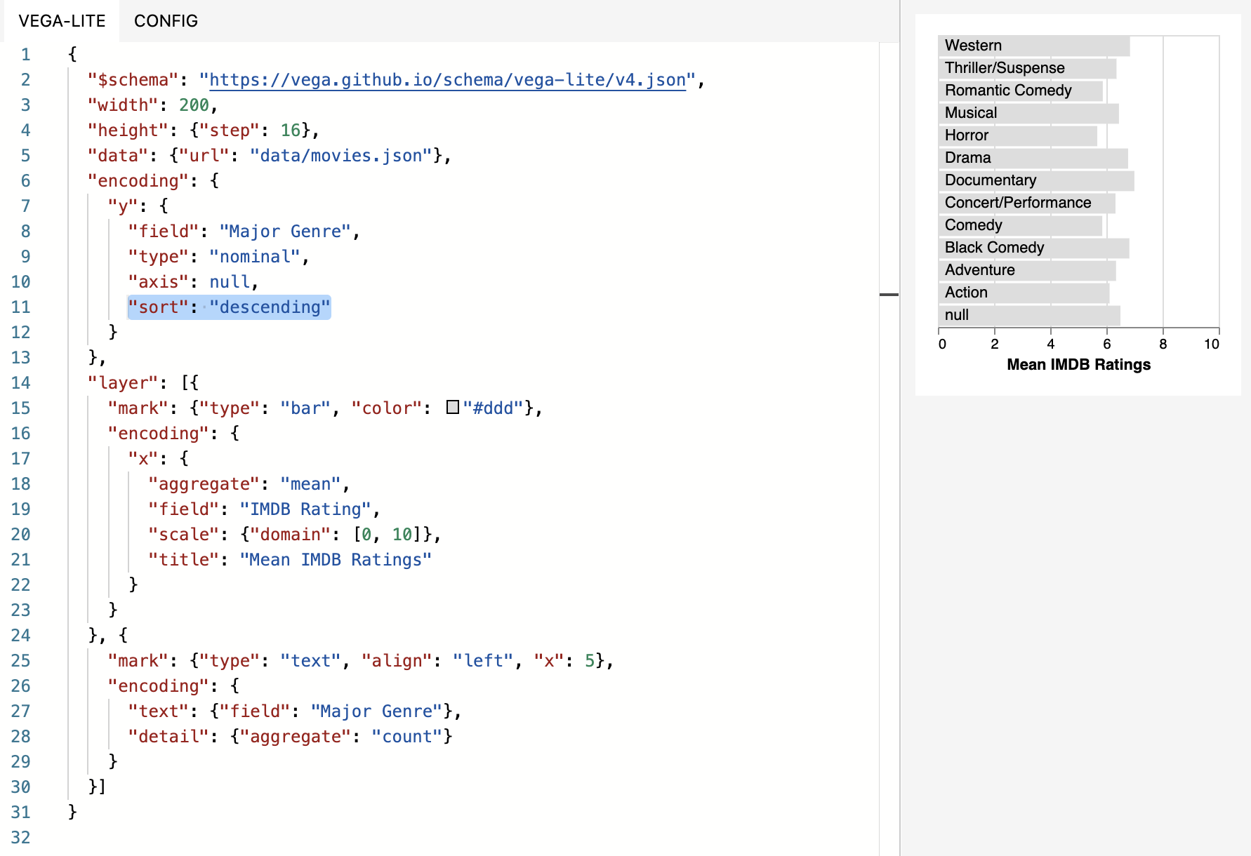
Oh, I see what you’re saying and what I think you want - like this? You need to aggregate pre-sort from one field imposed on another and then assert the order.

Reply
Most helpful members this week
Enter your E-mail address. We'll send you an e-mail with instructions to reset your password.