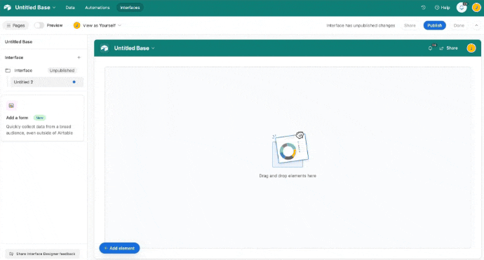
New Dashboard Interface - grid view and/or edit records in-line?
Having a few issues with new dashboards...
Is there a way to not use a list, but instead use a grid layout for data on a dashboard? List view, especially here where you can not do levels, is useless.
Is there a way to edit records in-line in the dashboard? no matter what I do, I can't seem to make it editable and have to expand each record individually. Not really working for our flow.
ps... any news of Record List moving to the new upgraded interface versions?
Page 1 / 1
You can create a "Blank" page and create your own dashboard
Here's how you can do it:
Interfaces -> Click '+' -> Click '+ Add page' -> Scroll to the end and select 'Blank'
In this page you can add your grid with inline editing and any other elements to your dashboard.
this is a legacy 'dashboard' that does not have any of the new features. Thats not what im interested in. I would like to use the new Dashboard that is designed to allow for all the new bells and whistles, but finding it hard to believe what i would consider basic functionality is missing.
I agree, and this addition would be a massive advance for the UX. I spend way too much time explaining to clients why it doesn’t work that way or why they can’t have a grid on that page type.
The grid page type is built into interfaces, but it’s hidden. You have to start off with a list view, and then go to “visualizations” in the right margin, and choose “grid”.
You can also edit fields inline, and you can choose which fields you want to be editable or non-editable.
Just noting that it currently appears impossible to add a Grid element to a Dashboard interface. @ScottWorld is correct that the Grid page type is hidden in some interface types, but for Dashboards specifically, there doesn’t seem to be any way to add it.
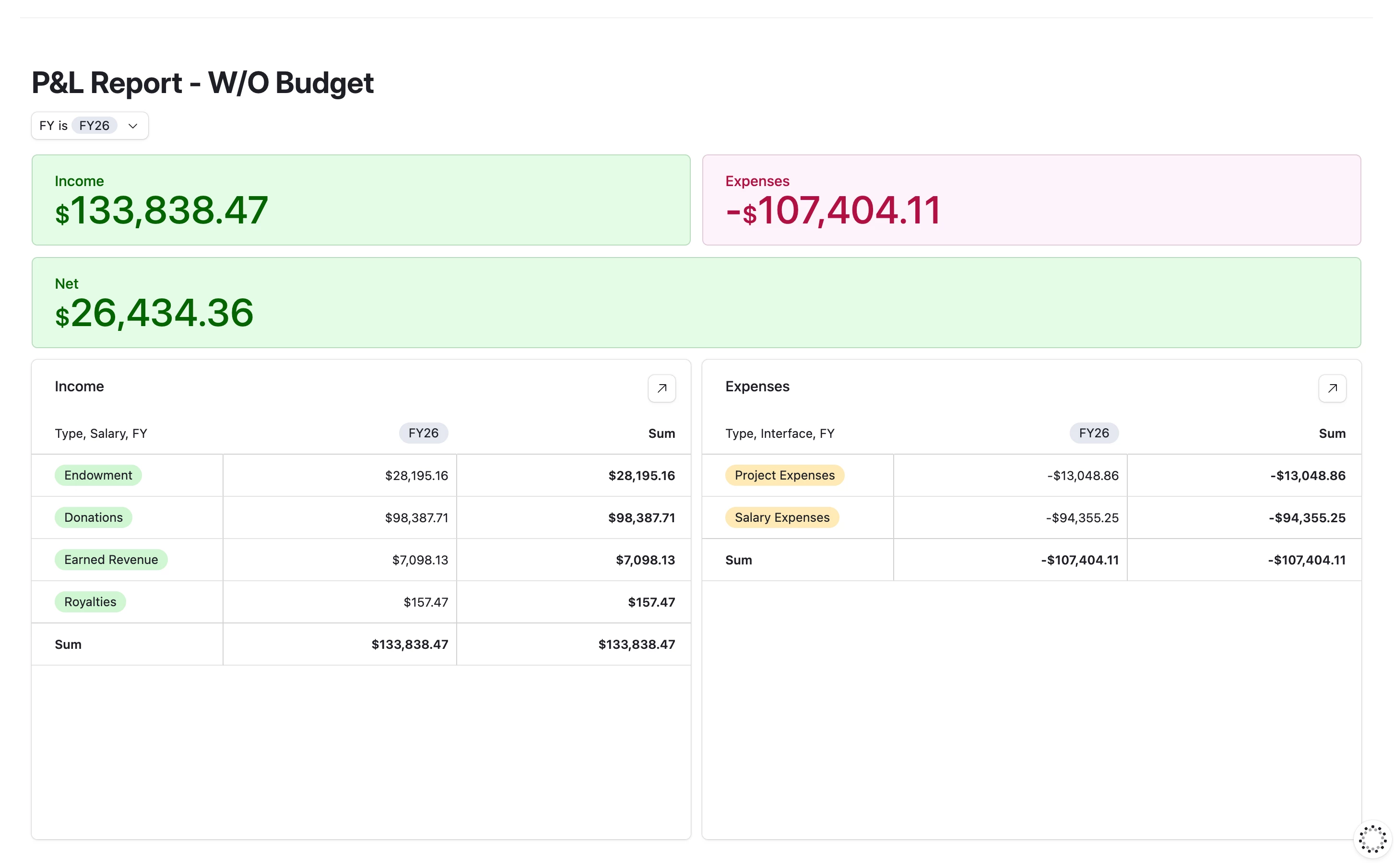
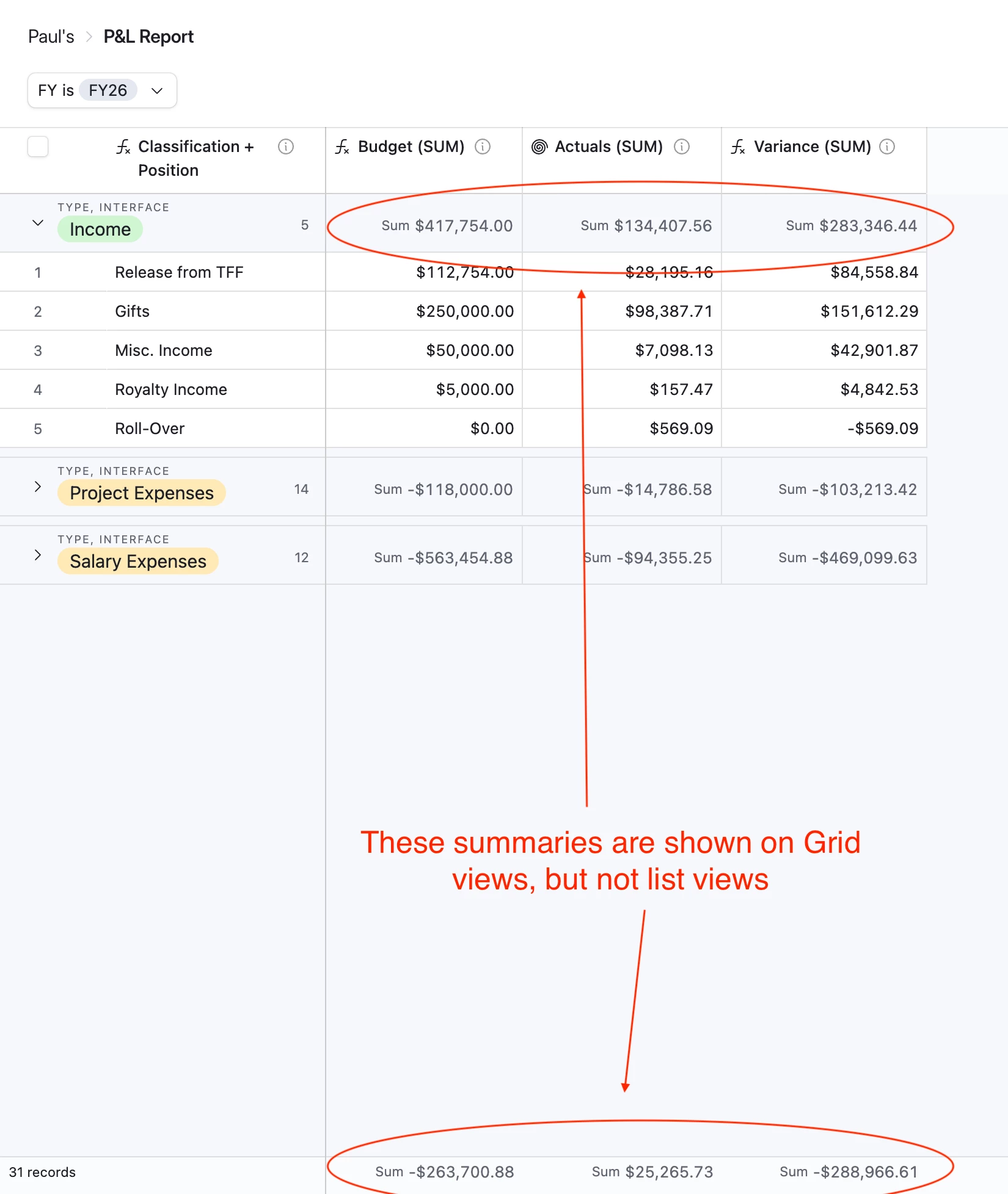
My use case: I’d like to use the Grid element for budgeting (e.g., building a profit and loss view). Grids can summarize currency and number fields, whereas Lists cannot. Ideally, I’d display income, expenses, and net totals as summary cards at the top, with a Grid below showing detailed line items. While a pivot table works for some of this, it can’t display all necessary fields (like 3 separate columns for budget, actuals, and difference/variance). (see screenshot)
The workaround is to create a separate Grid on another interface page—but that disconnects it from the main dashboard. (see second screenshot)
The legacy blank interface allows this setup, but it lacks features like dynamic summary card coloring and mobile visibility.
Enabling the Grid element in Dashboards would make financial reporting and analysis much more seamless.
Ah, you’re right! Grid views are not available on dashboard pages!
The inconsistency between the different interface pages — and the inconsistency between list and grid views — is very frustrating.
Please be sure to submit all of this as feature requests to the product feedback form.