
Updates to the expand and edit record experience are here


Hi all -


I’m thrilled to share that with the help of the amazing feedback from the community, the next wave of enhancements to the expand and edit record experience are here. We will be continuing to iterate on this experience, but some of the changes you’ll see include:


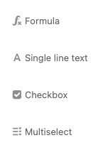
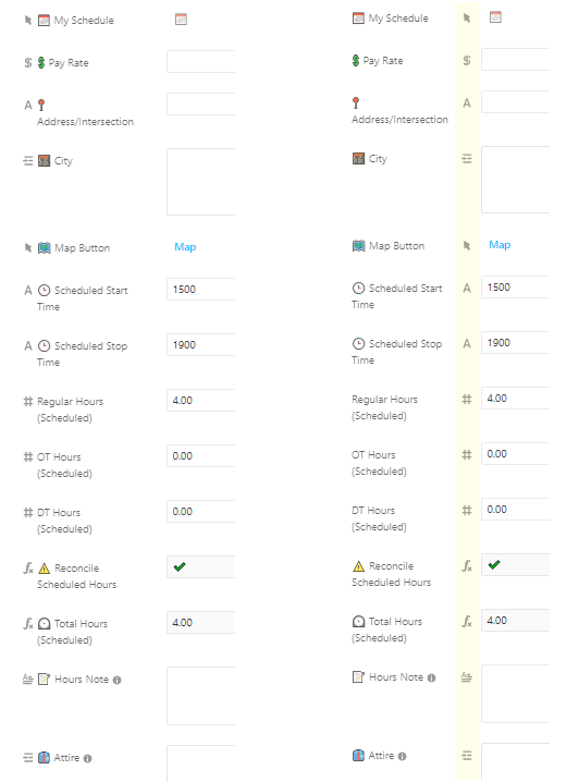
  • The return of field icons and input borders


  • Clearer disabled / read-only states


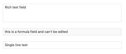
  • Removed placeholder text


  • Miscellaneous visual polish like larger gutters and updated container lengths


Additional resources:


Let us know if you have any questions or feedback and we hope these are impactful changes!

8 replies

  • Inspiring
  • 63 replies
  • March 24, 2022

@Jordan_Scott1 I personally think it is much better. Thank you for your help on this. If I were to change one thing though, it would be moving the field icons next to the fields and make the little hovering field edit triangles on the left side of the field name.


This is a solid improvement in both the product and in creating effective mechanisms to respond to user feedback. Design is clean, whitespace is well-used, just about every problem with the previous version has been addressed. Nice work all around.


ScottWorld
Forum|alt.badge.img+20
  • Brainy
  • 8719 replies
  • March 24, 2022

Thank you so much, @Jordan_Scott1! This is fantastic news across the board!! :grinning_face_with_big_eyes: 🎉


ScottWorld
Forum|alt.badge.img+20
  • Brainy
  • 8719 replies
  • March 24, 2022

After playing with this for a few minutes, I’ve found that it is difficult for me to tell the difference between the editable & non-editable fields.


I think that this could potentially be solved by making the grey background a darker shade of grey (for the non-editable fields).


Databaser
Forum|alt.badge.img+4
  • Inspiring
  • 866 replies
  • March 24, 2022

Great improvement! Thanks 🙏


Karlstens
  • Inspiring
  • 601 replies
  • March 24, 2022

Looking good. 🙂 Thanks everyone!


My only remaining feedback would be to add a shade of colour (or two) that removes the white-on-white which will allow more clarity to the edit fields.


EDIT: Wait, that’s right - how do I access the recent changes sidebar that used to be in the original Field Editor? I actually needed that the other day and never figured it out. 😦


EDIT 2: Thanks @kuovonne 👇t2: 😂


kuovonne
Forum|alt.badge.img+17
  • Brainy
  • 5987 replies
  • March 24, 2022
Karlstens wrote:

Looking good. 🙂 Thanks everyone!


My only remaining feedback would be to add a shade of colour (or two) that removes the white-on-white which will allow more clarity to the edit fields.


EDIT: Wait, that’s right - how do I access the recent changes sidebar that used to be in the original Field Editor? I actually needed that the other day and never figured it out. 😦


EDIT 2: Thanks @kuovonne 👇t2: 😂


It’s still there. Click the “Show comments and revision history” icon in the top right of the expanded view.


kuovonne
Forum|alt.badge.img+17
  • Brainy
  • 5987 replies
  • March 24, 2022

Thank you for these improvements.


I noticed that the primary field has some of the old behaviors from the previous design. If the primary field is a blank single line text field, the user is invited to type a value. If the primary field is a blank formula field, the user sees a dash instead of a complete blank. I think that your designers made a good call here. The primary field is different from other fields, and I can see why it calls for different behavior.


Reply