I like the move to clarify people are looking at “data” vs “automations” vs “interfaces”.
Just so people don’t wonder “what happened to the ‘x’ button”, here’s a few changes I noticed:
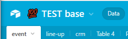
- For bases that have an Icon, that icon is now the button to get back to your Workspaces. Bases that don’t have an icon will show the Airtable logo in the same spot it used to be (top left).
- The Snapshots and Base Trash icons were collapsed into one icon for Base History. Its the icon to the right of the notifications icon
- The dropdown to see the list of all tables in the base under the Data tab used to be all the way to the left as a hamburger icon, its now to the right next to the Add/Import button as a down arrow.
- (I actually think this should be moved back the left, since that’s how it is for the View Finder. Also if you have a lot of tables, you don’t want to scroll all the way over there, putting it fixed at the left means you can search through all your tables easily.)
With this update, It seems to me that Airtable is less and less “Excel on Steroid”.
I don’t know if i like this.
I think I already received this update since I registered like 2 weeks ago. Is it possible that I was in a beta that is now the new default?
These are really great changes across the board! Thanks, @Rotimi_Iziduh! :grinning_face_with_big_eyes: :raised_hands: :medal_military:
I agree with @Kamille_Parks that the dropdown menu (to see the full list of tables) is a bit more difficult to find now, although I never really used that dropdown menu too much before, so I don’t think that it will affect me too much.
However, one change that I would really love to see is to please remove the unnecessary tooltip that shows up when you hover over the name of the view in the top toolbar.
The tooltip in the top toolbar:
(1) is redundant because it already shows up when you hover over the name of the view in the left margin, but more importantly,
(2) this tooltip actually BLOCKS the view names in the left margin, which was specifically what you were trying to see by hovering over the name of the view in the top toolbar. So you’re required to hover over the view name and then you immediately have to move your mouse to see the names of the views in the left margin.
Thanks! :grinning_face_with_big_eyes:
Yes, that is likely what happened.
It took me a lot of time to find out, how to get to my other bases. I always went via the top right icon, to my account, selecting my workspace, going to the mini link on the top right to go to my bases. That the icon on the left is clickable on hover was not obvious to me (and I am a software developer). It would make sense to outstand this icon or add a “To all bases” button under the profil icon menu.
Thank you for this announcement! Would you mind sharing what constitutes “Core Surfaces”? I noticed that earlier this year you informed us about the redesigned record expanded view.
I was pleased to see that Airtable was open to feedback on the expanded view redesign. Is it safe to say that you are also open to feedback on this re-design?
-
For example, Kamille notes that base icons have replaced the Airtable logo that is used to return to the workspaces, and Partyborn noted that this caused confusion. I think that the logo should be brought back.
-
Kamille also notes that the list of all tables has moved from the left side of the screen to the right side, and thinks it should be moved back to the left. I also agree that I preferred having it on the left, near the list of views.
The community would appreciate it if you could let us know if any of these suggestions are being implemented.
I also agree that the Airtable logo should be brought back. This helps Airtable in terms of branding, and also helps with ease of use.
I kind of like the new look, but I do worry that automations has been brought out of hiding a little, I fear some questions coming my way from my users!
i like this, but do agree the list of tables is hard to find now.
Love the floating windows in the automation pane!
Question - is there a keyboard shortcut to switch between tabs? Always thought there should be but never found one.
Andrew
I also agree that the Airtable logo should be brought back. This helps Airtable in terms of branding, and also helps with ease of use.
Or allow upload of custom logo.
i like this, but do agree the list of tables is hard to find now.
Love the floating windows in the automation pane!
Question - is there a keyboard shortcut to switch between tabs? Always thought there should be but never found one.
Andrew
On windows it is Ctrl+j
Just spotted the new “Manage Fields” screen too.
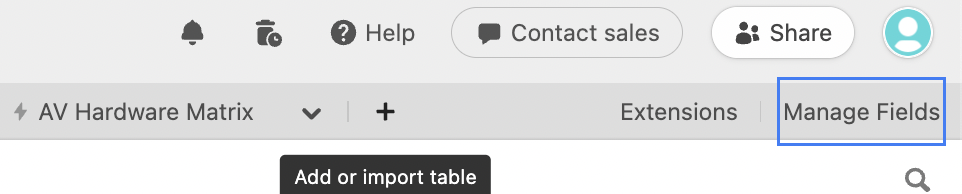
Just spotted the new “Manage Fields” screen too.
Yes!!! this is great. Also shows dependencies (enterprise).
i like this, but do agree the list of tables is hard to find now.
Love the floating windows in the automation pane!
Question - is there a keyboard shortcut to switch between tabs? Always thought there should be but never found one.
Andrew
Click the help icon (top right) to see keyboard shortcuts. The keyboard shortcut to see all shortcuts is CRTL+? (likely Command+? on Mac)
The Manage Fields pane is likely to get its own announcement post so that’s why I didn’t mention it here.
Regarding the Airtable Logo v. Base Icon, maybe a solution would be to just put the Logo in the top left where it used to be and then the Base Icon directly next to it (and of course followed by the name).
Imo a great update! :muscle: :raised_hands:
I too found it easier on the left hand side. Although it does seem to be always present, even in bases with a lot of tables, so not sure @Kamille_Parks if that already changed?
Also, I’m still seeing the AT logo, so maybe also already changed?
Imo a great update! :muscle: :raised_hands:
I too found it easier on the left hand side. Although it does seem to be always present, even in bases with a lot of tables, so not sure @Kamille_Parks if that already changed?
Also, I’m still seeing the AT logo, so maybe also already changed?
It shows the Airtable logo if you haven’t chosen a custom logo for your base. You have an emoji as the first character of your base, but that’s not a custom logo.
Imo a great update! :muscle: :raised_hands:
I too found it easier on the left hand side. Although it does seem to be always present, even in bases with a lot of tables, so not sure @Kamille_Parks if that already changed?
Also, I’m still seeing the AT logo, so maybe also already changed?
In addition to Scott’s clarification regarding the Logo and Base Icon placement, it wasn’t so much “scrolling” through multiple table names to get to the table picker, but like, it being all the way on the other side of the screen. Whereas the equivalent feature for views (the view picker) is on the left side of the screen.
Having a poke-about these changes now. The “Manage Fields” page looks very cool, thanks for that!
May I add a feature request - perhaps an extra column stating which Views that the field is visible in, and the ability to toggle the field on or off in multiple tables?
Thanks again for your hard work, this is great. :beer:
Yes, totally agree about the visibility toggle!
It’s a great update! Thanks!
I’d REALLY like to have the option to see the tabs vertically (fixed on the left).
The previous way that the tabs were shown were more clear to me. Didn’t like the new UI of the tabs.
The dropdown menu to see them vertically I liked but it’d be better on the left. Hope you agree, tnx!
Nice changes! now I can press click + ctrl and it will open the new base in a new tab! (in google chrome). gooood!
Nice changes! now I can press click + ctrl and it will open the new base in a new tab! (in google chrome). gooood!
Firefox too :smiling_face_with_sunglasses: Excellent.
Nice clean update. Only suggestion is to maintain the tabs when in an interface. Feels (I assume unintentionally) disconnected when navigating to an interface from the data tab to not be able to navigate back by clicking the data tab.
Totally agree with @Jack_Manuel. What’s the point of the new navigation at the top, if it completely disappears when we switch to an interface? The new navigation doesn’t make anything easier if it doesn’t actually present a consistent user interface that actually makes things more user-friendly for the users. @Rotimi_Iziduh


