Hello! I’m Ayesha, a Product Manager here at Airtable. We’re so excited to share a small improvement to let you display your percentages as progress bars.
What are progress bars?
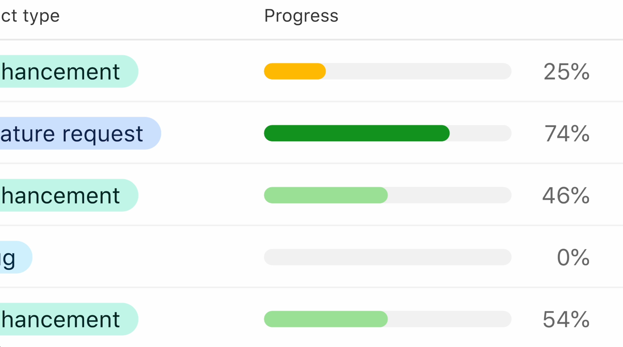
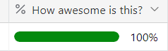
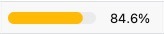
For your fields that are formatted as a Percent, you can choose to display the field as a progress bar. You’ll see the progress bar in all the surfaces where you see that field today, across your bases and interfaces. In forms, you’ll still see just a numeric input.
How do you enable progress bars?
Progress bar formatting is a supported option for the following field types:
- Computed fields with a numeric result (format must be “Percent”)
- Formula
- Rollup
- Lookup (only lookups with 1 number value are shown as a progress bar.)
Enable it with “Display as progress bar” under Formatting.
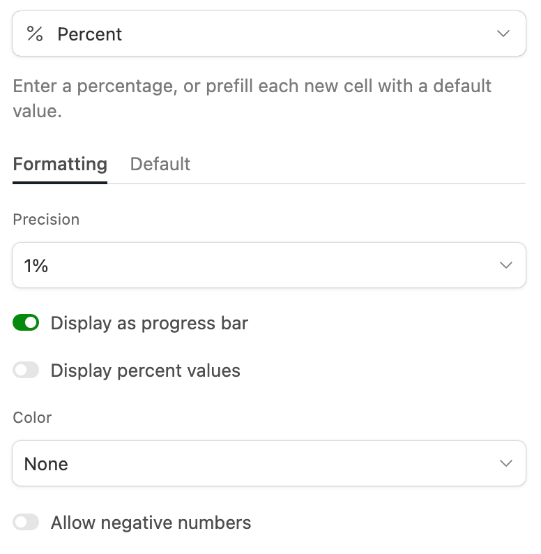
You can also enable the ability to see the percent values next to the progress bar.
How can you customize the colors?
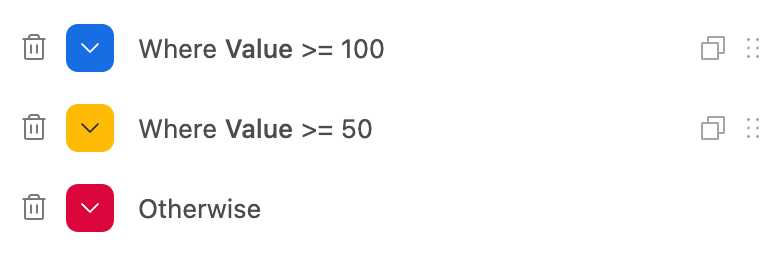
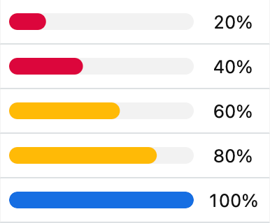
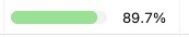
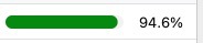
By default, progress bars are shown in a medium green color. If you’re on a Pro plan or higher, you can customize the color of a progress bar and add in conditional rules. We’ll color the progress bar with the first color that matches.
—
We’re looking forward to hearing what you think, please let us know if you have any questions.
This update is available now. If you aren’t seeing these changes reflected, please try clearing your cache.
Love it!
Those are some pretty smart inclusions beyond just "show a progress bar". Well done team.
Wow! This is great news!! And this represents the first time in YEARS that you guys have actually given us a valuable feature that we have all been requesting for years. So thank you! 😃🙌
The color-coding options are particularly useful, because that is one of the key things that we all would have wanted! 😎
Does this mean that Airtable is starting to care more about what customers need in the product, and that Airtable will start listening to customers more in the future? I ask because:
1. We all know that this has never happened in the past. The reverse has actually happened for years, and you can see the perfect example of this in this now infamous thread from last month. This is just one example of dozens. In the past, Airtable has made decisions on its own that are wildly out of touch with their customers’ needs.
2. We’ve also got an ongoing customer request list here (with many more requests that haven’t been typed up yet). Many of these feature requests have been continuously requested by customers for at least 6 years.
Anyways, it’s nice to see this new & valuable feature in the product! Thank you! 😊
Thanks for this. It's most useful and I'm looking forward to gearing my base with linear interpolation calc fields over this weekend. 🥳
Looks very nice.
I think, for even better usage, these fields might be selectable in record coloring menu.
Excellent little feature. One request if I may; would handy to be able to colour the empty bar e.g. angry red empty bar because you're over budget.
Edit: Actually I've just realised this doesn't really make sense as it would be confusing but I can't seem to delete a comment?
This is amazing news, and exactly the kind of improvement we need!
Feedback: as a heavy Airtable user since 2016, it's improvements like this that truly matter.
Other changes like the new Dashboard, Interfaces... These all feel clumsily added. What I really want are more improvements that help us edit data and native Views. The new List view is absolutely useless compared to the original Grid set to Group By. What I'd really like is a native View that's more like a Notion page. Make the Long Text a first-class citizen. Right now the Long Text feels hard to read in any view, including the Expanded Record view. I would love to see a "Page" view that makes the Page Designer a view instead of some extension cramped in a corner or a full-blown Interface. I only use Extensions/Blocks/Apps for data cleanup and because there's no other choice. Same as Interfaces, it's annoying having to 'leave' the data to view the data in a wiki or MS Word full page view. Feels like a tremendously inefficient way of working with a Long Text field when you peeps could just build a Page view instead.
Airtable is my favorite SaaS app of all time. But it feels like many of the new additions to the platform are losing the plot of what Airtable is great at -- importing, tidying, and sharing data. That's the core, not the other nice to haves in stuff like Interfaces.
That's why I love this Progress feature. It's something people have been trying to do with formulas for a long time, and you just made that a first-class citizen instead. Brilliant!
More core improvements that improve our work, please! Great job 💚
Great new feature! 🥳😍
Feedback: as a heavy Airtable user since 2016, it's improvements like this that truly matter.
As another poweruser since 2016, I can only agree 💡💪 Also with the sincere expectation from @ScottWorld that core requests from 6 years old will finally be taken seriously...
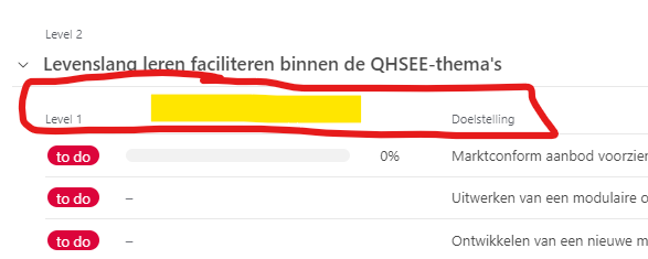
@Ayesha_Bose, I notice that there is no field label for this in a Interface list view? Would be useful to be able to name the progress you are showing.
Thank you, @Databaser, for the shout-out! You understand the pain that all of us Airtable customers have been through with the Airtable team.
Thank you for this wonderful new feature. I really like how it is introducing more formatting options to existing field types (versus adding field types). It is a beautiful implementation.
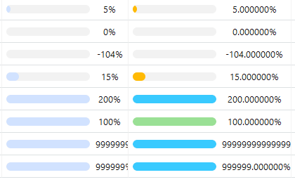
I experimented with using negative values and numbers over 100%.
Negative values appear identical to 0%. I was not able to find a way to make them look different. For example, when looking for a percentage change in a value, I would want to be able to see easily if a value went down versus staying the same. I'm not sure what this should look like and I understand the choice for the current implementation. Just hoping for something interesting if you revisit this feature.
For percents over 100%, the bar is the same fullness as 100% but I was able to use coloring to differentiate between the two. Yay.
For very large percents (over 6+ digits?), the formatting is cut off. This is a super minor quibble. I don't see why anyone would have such a large percent in practice.
The alignment of the numeric percents appear to be centered, instead of left aligned (they way percents are aligned without a progress bar). I'm curious about this design choice.
@Databaser: thanks for flagging this! In List View, we don't show the name of the first field but if you move your progress bar field to the right, you should see the name of the field show up. Let me know if you run into any issues with that.
It is a very good feature.
This is a great feature, but would be even more useful on a dashboard than within the table itself.
Hi, that's a really nice feature.
I have an issue with this though, the color formatting seems buggy:
With decimal percentages the conditions are not recognized properly, I have the following conditions on a field
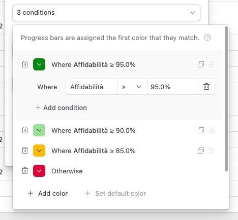
the results unfortunatelyare not correct for values that are near the "breakpoints".

Any suggestions?
Thanks
This is a nice little feature! It make my Analytics tables slightly more visual. Good job, guys.
