
Kanban Cards Need To Be More Compact


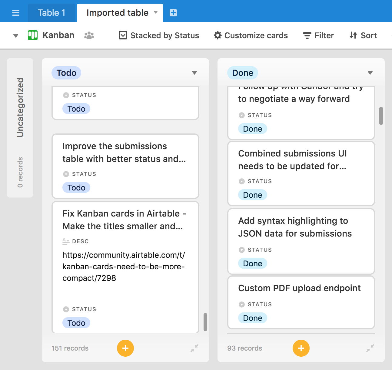
I am trying to convert from Asana to Airtable using Kanban cards. But the Kanban cards, even with the recent improvements hiding fields if they are empty, are still too chunky. Using a non Kanban view on Asana. I can see 15 tasks without having to scroll down, and their Kanban view will show around 5 tasks. But with Airtable, the cards are so huge, I can only see 2 or 3 cards before I have to scroll down.

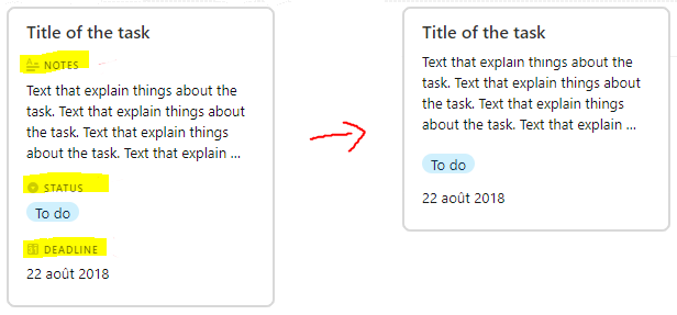
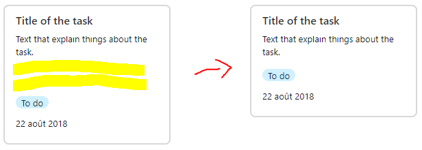
If there was an option on each card to show a compact view or a standard view, it would greatly improve the usability of Kanban cards with airtable.

The compact view only needs to show the title, and if you want to see more of the card you can toggle the standard view.

This would greatly increase the usability and help me move everything off of Asana.

79 replies

Yes!
I love the fact that we can hide fields on cards, but when I un-hide the collaborator field, it not only adds the collaborator name, with the collaborator icon, it also adds an extra line (and a lot of white space) to label the row! Labels should be optional. I don’t want to waste space in my card list for a line that says “date” when the field that follows it is obviously a date… At the same time, there should also be an option to show the entire content of a field. I don’t want my titles truncated.
It would be nice if we could adjust the width of columns too. Often we just have a few lists, but they are too long too read and too narrow to display properly. It would be great if we could make the column wider and let the fields fill in the available width, side by side if possible.
It would be a dream if we could design the cards and the expanded record views… :slightly_smiling_face:
Thanks!
-Donald


  • New Participant
  • 4 replies
  • January 25, 2018

Currently because the kanban columns are very thin, AND the title for the cards are shown in a large font (relative to the width of the columns), most of my card titles are being truncated, even after considerable effort to make them shorter.

I’m new to AirTable and it looks very nice, it has potential to replace Asana for our team, but this one thing is rendering the Kanban view essentially useless for me.

Note this is a bit different from original post. Whereas OP is worried about cards being too “tall”, I actually would like them “wider” (or at least for the title to use smaller/thinner font), so you can see more of the title text without it being truncated.

Any ideas?


  • New Participant
  • 3 replies
  • January 25, 2018

Agreed here – most of the processes we track using Kanban cards (which are awesome) are more than, say, 4 steps long - meaning I’d need a dual, triple or quadruple monitor setup to see the entire “board,” even with display settings adjusted. Would be super helpful to be able to visualize an entire production timeline from start to finish at a glance and more compact cards would be the first step.


Forum|alt.badge.img
  • Participating Frequently
  • 6 replies
  • February 2, 2018

i have a 5k 27’’ screen and i still need to scroll a lot with the kanban view O.o also, the titles just cut, this is not very friendly


  • Author
  • Participating Frequently
  • 7 replies
  • February 2, 2018
marcio wrote:

Currently because the kanban columns are very thin, AND the title for the cards are shown in a large font (relative to the width of the columns), most of my card titles are being truncated, even after considerable effort to make them shorter.

I’m new to AirTable and it looks very nice, it has potential to replace Asana for our team, but this one thing is rendering the Kanban view essentially useless for me.

Note this is a bit different from original post. Whereas OP is worried about cards being too “tall”, I actually would like them “wider” (or at least for the title to use smaller/thinner font), so you can see more of the title text without it being truncated.

Any ideas?


All Airtable has to do is copy Trello.

In Trello, if you make the title too long it goes into the next line so nothing gets cut off. Even if you make the title really long and it stretches to 3 lines, it is still a really petite bubble.

Being able to view other fields within the Kanban is a nice feature since sometimes you want a large Kanban to stick out, but this should be within the control of the user otherwise it defeats the purpose of using Kanban.

Airtable, do you even Kanban?


  • Known Participant
  • 11 replies
  • February 6, 2018

Zoom out to like 80% or 75% in Chrome, you’ll see much more. I also pin the Kanban tab in Chrome and use it all day as a project management tool. Works pretty good until they figure this out.


Collapsible records in the Kanban view would be very helpful!


  • Participating Frequently
  • 5 replies
  • March 30, 2018

Same here,

KANBAN needs a refresh. As mentioned before i dont need the discription when its shows a colaborator or title.

Please add that option


  • New Participant
  • 3 replies
  • April 20, 2018

Yes, this is a very important area to focus on to make Kanban useable. It’s a great option, but not the way it’s done. Even just allowing the title to wrap would make a great MVP solution. We can’t tell what a majority of or items are without expanding each record (due to them being truncated)


  • New Participant
  • 3 replies
  • June 8, 2018

Bump*

This feature (in addition to being able to complete checkboxes on linked records) will convince my team to migrate from trello


Hello there,

I totally agree with making the kanban cards more compact, or at least to have the options available, like you have crop-fit options for the picture. And I am not talking about adding new functionality to have a cool Kanban, I am talking about having a real Kanban that respects Kanban spirit, meaning: only display relevant & important information, hide everything else, period.

Because Kanban are designed to enable people to quickly find & manage a lot of cards, they should always be visually optimized and space should never be wasted.

Few solution to make it possible in Airtable:

  • Attributes names can be removed, we don’t need to have them a million times. Cards are simples, they display relevant & important information, so people using the Kanban know what are the important attributes.

  • Empty space in long text attributes should not actually take any space, this is wasted space.

In this example, the two solutions divide the card’s height by almost 2, so we can display almost twice more cards on the same screen.


  • Author
  • Participating Frequently
  • 7 replies
  • July 30, 2018
Kevin_Gotteri wrote:

Hello there,

I totally agree with making the kanban cards more compact, or at least to have the options available, like you have crop-fit options for the picture. And I am not talking about adding new functionality to have a cool Kanban, I am talking about having a real Kanban that respects Kanban spirit, meaning: only display relevant & important information, hide everything else, period.

Because Kanban are designed to enable people to quickly find & manage a lot of cards, they should always be visually optimized and space should never be wasted.

Few solution to make it possible in Airtable:

  • Attributes names can be removed, we don’t need to have them a million times. Cards are simples, they display relevant & important information, so people using the Kanban know what are the important attributes.

  • Empty space in long text attributes should not actually take any space, this is wasted space.

In this example, the two solutions divide the card’s height by almost 2, so we can display almost twice more cards on the same screen.


Great points!

I love the way you phrased this. The spirit of Kanban is to only display relevant information and to visually optimize the tasks to remove clutter. This is what airtable needs to focus on with Kanban.

I agree with the attribute names being removed. If needed Airtable can replace the attributes with an image that references that attribute or remove it all completely. I think this should be up to the user IMO.

What I would really like to see is the ability to toggle the cards to quickly show more information or minimize the information shown. This is something that not even trello has. In the example you posted you could have a long list of To Do’s within the Kanban. There could be an arrow pointing down to expand the To Do’s and an arrow pointing right for when you want to minimize and hide the list. This way you could have some large Kanban cards and some minimal Kanban cards depending on what you are working on that day.


Kevin_Gotteri wrote:

Hello there,

I totally agree with making the kanban cards more compact, or at least to have the options available, like you have crop-fit options for the picture. And I am not talking about adding new functionality to have a cool Kanban, I am talking about having a real Kanban that respects Kanban spirit, meaning: only display relevant & important information, hide everything else, period.

Because Kanban are designed to enable people to quickly find & manage a lot of cards, they should always be visually optimized and space should never be wasted.

Few solution to make it possible in Airtable:

  • Attributes names can be removed, we don’t need to have them a million times. Cards are simples, they display relevant & important information, so people using the Kanban know what are the important attributes.

  • Empty space in long text attributes should not actually take any space, this is wasted space.

In this example, the two solutions divide the card’s height by almost 2, so we can display almost twice more cards on the same screen.


I totally agree, attribute names can be removed without problem :ok_hand:


  • New Participant
  • 2 replies
  • August 28, 2018

+1 totally agree with @Kevin_Gotteri explication


Forum|alt.badge.img
  • Participating Frequently
  • 5 replies
  • September 10, 2018

Yeah, we want to use this for our sprint planning, but it’s not quite suitable in it’s current form.


  • New Participant
  • 3 replies
  • October 2, 2018

I just convinced one of our customers to switch to AirTable from Trello and this is a HUGE disappointment for them. I’ve told them to zoom out in Chrome/Safari, but they don’t understand why it doesn’t just wrap to a 2nd or 3rd line since, “Trello even does that.”.

Really think many would benefit from this request. So + 1 +1 +1 +1 +1 +1,000,000,000


Doug_Justice wrote:

I just convinced one of our customers to switch to AirTable from Trello and this is a HUGE disappointment for them. I’ve told them to zoom out in Chrome/Safari, but they don’t understand why it doesn’t just wrap to a 2nd or 3rd line since, “Trello even does that.”.

Really think many would benefit from this request. So + 1 +1 +1 +1 +1 +1,000,000,000


We switched from Trello, but the Kanban has been unusable to us for so long, I think we’re heading back soon. Not being able to use the kanban on mobile or tablets also makes it pretty useless for a lot of us.
-Donald


  • New Participant
  • 3 replies
  • October 5, 2018

@Donald_Newlands - Wow, we haven’t even looked at them via a mobile device or tablet…that’s not good news at all, but hopefully they’ll find a way to improve these items sooner vs. later. If you haven’t done so already, I’d strongly suggest opening a support ticket so it gets on their product backlog (if it isn’t already) and gets placed to the top.


  • Participating Frequently
  • 9 replies
  • October 23, 2018
Kevin_Gotteri wrote:

Hello there,

I totally agree with making the kanban cards more compact, or at least to have the options available, like you have crop-fit options for the picture. And I am not talking about adding new functionality to have a cool Kanban, I am talking about having a real Kanban that respects Kanban spirit, meaning: only display relevant & important information, hide everything else, period.

Because Kanban are designed to enable people to quickly find & manage a lot of cards, they should always be visually optimized and space should never be wasted.

Few solution to make it possible in Airtable:

  • Attributes names can be removed, we don’t need to have them a million times. Cards are simples, they display relevant & important information, so people using the Kanban know what are the important attributes.

  • Empty space in long text attributes should not actually take any space, this is wasted space.

In this example, the two solutions divide the card’s height by almost 2, so we can display almost twice more cards on the same screen.


Totally agree on hiding the attribute names.


  • Participating Frequently
  • 9 replies
  • October 23, 2018

Also need the ability to expand/collapse the 'NAME" attribute in both Kanban and gallery views. (Similar to the grid functionality but on Gallery and Kanban views). My printouts have half the text cut off.


  • New Participant
  • 1 reply
  • November 21, 2018

The lack of usability for Kanban view is crazy. Similar to Trello, this is one of the reasons we opted to port over our product management to Airtable; however, the lack of support for Kanban on mobile and the title truncated makes it unusuable on the road or during meetings.

This would solve a lot of pain, Airtable!


  • New Participant
  • 1 reply
  • November 24, 2018
marcio wrote:

Currently because the kanban columns are very thin, AND the title for the cards are shown in a large font (relative to the width of the columns), most of my card titles are being truncated, even after considerable effort to make them shorter.

I’m new to AirTable and it looks very nice, it has potential to replace Asana for our team, but this one thing is rendering the Kanban view essentially useless for me.

Note this is a bit different from original post. Whereas OP is worried about cards being too “tall”, I actually would like them “wider” (or at least for the title to use smaller/thinner font), so you can see more of the title text without it being truncated.

Any ideas?


This is the sole reason our product team won’t be adopting Airtable. You can’t see what things are with three words visible tops. Clicking into the card to read the title (or hovering) is simply too cumbersome.

I have tried three times thinking maybe I could make it work because I want everything else in Airtable so badly, but this simple change would earn them a paying team instantly.


  • New Participant
  • 1 reply
  • January 3, 2019

Perhaps the solution here is to let a Kanban view select a Page Designer object to use as the template for the card? AirTable should still offer a nicer looking default card - seriously, why haven’t you done this? - but it would allow deeper customization so you don’t have to solve everyone’s problem and create further product stickiness.


Hi everyone. I was also really disappointed when I imported all my Trello cards into Airtable and realized that the Kanban cards could only display the first few words from my titles. So I decided to fix it with some custom CSS on userstyles dot org.

To use this custom CSS, first you need to install the Stylish browser extension. Then go to the userstyles dot org website, and search for the “Airtable - Better Kanban Titles” style. (Sorry, I’m not allowed to include any links in my post!)

I was able to make the font smaller and allow up to two lines, instead of one. That used up all of the available margin, and unfortunately I’m not able to add more lines without access to the JavaScript source code. (The cards use position: absolute and they calculate the heights and offsets in JS, so I can’t do too much else here.) But I think this is already a huge improvement.

Please try it out and let me know if you run into any issue! And hopefully the Airtable designers will add this as a built-in option.


Yes 100% Agree. The number one feature needed to change on kanban is allowing the full title to show. The benefit of kanban is to see an overview. Its kind of useless without being able to quickly glance at the titles (getting cut off).

Thank you so much @Nathan_Broadbent for posting your fix. I googled your blog post and found the solution. For anyone looking for his solution, google: Migrating From Trello To Airtable + formapi

Super quick and easy using the extension!


Reply