

👋Hi all! I’m Stephanie, product marketer at Airtable and I'm so excited to introduce some powerful new features to help teams build AI-powered apps on top of shared data—all within a single, scalable platform.
Today, we’re bringing AI to Airtable, making Airtable the easiest and fastest way to deploy AI-powered applications across the enterprise. We're also releasing new features to empower teams to get up and running and build powerful apps quickly with a suite of pre-built applications for marketing and product teams.
- Apps by Airtable: Get set up and running faster than ever with out-of-the-box apps built for critical use cases. Available for Enterprise.
- Verified data: Easily protect and manage your org’s most important data from one place, while making it accessible to those who need it most. Available for Enterprise.
- Two-way sync: Automatically sync data and edits back and forth between workflows so your teams can easily collaborate on the most up-to-date information. Available for Enterprise.
We’re rolling these updates out over the next week; if you don’t see them reflected in your workspace, hold tight!
But something I’m super excited to announce is a new left navigation in Interface Designer. Now, we’re making it easier for you to quickly find and engage with the most important parts of their workflows. In addition to the updates we released back in March, Interface Designer makes it that much easier to build on Airtable. (And spoiler alert: we’re not done. Stay tuned for even more exciting updates to the app building experience)
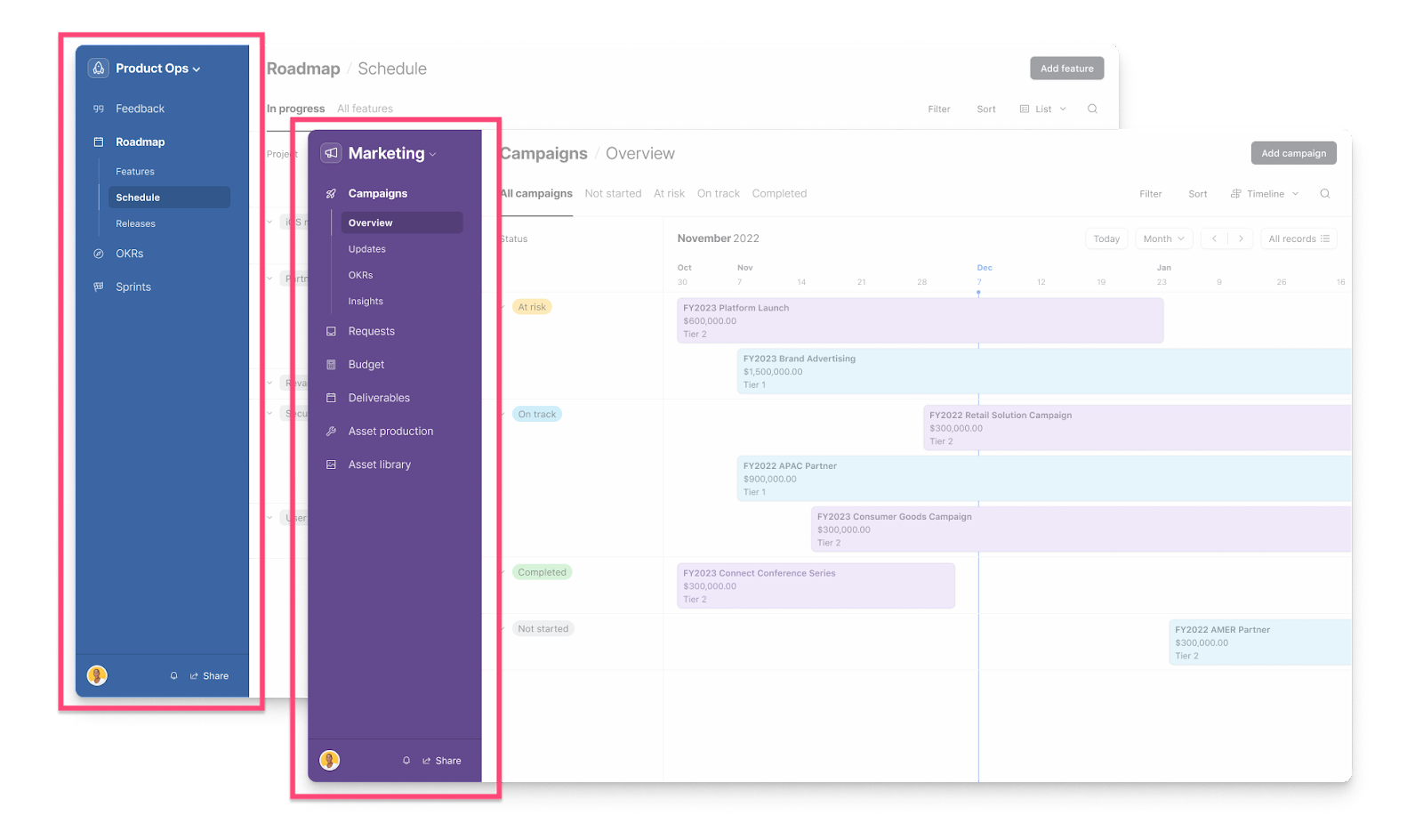
Left Navigation: New left navigation panel for easy navigation between interfaces & pages.
But that’s not all, you’ll also see that we cleaned up the share view menu so that your teams can discover and share important views and data across the org.
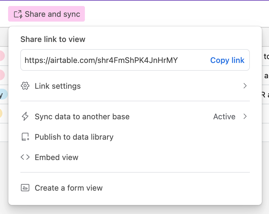
Redesigned Share View Menu: Simplified sharing and syncing with a redesigned share view dialog.
These features will be a game changer for teams of all sizes—helping them build the apps they need on a scalable, secure platform. Learn more about these updates in our blog post!
We can’t wait to hear what you think, and see what you build, with these updates!


