I’m Rotimi Iziduh and I’m the product manager working on various Core Surfaces here at Airtable. I’m super excited to share a set of upcoming updates that make the in-base experience easier to navigate, and improve the discoverability of the automations and interfaces features. Specifically, we are introducing a new top navigational structure that contains the below three tabs:
Data: This is the default starting point of the old experience. As before, it is where you will review and edit the various tables and views that contain your data
Automations: This provides easier access to automations that trigger various actions based on your underlying data
Interfaces: This gives quick access to a visual layer to turn your underlying data and automations into apps that are tailored to your unique workflows
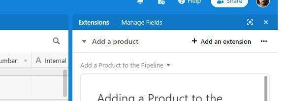
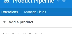
To illustrate this, here’s a quick before and after snapshot:
Before:
After:
We’re excited to launch these improvements and please keep an eye out for more exciting updates across your favorite Airtable surfaces!
Thanks, Rotimi
These updates will be rolled out to 100% by end of day tomorrow. If you aren’t seeing these changes reflected, please try clearing your cache.
Page 2 / 3
I like the new layout. But something makes me feel anxious. Can you remove the darker color in free space in the tab (like the old one)? It will make the header seem bigger and fearless. To me, the new one looks like too much color (orange, and darker orange, too much for me )
Hi there, I got the update yesterday and have a problem with editing scripts… I sometimes edit a script and before finishing testing, I need to SAVE, but not make the changes live, because I need to finish my testing at a later stage.
I see that I have one of 2 options, DISCARD changes or Update the script
I’ll save WIP script changes locally to enable me to not loose everything before I want to make a change live.
If there is another way / process flow that anyone is following for editing and testing script changes please let me know
Generally this feels like a strong move. I ESPECIALLY like the ‘show a table in a dockable popup’ feature that is now in automations. I hope that UI approach finds more uses in the future. And Manage Fields is very useful for managing more complicated bases.
One item that felt very odd to me: The behavior of the Extensions and Manage fields menu items.
When in Manage fields, it bolds Manage Fields, which makes sense:
But when you show the extensions pane, we get a divider between the data and the Extensions pane and the darker “header bar” breaks in two pieces. OK, that makes sense. But the Manage Fields menu item is now in the Extensions section rather than the data section. This suggests that Manage Fields is now related to Extensions – though of course, it is not.
To reinforce this point, the other buttons in that “header bar” – to expand it to full screen and to close Extensions – are specific to extensions. So that surface is clearly supposed to be for extensions-related UI only, but the Manage Fields button confuses that. In fact, it’s even worse when you expand Extension to be full screen – the Manage Fields button is still there:
This leads to the very weird user experience of clicking Manage Fields from within a maximized Extensions pane. Manage Fields is specific to the context of a table, but a maximized Extensions pane is not - in fact it does not list a current table at all… so “manage fields” of … what, exactly? Yes, it’s the last table you were in, but that context switch – from full screen, base-level to full-screen table-level is not communicated with the UI very well, and so it is jarring.
OK, so how to fix this? One option is probably very simple: Swap the position of Manage Fields and Extensions menu items in the darker header bar. With Extensions on the right, the Extensions Pane division header bar can happen between these two options, with Manage Fields staying on the “data side” of the split an Extensions moving into the pane’s header. That keeps the UI elements in the extensions pane header bar to only those that apply to extensions.
I also agree that the Airtable logo should be brought back. This helps Airtable in terms of branding, and also helps with ease of use.
I prefer the current format. It’s all a little cleaner.
However, I’m not moving between bases - we keep everything all in one, so for my use case, I feel the current format is nicer
Hi there, I got the update yesterday and have a problem with editing scripts… I sometimes edit a script and before finishing testing, I need to SAVE, but not make the changes live, because I need to finish my testing at a later stage.
I see that I have one of 2 options, DISCARD changes or Update the script
I’ll save WIP script changes locally to enable me to not loose everything before I want to make a change live.
If there is another way / process flow that anyone is following for editing and testing script changes please let me know
I recommend that you pair your script writing process with an external code editor such as VS Code and a git version control system such as GitHub. Save your in-progress code locally in VS Code. Store and track versions of your code in GitHub. Have a copy/paste workflow between the VS Code and the Airtable code editor.
I like the new layout. But something makes me feel anxious. Can you remove the darker color in free space in the tab (like the old one)? It will make the header seem bigger and fearless. To me, the new one looks like too much color (orange, and darker orange, too much for me )
I agree with this feedback too!
Yay! I like the new layout. I agree with others above, Table Chooser hamburger that moved to right side as arrow is going to take some getting used to - especially when already going to that zone of the UI for view choosing so often…
STILL NEEDED: Improvements to how the table tabs slide/highlight when selected. I Think there has been some progress here, but not complete. (I always called it Slippery Tabs when I submitted bug reports). Tab highlight not following your view choice/staying on screen/getting half hidden and making impossible to select properties dropdown is a pain when tables/tabs exceeded window width and scrolling or table choosing is required. And if they don’t show up as highlighted, you don’t have any idea what tab you are in unless you remember. Unfortunately that behavior is not resolved but I really hope it gets tweaked now that they have a new shiny UI upon which to refine!
The image here shows that I have selected a table but it does not show up as a highlighted tab, and I don’t know the name of it. It kind of happens randomly - but I’m sure some reason I could try to figure out based on how far left or right I was in the tab order before starting.
+1 for this request. It’s annoying.
I kind of like the new look, but I do worry that automations has been brought out of hiding a little, I fear some questions coming my way from my users!
I agree. The vast majority of my users (incl. many base owners) rarely touch automations or even extensions without direct support from my team. At larger companies where most users are not base owners nor power users themselves, placing more advanced functionality front and center will make Airtable look and feel more complicated and induce anxiety.
I think it makes more sense for the automations function entry point to return next to the extensions button, as these are targeting the same type of user. Otherwise, I would update the order of the top buttons to Data, Interfaces, Automations to put less emphasis on automations and more on interfaces which touches more users (hopefully).
Also, a deeper discussion of the new navigation bar here:
I like the new layout. But something makes me feel anxious. Can you remove the darker color in free space in the tab (like the old one)? It will make the header seem bigger and fearless. To me, the new one looks like too much color (orange, and darker orange, too much for me )
I too am now feeling this anxiety I agree, the darker colour needs to end with the base table tabs.
Yeah, it’s very disconcerting. Not sure why this was implemented. It makes the entire screen much more cluttered and less usable. @Rotimi_Iziduh, are you still following the feedback in this thread?
You’ve always been able to retrieve field IDs from your base’s API docs, but this should save you some clicks/browser tabs.
@marks thank the lord that’s finally in there. You could get a table, view, and base ID from looking at the URL but non-coders had no easy way to find field IDs. Great addition.
@marks It may be a small change, but this has to be one of my favorite small changes in recent memory. I wrote a script to help me grab field IDs to use in scripts, and that’ll still help when I need to get them in bulk, but sometimes I just want one, and this will probably be the easiest way to do that going forward. THANK YOU!
Yay! I like the new layout. I agree with others above, Table Chooser hamburger that moved to right side as arrow is going to take some getting used to - especially when already going to that zone of the UI for view choosing so often…
STILL NEEDED: Improvements to how the table tabs slide/highlight when selected. I Think there has been some progress here, but not complete. (I always called it Slippery Tabs when I submitted bug reports). Tab highlight not following your view choice/staying on screen/getting half hidden and making impossible to select properties dropdown is a pain when tables/tabs exceeded window width and scrolling or table choosing is required. And if they don’t show up as highlighted, you don’t have any idea what tab you are in unless you remember. Unfortunately that behavior is not resolved but I really hope it gets tweaked now that they have a new shiny UI upon which to refine!
The image here shows that I have selected a table but it does not show up as a highlighted tab, and I don’t know the name of it. It kind of happens randomly - but I’m sure some reason I could try to figure out based on how far left or right I was in the tab order before starting.
In the mean time you can use Ctrl+j to see your active table and jump to another one without scrolling.
I have to admit, I just learned about command+J today and am so excited about it
In the mean time you can use Ctrl+j to see your active table and jump to another one without scrolling.
Side note: Ctrl + J is also a keyboard shortcut universal to browsers for navigating to Downloads. Not sure if intentional… I guess at least that it’s easy to remember? I should really make time to learn all Airtable shortcuts.
@marks thanks for the Field ID update, super useful.
I like most of these changes, however, I’m now seeing an “Insights” tab on the far right. I’m on the Pro plan, so all it does is tell me that the feature is only available for Enterprise. No sneak peek. No basic functionality. Just a constant reminder how frustrating it is that Airtable doesn’t provide a mid-level option between Pro and Enterprise.
My business is not large enough to warrant switching to Enterprise at this time (I can’t justify a 10-100X price increase for a few additional features), and I’m not even sure that Airtable would permit me to move to Enterprise without additional users. So why continually market something to me that is not viable or even available to me as a loyal paid user? All it does is serve as a continual reminder of what to me is one of Airtable’s biggest flaws. If you want me to move to Enterprise, I would be happy to consider it. But if you don’t have an Enterprise plan that I can even consider signing up for, please stop telling me how great it would be if I signed up.
Better yet, create a viable path for Pro users to grow with Airtable and eventually become Enterprise subscribers. This would mean allowing Pro users to pay more to access Enterprise features that are actually needed by businesses earning less than $1,000,000/year. Namely increased record limits, automations and Blocks/Apps/Extensions. You have Pro users lining up saying that they’re willing to pay more for these basic Enterprise features. But they won’t wait in line forever. I have seen dozens of Pro users abandon Airtable for this exact reason.
Edit: The “Insights” tab has now been moved over to the right, and includes the star symbols showing that it’s an upgrade feature. This is better, but my complaint still stands regarding the lack of a viable route for most Pro users to transition to Enterprise, or at least pay for higher limits.
One thing I’d like to add; any plans to make notifications accessible within an interface? I have an excellent use case for an interface now, namely copy editing social media posts, and having the comments always visible is great, but not knowing when someone has commented on a post that I’m not working on means I can’t yet ‘live’ in this interface.
Yes, interfaces not only needs notifications, but it also needs a quick way to navigate back to “Data” and “Automations”. As it stands now, Interfaces is just a completely disconnected layer from the rest of Airtable, which makes it unlikely that people will want to use it. @Rotimi_Iziduh
You’ve always been able to retrieve field IDs from your base’s API docs, but this should save you some clicks/browser tabs.
Thanks for this functionality. A few possible enhancements:
bulk edit fields from this screen (thinking particularly select and delete several fields at once)
setting field visibility in expanded record view; some fields are entirely admin, part of a formula calc or automation, or otherwise irrelevant and distracting even in “show hidden fields” view - would this be a place to take those completely out of the picture? I’ve long wanted more ability to control what happens in expanded record view based on different views or contexts, but until that day it would be nice to at least be able to kill some fields entirely outside of certain grid views.
From a UX perspective it’s very uncool to limit full Dependencies viewing to Enterprise users. Data integrity should be the most baseline feature/requirement across all Airtable use cases, and it sucks to get an alert essentially saying “Sure, you can delete this field, but it may have some damaging consequences. We know what those are but we’re not going to tell you because you are not big enough to deserve that information. Now go figure it out for yourself, loser!” We sometimes hear that Airtable is “Excel on Steroids,” but Excel lets everyone trace dependencies - this is more like “Excel On a Bad Diet and Lack of Exercise.”
I could not have said this better myself. It is yet another example of Airtable slapping its customers in the face by doing this, and it seems like they do not care.
It’s like having access to the airport’s lounge as a Business class passenger but when you visit the buffet, the cookie jar is for First class passengers only.