

I have a table of feedback for two cafes in a base. Each bit of feedback has an assigned category.
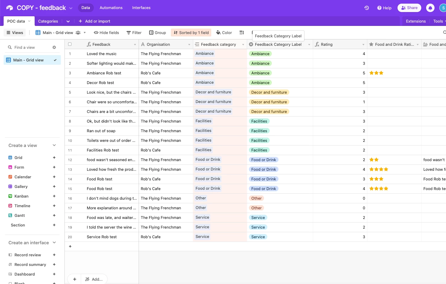
I have another base that is linked to the category so that I can view aggregated data such as average feedback score by category. This data is then visualized outside of Airtable.

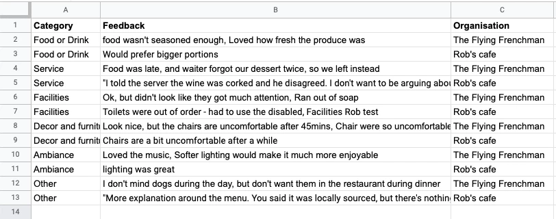
The problem is that in Airtable as category is the primary, it lumps the cafes together in each row, so from this table I can't distinguish one from another. I need an output where I can see organisation as a breakdown of the category. Something like this (almost like a pivot table structure):
How would I go about designing my base in order to achieve that?
IMPORTANT - the data needs to be in one view ideally rather than filtered views because my visualisation tool can read at the table level, but not view level (I do my filtering there).


