Hello,
My organization has developed a great app in Airtable for our really unique use case (context at the bottom). The functionality of the app is really, really great. The user interface design and usability is poor and is now causing problems, and I'd like help improving the user interface.
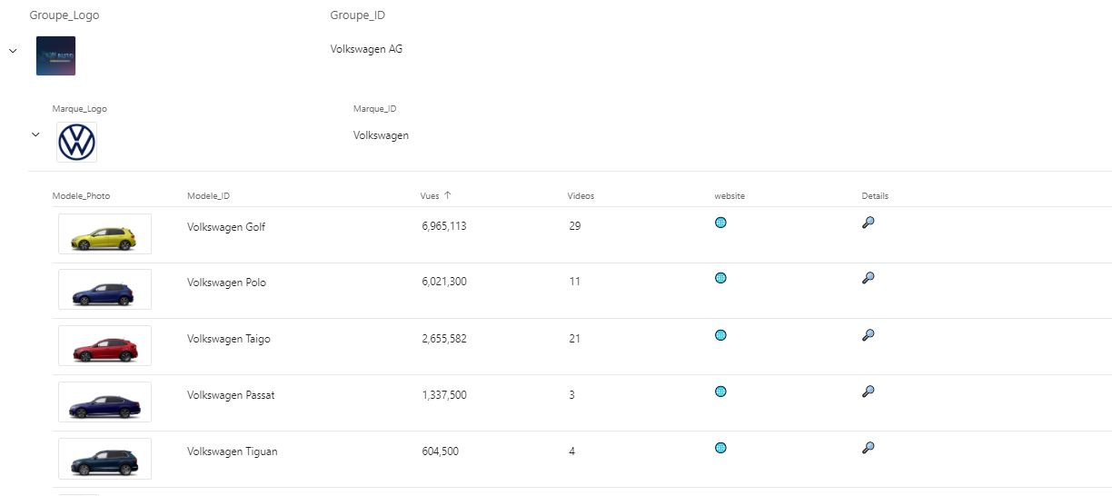
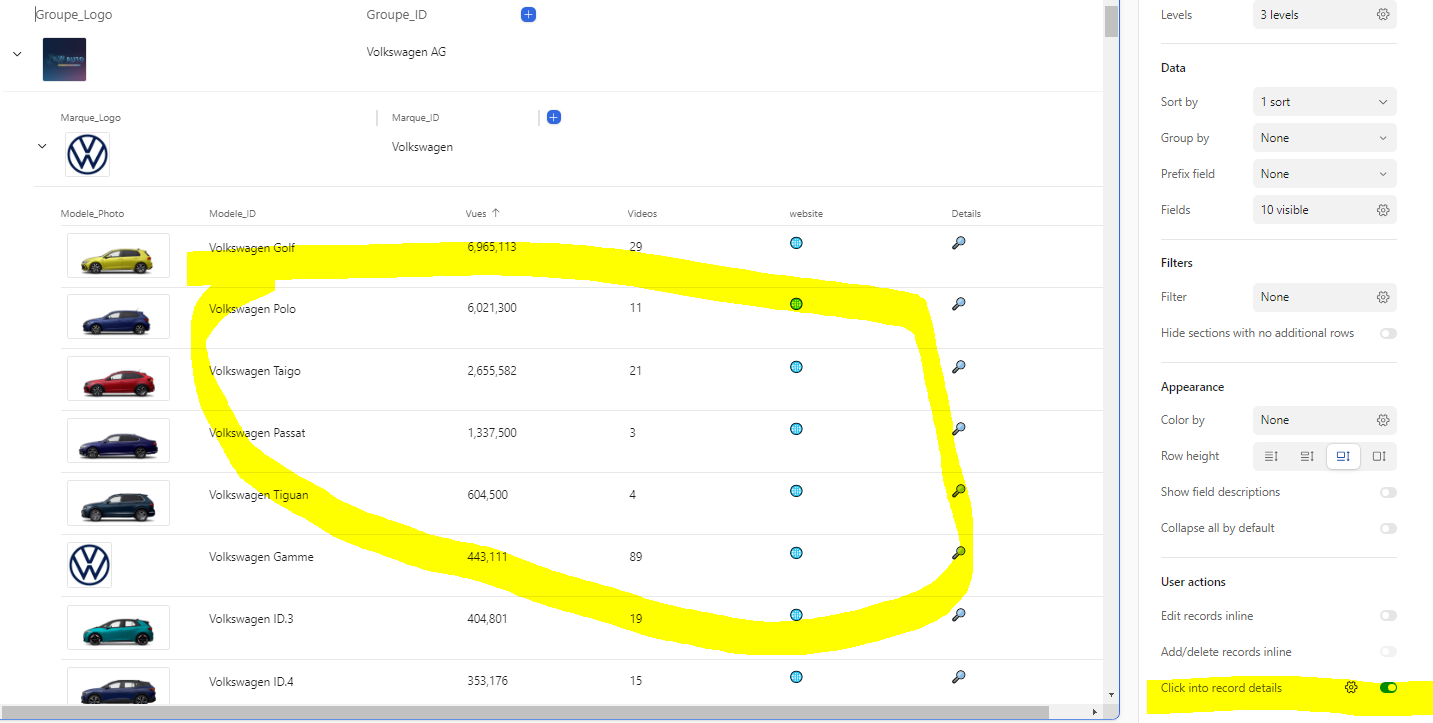
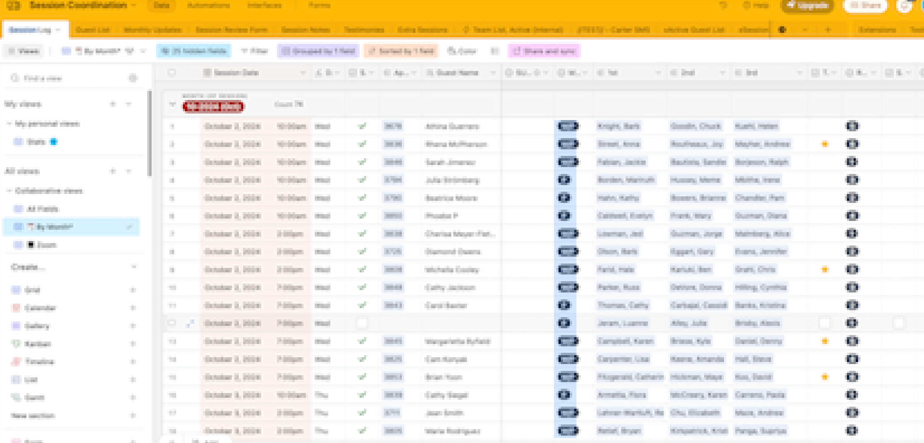
The biggest problem is that we have so many different datapoints that we need to access, that our "Grid View" tables are too wide, so we can't see all the information at one time that we need to see.
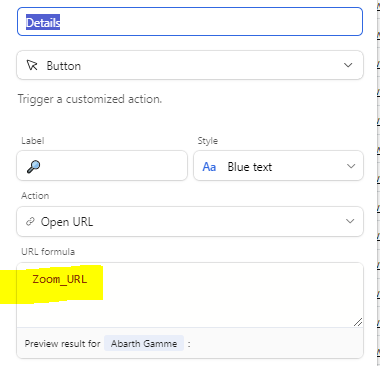
How can I transform my Airtable user interface into something that's really helpful and usable? All the data is there, and it works well, but the UI is too complicated. Does anyone have recommendations, best practices, or resources to help me understand how I can do this?
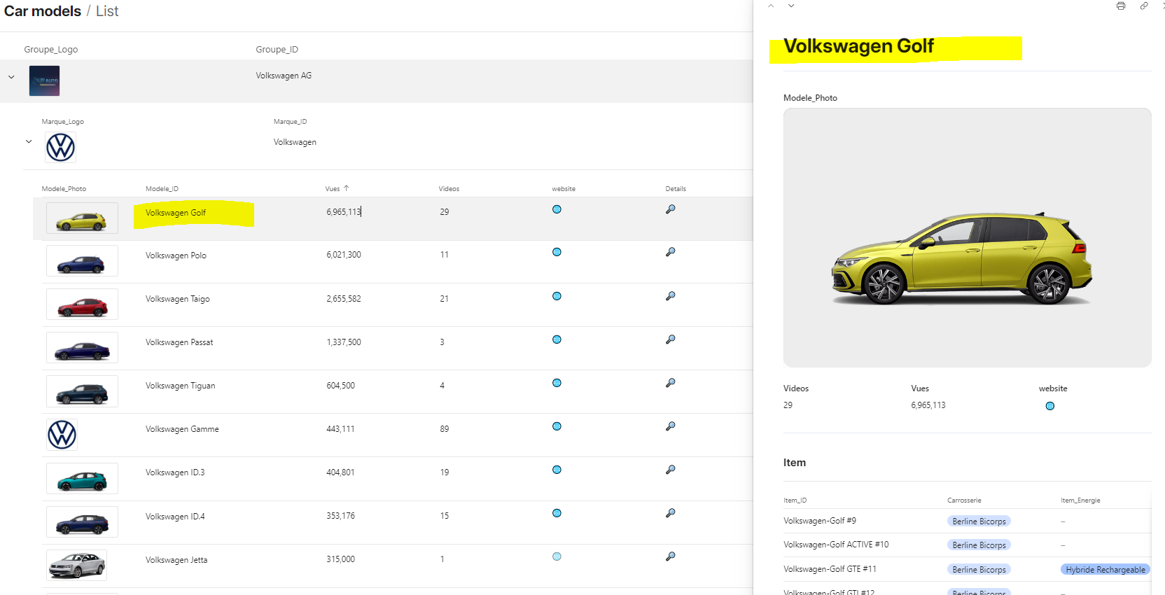
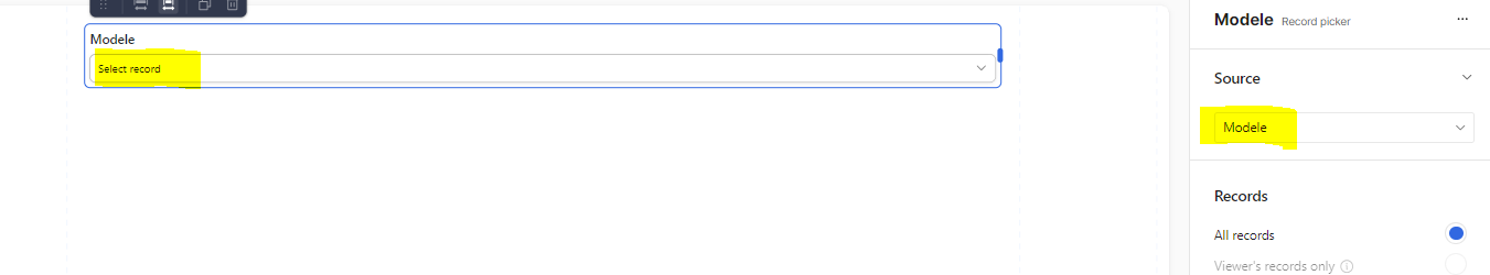
I also considered using "Record Viewer" interface, but I need the "high level view" of all records, not just "zooming in" to one record at a time.
I'd love to use List View and have a "2nd Row" of fields I could add underneath the initial line of a record so I wouldn't have to scroll to the right, but I don't see a way to do this.
TIA,
ML
Context:
My organization is a nonprofit that offers counseling appointments to individuals. We have developed a really great app that brings together a number of systems to 1) schedule volunteer counselors, 2) intake guest applications, and 3) schedule guests with counselors. There are a lot of logistics, and not having a good overview of these appointments (1 month at a time, for example) where we can quickly see the status of a month's appointments with some granular detail is becoming problematic.