
Noob here. Frankly don't know where to start, and my mind is whirling with the results in the community, so let me describe what I'm going for.

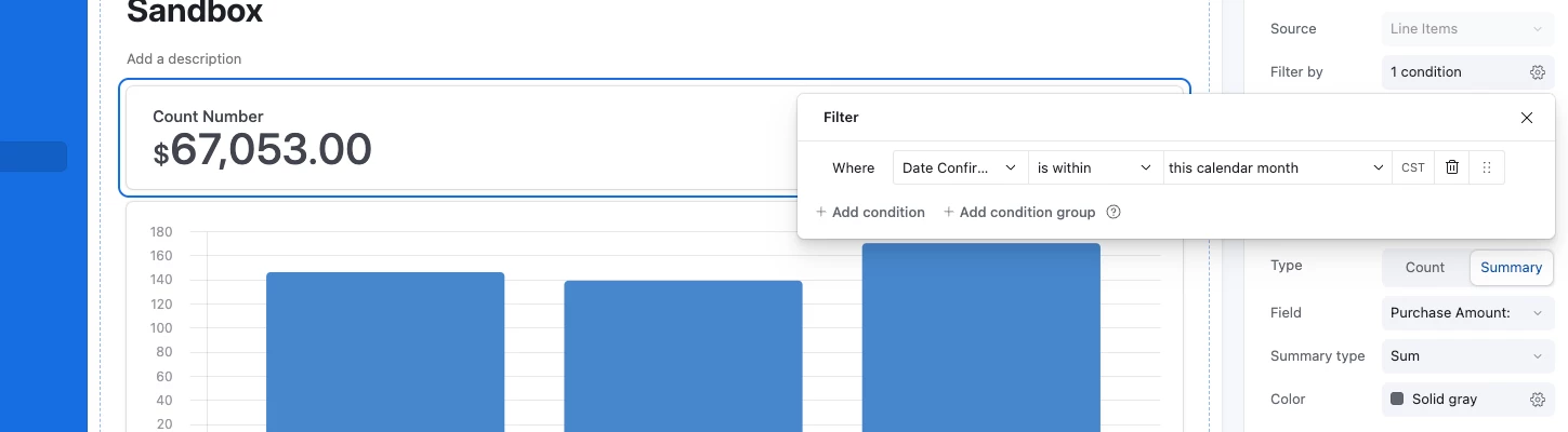
I've created a form that allows my community to report data in four areas for a health challenge: calories consumed, exercise calories, water consumption, and sleep hours. There's also the date and the person's name in the table.

What I want my community to see is a summary of each of the four areas for the current month. I'll embed the view on a web page. Rollups, aggregations, linked records — I'm starting from square one in using Airtable and haven't figured out which and how to make this work. 'Lil help? Thanks!

Hi there! 

do you plan on doing it for current month, or for the 30-day cycle? and are you utilizing an interface dashboard embed? I'd  recommend this route - you could set a condition to your number elements. Here's a quick example of a similar format (counting currency during a month)

Let me know if this was helpful ! 


The interface dashboard is what I'm looking at now, because it's soooo much better looking than something like a gallery card. And, yes, it would be for the current month — probably a separate one for the current year or even lifetime.

Thanks for this: your example prompted me to think of something differently and the embed looks great!


Amazing to hear! Happy I could help and here as a soundboard if needed. 


Reply