How to format interface buttons layout in Airtable.
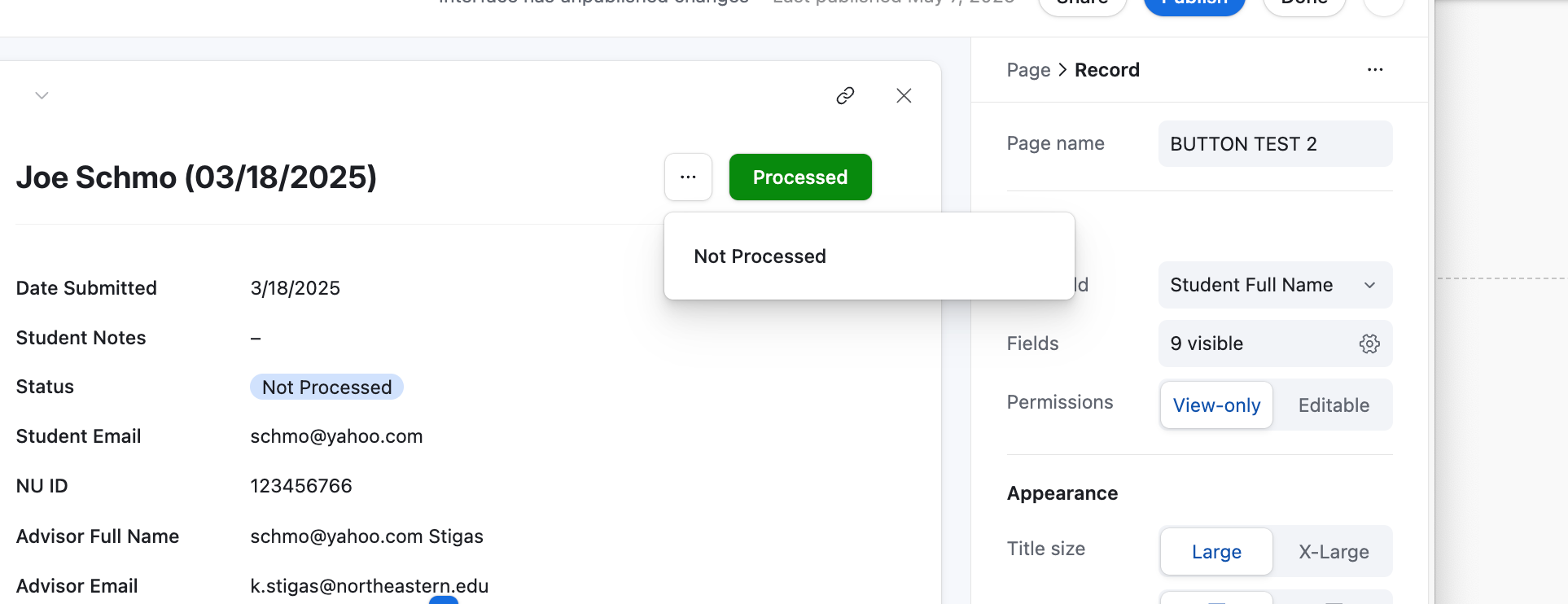
Hello Airtable users! I have a seemingly simple question (with hopefully an even simpler solution). Does anyone know how to format interface buttons so they appear side by side rather than in a format like the one screenshotted below? We are in need of having two buttons (a Processed button and a Not Processed button) for our interface users, but with this default layout, the presence of the second button is obscured. Any insights from this group?
The buttons how they appear now:
Page 1 / 1
I believe the easiest workaround is adding the buttons to the Group instead of the Record, if that makes sense? Basically, just click into the negative space to the right of the fields and it should pull up the Group settings panel. Adding Buttons there usually lets you add two without obscuring either of them. You’ll know you found the right place if you see this at the top of the settings pane on the right side:
You could also make the Status field (and only the Status field) editable if you click on that specific field and edit the Permissions from View-only to Editable. From a UI perspective so the field is more prominent, similar to the buttons: you could then make the field larger, bump the field out into its own group, and stick it up top (with a Group title and/or helper text that’s something like “Update status” to make it clear that’s where they should be clicking). Should accomplish a similar function, though I acknowledge it adds an additional click if you’re changing the status.
Hope either of these helps!
Hey @e.hobson!
Unless I am missing smth, I am afraid that is not possible. I believe that depending on the size of the view (small panel or wide expanded view) you might be able to fit one or two fields. But that is done automatically done by Airtable and you cannot choose how many to show. Best you can do is re-order to decide which one to show.
I’d love @ScottWorld to prove me wrong though!
Feel free to submit this as a feature request, it would be useful!
Mike is correct — most interface pages will allow you to have 2 buttons visible at the top of the screen, but the record review page will only allow you to have one visible button at the top of the screen.
It’s a very odd decision by Airtable, but you can easily workaround this limitation by creating groups.
As @stagandforge pointed out above, you can create your own groups on any interface page that you would like — including the record review page — and you can always get 2 visible buttons at the top of each group.
Furthermore, if your buttons are taking people to URLs, you can also use button fields and place as many of them as you want on your page, up to 3-4 buttons across horizontally.