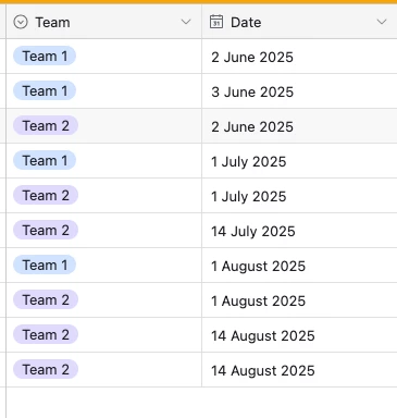
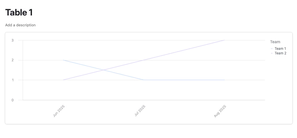
I am looking at creating a line graph in the interface. Is there a way to show multiple teams as the lines? What I am hoping for is X axis to have the months and the Y axis to have the number and each month to populate the number is this possible?
Thank you
Page 1 / 1
Here’s an example I put together, but it really depends on how your data’s set up I’m afraid. If you could provide some screenshots of your data that’d be helpful!
Thank you for you response. Here is an example of the data I ma looking to put into a line graph. Where I want the X axis to have the month, Y axis the Points awards and the lines to show how many points have been awarded each month from that team/manager
I hope that is clear.
Thank you
Hi,
I suppose your Month field is formula with DATETIME_FORMAT. The output is text that will be sorted A-Z, if you choose it as X label. So, use Date instead, in X-axis options, select Bucket by Month. In Y-axis options, in Group by, select team/manager
Amazing thank you. I got it. I also discovered that I had to create a blank template to add the chart it seems to have more functions on the right hand side. But thank so much