
I created a bar chart that shows data based on 2 categories:
- month in the year (string, x-axis)
- monthly actions finished (percentage, y-axis)
There are 2 major issues that make the product acts weird:
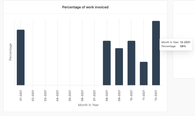
When there is no “100%” value, there are no values on the y-axis bar. I’m got into confusion that the highest bar is 100%, which is not (on the image attached its 58%)
All the meaning of percentage is SOMETHING-AS-PART-OF-100, I don’t want to see the maximum value as something which is lower than 100%, it’s missing the whole point of percentage.
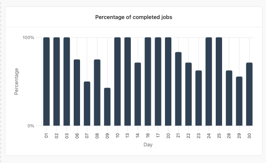
In case there is a “100%” value, The values shown on the y-axis are only 0% and 100%, I can’t see the values between (like in the number column for example), I MUST hover each bar to see its value.