Hi there,
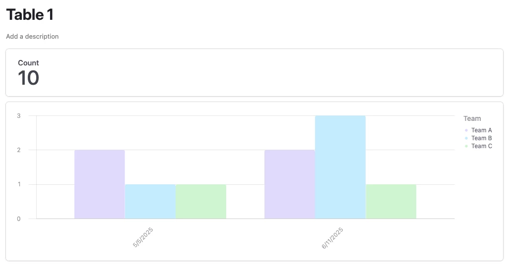
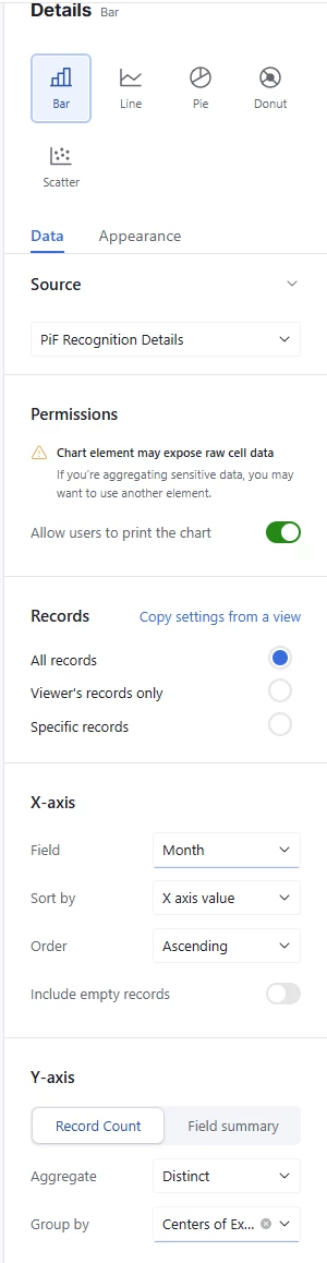
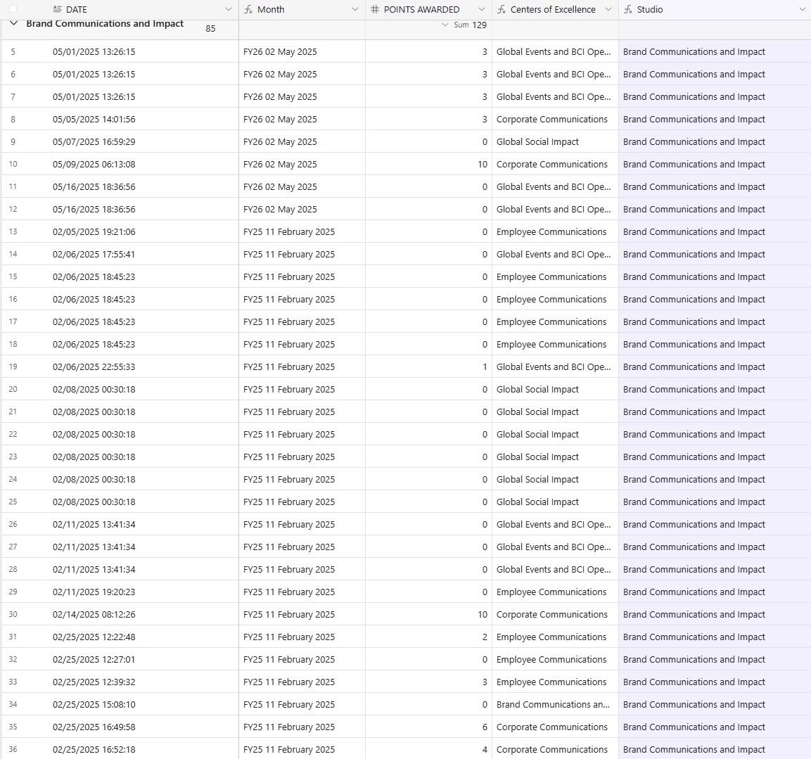
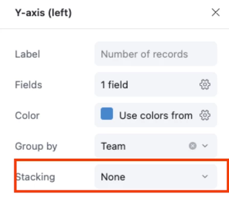
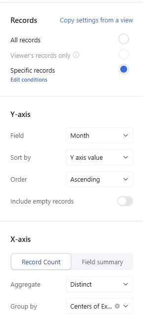
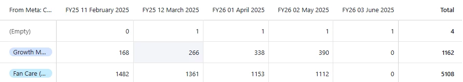
Is it possible when creating bar charts that you can have visuals like we do on Excel or powerpoint? For example On the X axis I want it to have the month, Y axis to have submissions made but the actual bar to show the each teams who have made submissions for those months.
Essentially, for one month it will have 3-5 bars which represents teams A-E
Thank you