Hi!
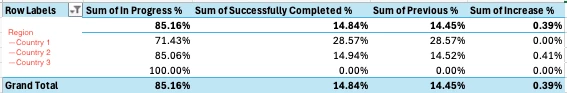
I have some pivots in Excel that I’m attempting to re-create in Airtable. It has multi-level categories in the rows (Region, Country) and then 4 different metrics that I convert to a %. (In Progress, Successfully Completed, Previous Week Successfully Completed, and Increase Amount) I have all of the line-detailed data that you’d need to get this in Excel (Record ID, Region, Country, and binary 1/0 for In Progress, Successfully Completed, Previous Week Successfully Completed, and Increase Amount.)
I cannot for the life of me figure out how to replicate this in Airtable and then add it to an interface. The closest I’ve been able to get is a grouped view of the data that I show as a grid and then removing the “0”s and changing the values of those metrics to be % Filled. This is almost fine, but it doesn’t stay grouped and expands too much. Is there a better way to do this?