

I am having an issue where I have a table that calculates a sum Total. I figured I could easily just show a user’s name + total on the interface but it seems very hard for some reason.
Right now, I get the sum with a user’s name, but it then adds all of these columns for each unique sum there is within the data set.
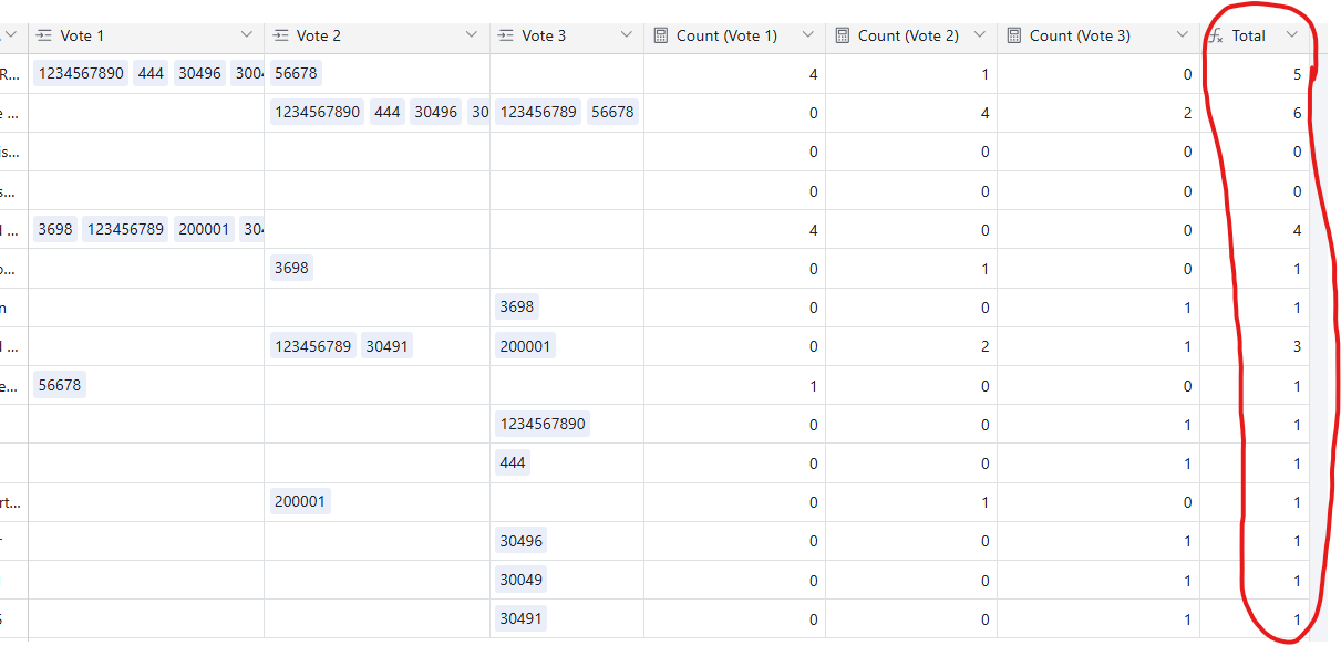
Example Image:

And here is what the data looks like
So I am just trying to make a table on the interface (as we will share that view) that simply shows Name + Total.
I have a bar chart showing this, which kind of works, but just having 2 columns with plain text would be nice too in the interface.
Thank you!
