Hello!
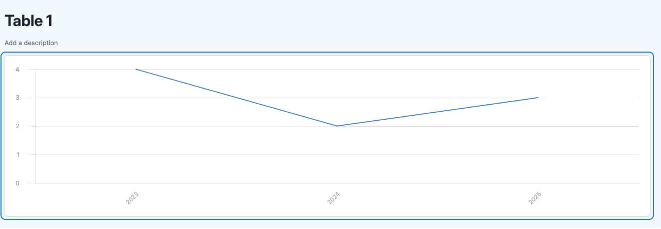
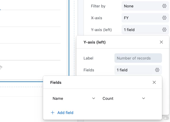
I am trying to create a line chart in an interface that shows the number of records (leads in this instance) we received this financial year vs last financial year. I essentially want to see how we are tracking in comparison. What is the best way to go about it?
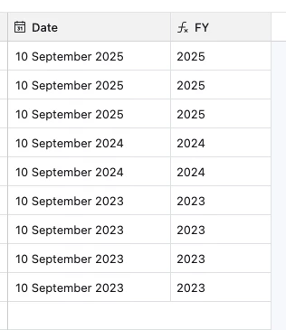
I have created a formula which indicates what FY the record was created in to assist with grouping but I just cant get it to display correctly.
Thanks in advance for your help! 😊