Month-by-month graph of records that are "valid" between two dates

  • March 7, 2024
  • 9 replies
  • 81 views

Forum|alt.badge.img+3
  • Participating Frequently

We have a fleet of vehicles, with a entry_date and exit_date, we also categorise their type (passenger/commercial). I was hoping Airtable could graph (suspecting only line graph will work here) each month of the year (Jan 2023/Feb 2023/Mar 2023/etc) and the total count for passenger vehicles and commercial vehicles where the month of the year fell between the entry_date and exit_date. Has anyone done this before? Thanks for any help in advance!!

9 replies

Dan_Montoya
Forum|alt.badge.img+17
  • Employee
  • March 8, 2024

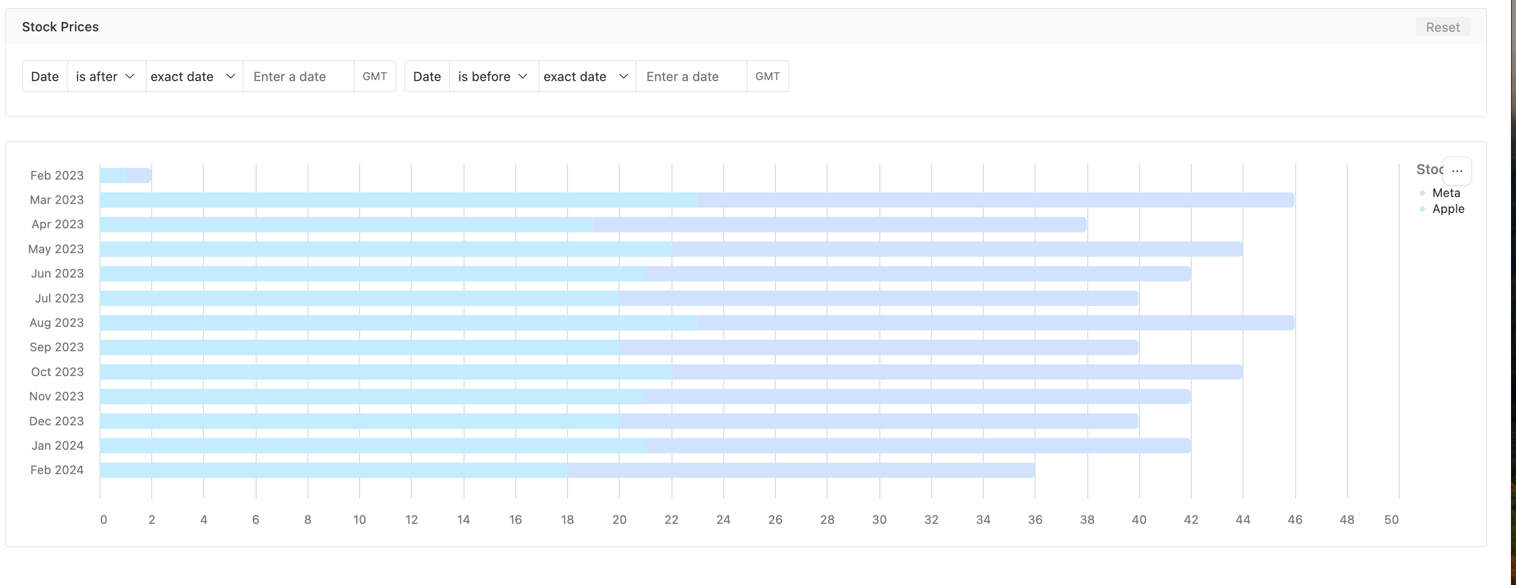
@wilkie  here is a interface I've used to show stock prices over time.  There is both a line graph which is mobile and desktop friendly and a desktop only version.  You could easily change the stocks to vehicle types and total passengers per type. I've added a filter at the type for the start and stop dates.


Forum|alt.badge.img+3
  • Author
  • Participating Frequently
  • March 8, 2024

 Hey @Dan_Montoya, thanks for sharing this! It looks to be just plotting multiple data points though, however I was looking to plot using a single record for each vehicle with entry_date and exit_date, and then with a graph bucketing by month, if each month along the x-axis fell between entry_date and exit_date then it would add to the count of vehicles for that month.

Eg Vehicle1, entry_date: 25/12/2023, exit_date: 07/02/2024.

On a graph where months were along the x-axis (count on the y-axis), so Oct 2023, Nov 2023, Dec 2023, Jan 2024, Feb 2023, Mar 2023, the count would be as follows:

Oct 2023: 0

Nov 2023: 0

Dec 2023: 1

Jan 2024: 1

Feb 2023: 1

Mar 2023: 0


Dan_Montoya
Forum|alt.badge.img+17
  • Employee
  • March 8, 2024

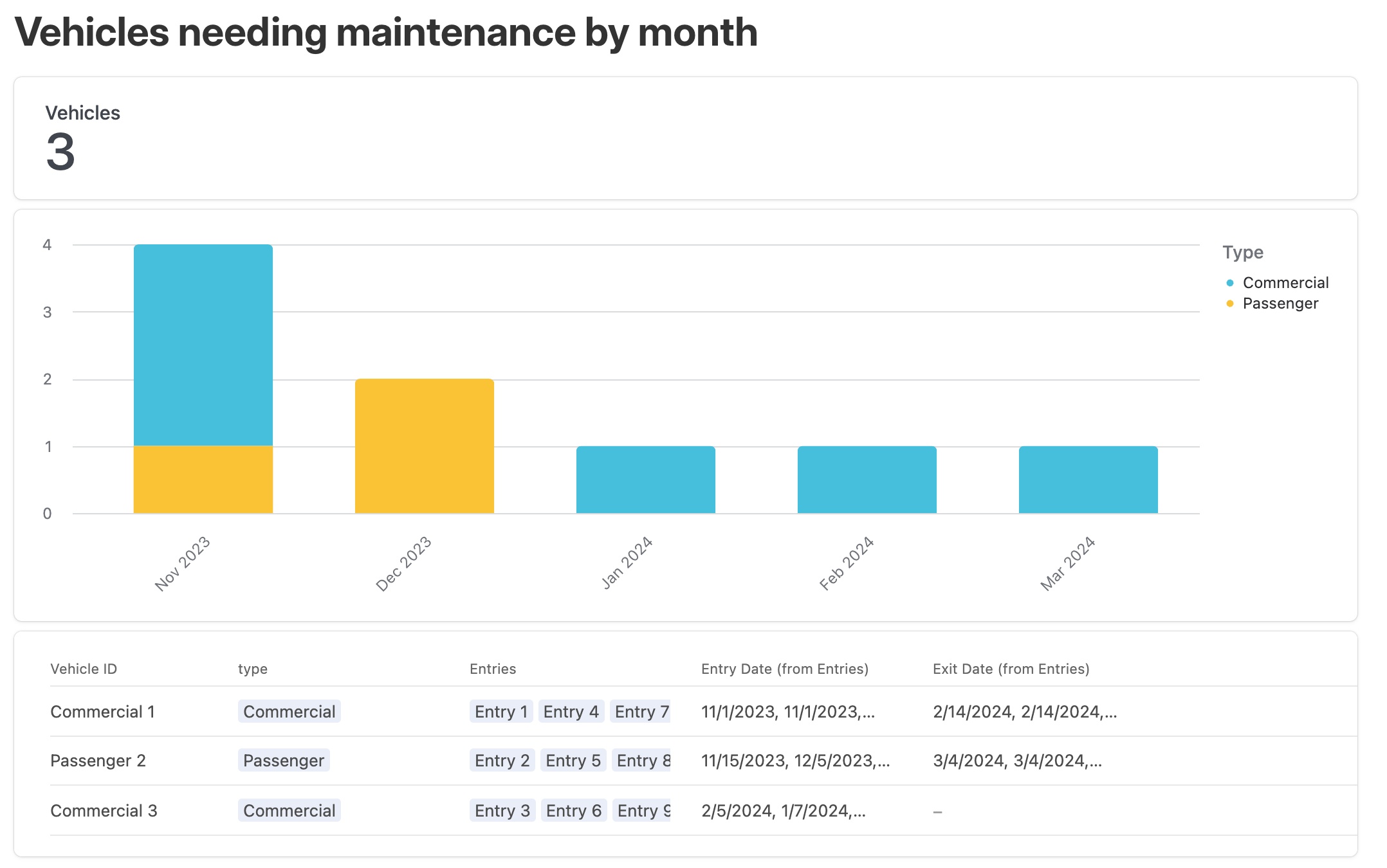
something like ?


Forum|alt.badge.img+3
  • Author
  • Participating Frequently
  • March 10, 2024

I think so, though not sure what is behind Entry 1, Entry 2, Entry 3, Entry 4, etc?


Dan_Montoya
Forum|alt.badge.img+17
  • Employee
  • March 11, 2024

Entries are service events. 


Forum|alt.badge.img+3
  • Author
  • Participating Frequently
  • March 11, 2024

Ahh ok thanks, it seems I still need to have something between the entry_date and exit_date for the vehicle to appear, is that right? Assuming a vehicle had 0 service events, what would be the best way to have its existence in the fleet be represented on a chart? Some of my vehicles don't have service events for a long period, so we essentially wouldn't be able to see they "exist" until that happened if it relied on that


Dan_Montoya
Forum|alt.badge.img+17
  • Employee
  • March 11, 2024

The entry dates can be the day they entered service and the day they left service.  Your choice. 


Forum|alt.badge.img+3
  • Author
  • Participating Frequently
  • March 16, 2024

How would this ensure they get displayed in the months/periods between the entry and exit date @Dan_Montoya ? Sorry I am confused! 😵


Dan_Montoya
Forum|alt.badge.img+17
  • Employee
  • March 16, 2024

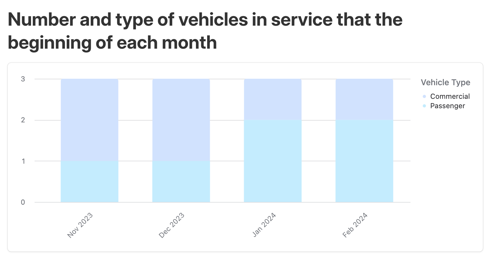
I think you want something more like .


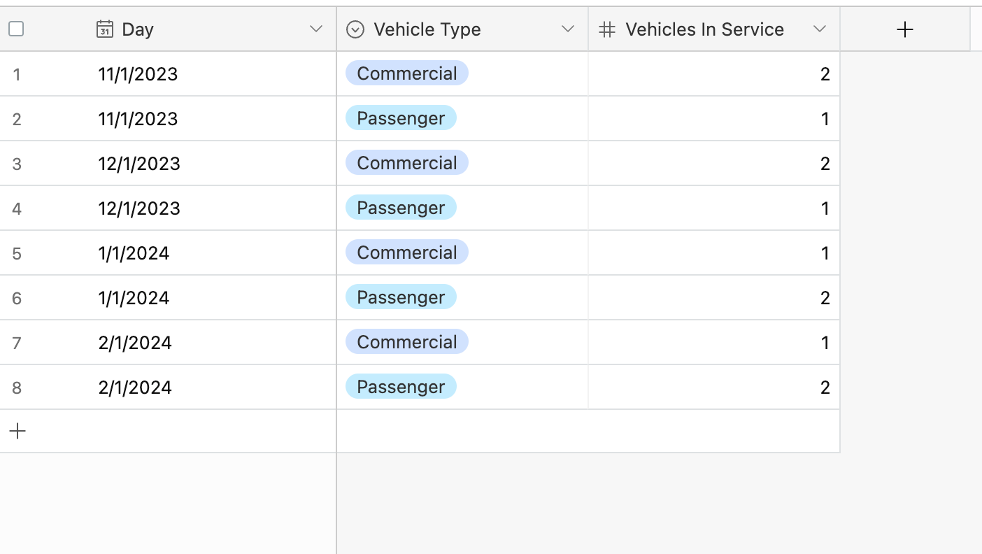
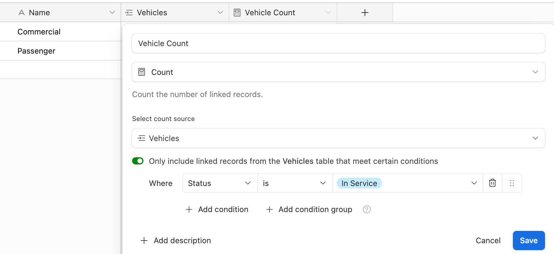
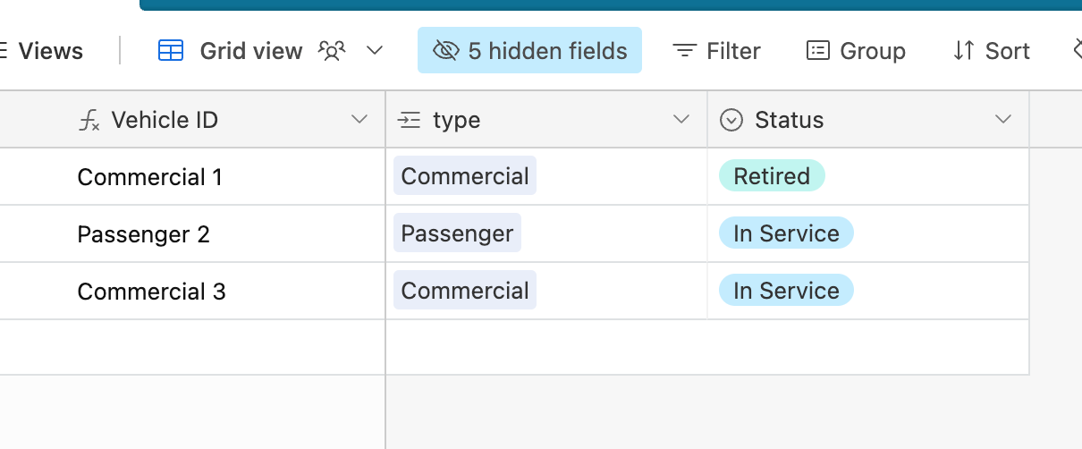
This graph is created from a table I call "historical log."  At the beginning of each month, an automation records the number of each type of vehicles in service creating a separate record for each type.