

Hi there,
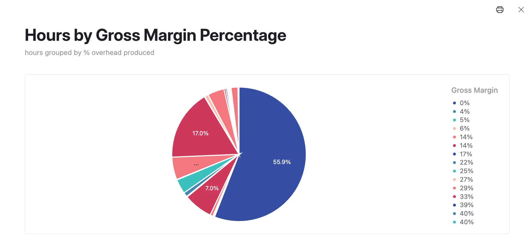
I’ve created a pie chart in my dashboard interface, and I selected a field to group records by (Gross Margin %). It seems to work well, but it sometimes displays multiples of the same value as separate slices (see multiple 14% and 40% in the legend below). Is this a bug, or am I missing something in the chart setup? I’m really confused why the same value wouldn’t group together automatically.
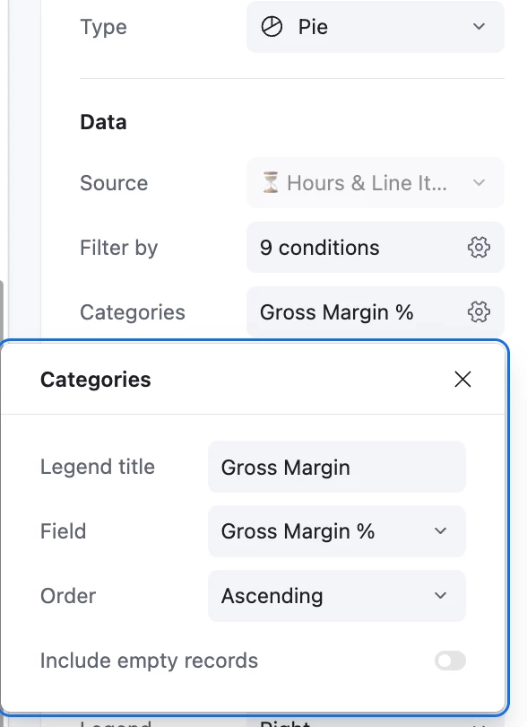
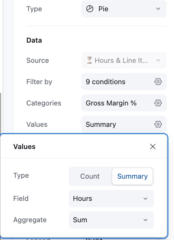
This is what my setup looks like:
If anyone has any ideas, I’m all ears! Thanks so much :)