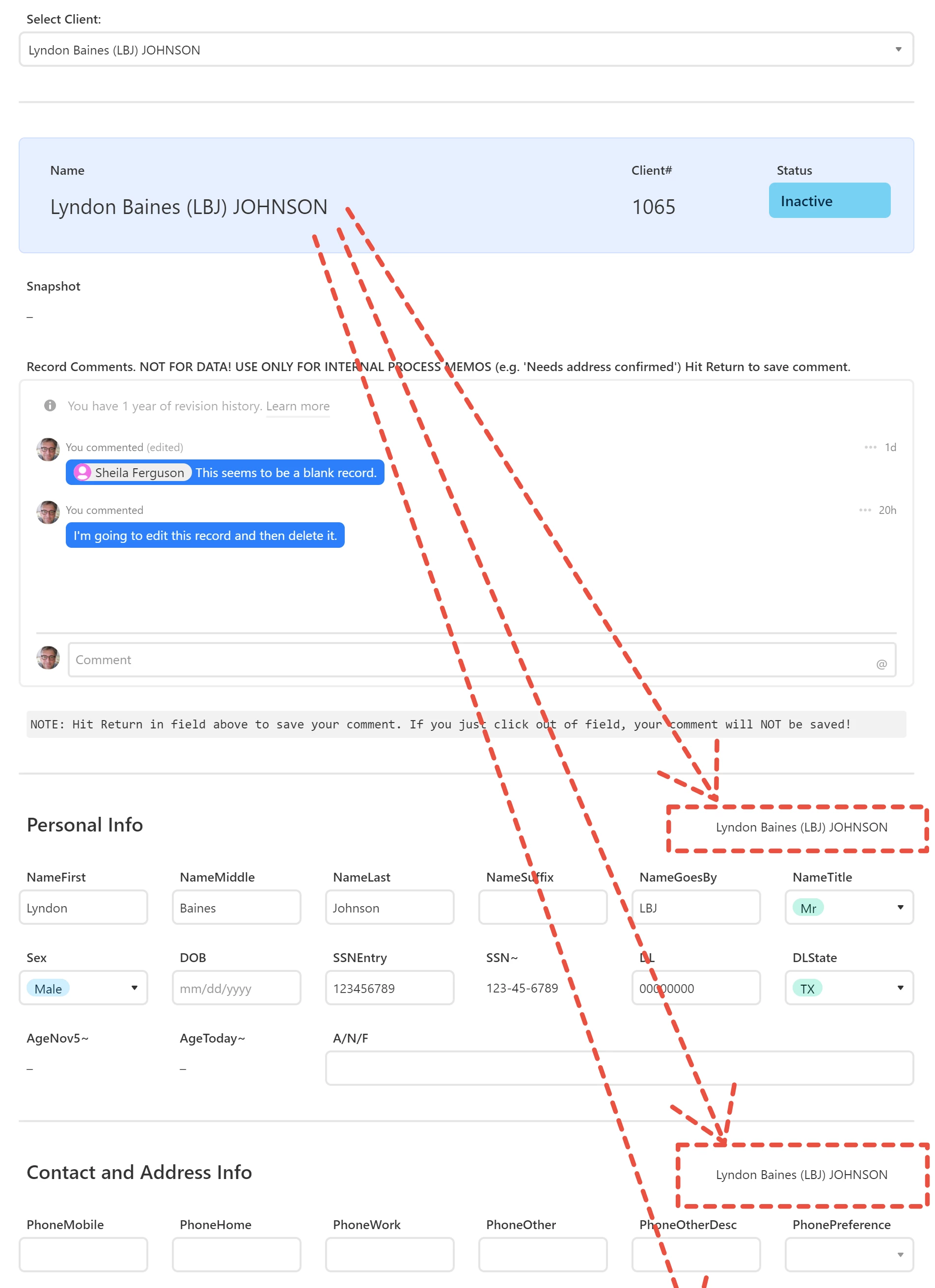
The problem: long details page loses name of record’s subject
On an interface page that shows record details for a person (say), if there are more fields than be displayed on one page, user will be required to scroll and scrolling will cause the name of the record to scroll up and out of view.
Requested solution
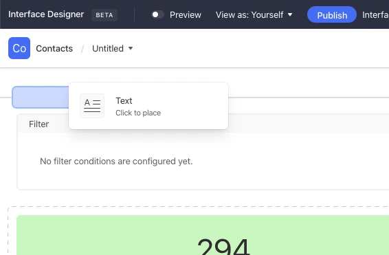
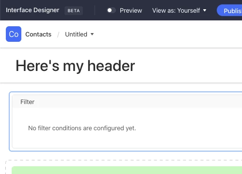
Would be extremely useful to have a Header option for interface pages. (As far as I can tell, there is no Header option at the moment.)
Workaround I’m using
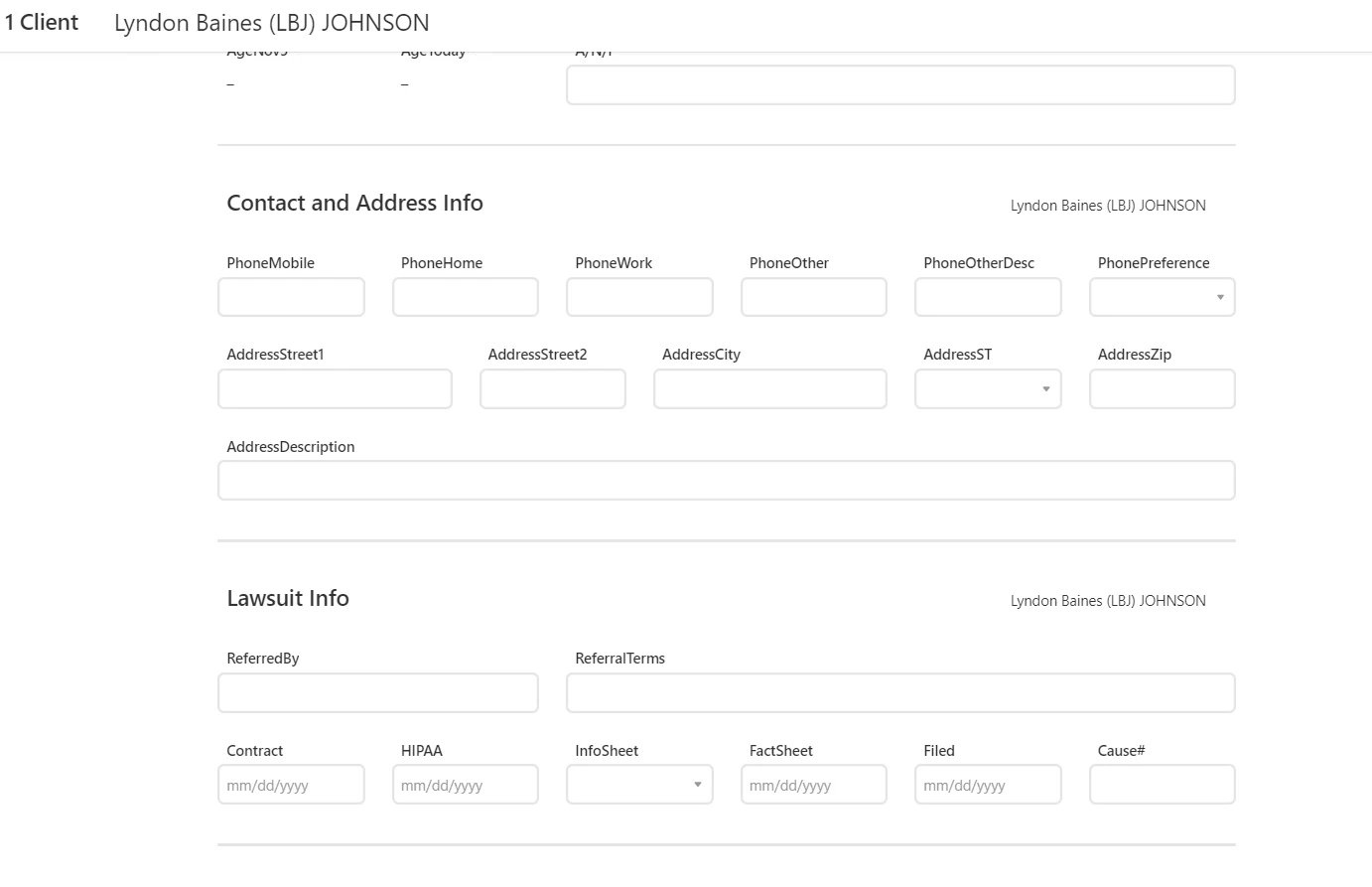
At top of the page is a sort of title area that shows the name of the record (+ client# and status). Below that, I’ve divided the page into sections. Each section has a heading. To the right of each section heading, I repeat the name of the record. See screen capture below. The arrows are intended to show that the record name (“Lyndon Johnson”) gets repeated below and continues to get repeated below and offscreen if user scrolls further down to new sections.
This is not a perfect workaround. If a section is tall enough, it’s possible that the repetition of the name might scroll up and out of sight before the next repetition appears at the bottom. Best I can come up with now however and so far seems to be working.
Anyway, Interfaces is working very nicely and I know it’s beta. Hope before next year we get something like a header or floating or fixed-position object that I can put the record name into.