

Hi there,
On this interface page, I have 2 progress bars: one visualizing the percentage of people who said 'yes' on a topic and the other one for 'no'.
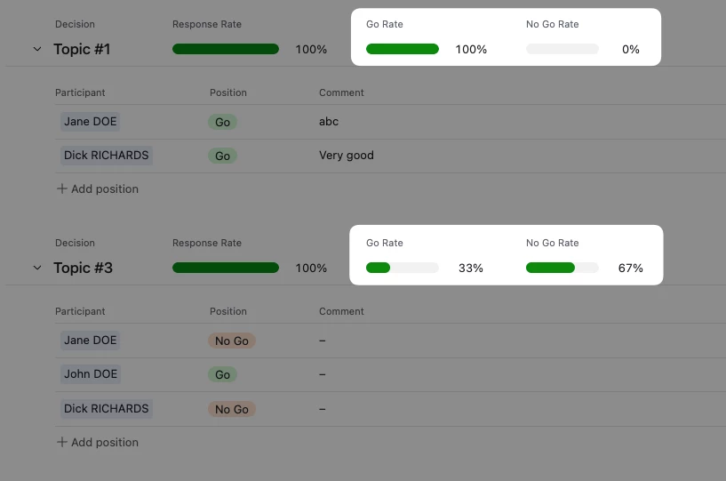
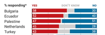
But instead, I'd like to get a stacked bar chart that combines the two figures into one single visualization object (like in the example below).
I don't think that's possible as of now on Airtable, at least not on a List-type page. Do you guys confirm?
Thanks for your help.