Hey folks, thanks for a great product.
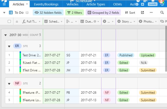
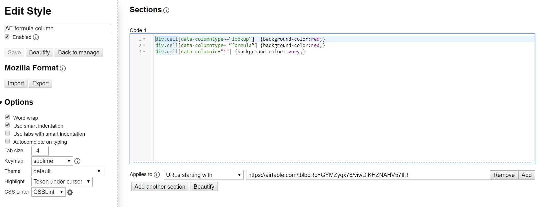
Simple request: Can you please incorporate the ability to create colored and/or highlighted fields? I’d like to call out certain rows within sheets. With the inferior, last generation sheets programs (shameless sucking up) I’d always used colors for this purpose. I realize I could use a column for this, but its a waste of a column in my mind, especially if you are trying to avoid scrolling left to right.
Thanks for consideration.