Hi,
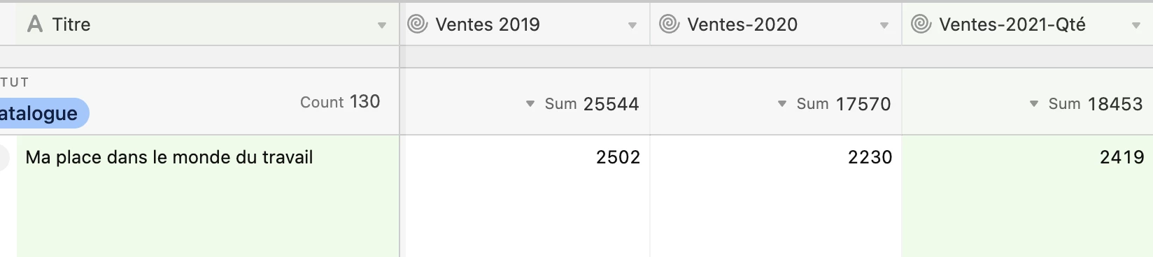
I want to do a bar chart for every record using the three columns Ventes.
For example, bar 1: Ventes 2019, bar 2: Ventes 2020, bar 3: Ventes 2021
Is it possible?
I am joining an example for 1 record, I have 150 records in that view.
Thank you

 +3
+3Hi,
I want to do a bar chart for every record using the three columns Ventes.
For example, bar 1: Ventes 2019, bar 2: Ventes 2020, bar 3: Ventes 2021
Is it possible?
I am joining an example for 1 record, I have 150 records in that view.
Thank you
Best answer by Alessio_Monino
hi @Veronique_Blais1,
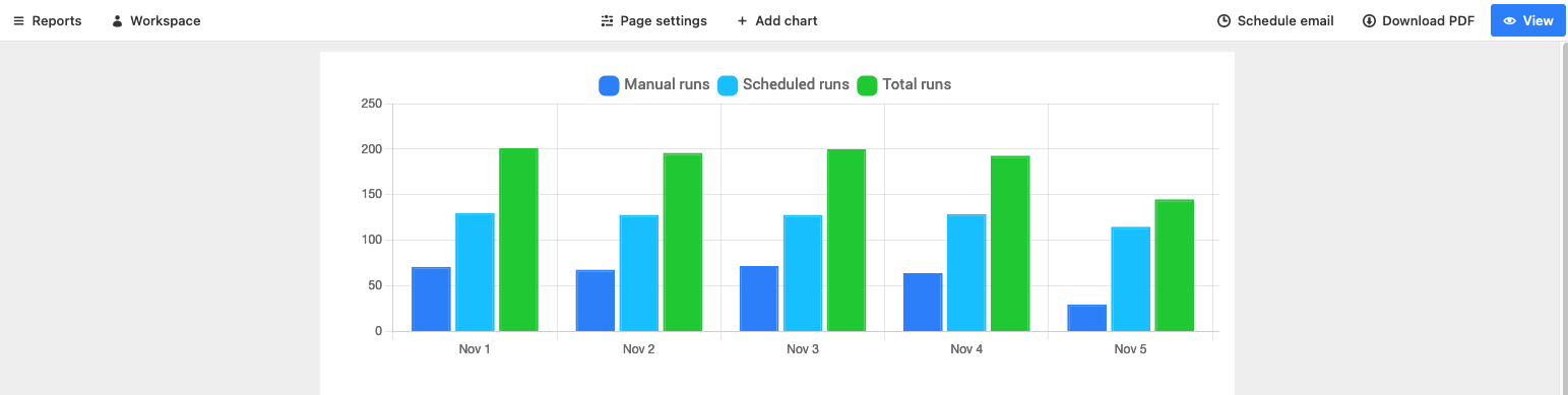
recently I had a client with a similar problem. The approach I used was creating an interface with several bar charts, each containing the information for only one record (you can achieve this by filtering the records in the bar charts). This is a great option as it allows you to view all the graphs’ information at a glance but it does require a bit of manual work, as you need to create a separate graph for each record (you can of course duplicate the graphs and modify only the title and filter option to go faster).
From looking at your test record, this should not be a big problem as it looks like it refers to categories of products (which I guess would not be increased/decreased frequently)
Hope this helps!
Website: alessiomonino.com
Calendly: Calendly - Alessio Monino
Email: alessio.monino@gmail.com
Enter your E-mail address. We'll send you an e-mail with instructions to reset your password.