Hi. I am fairly new to airtable. I am trying to represent my marketing data on a chart, but I cannot get the chart to represent the way I want it too.
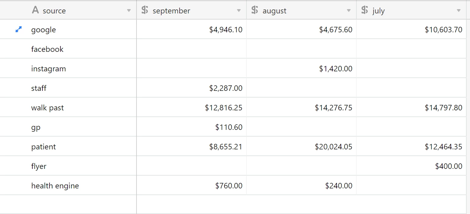
I want it to show the $ amount on y axis, months on x axis and then a stack for types of marketing.
How do I make this work.
Thanks in advance