Hello everyone,
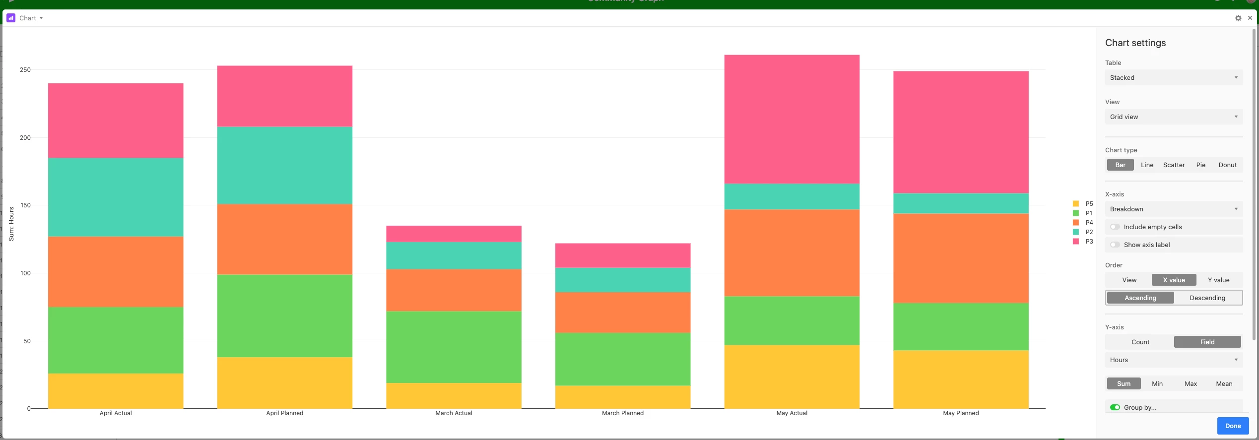
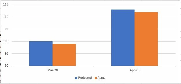
I am trying Airtable to prepare some reports. For this purpose, I need to create a graphs to represent month on month change in planned numbers as compared to actual numbers.
For Exmaple, I have 5 projects, say - P1, P2, P3, P4 and P5. I have planned some hours on each project for May and June. I am also tracking my actual work hours on these. We can use this data for create a graph:
|Project|Month|Planned Hours|Actual Hours|
|P1 |May|15|18|
|P2|May|18|12|
|P3|May|25|30|
|P4|May|20|23|
|P5|May|22|16|
|P1|Jun|20|10|
|P2|Jun|25|27|
|P3|Jun|15|20|
|P4|Jun|23|15|
|P5|Jun|30|40|