Hi,
Hope all reading this are well and staying safe.
I’m creating a Business Dashboard with a range of graphs for different purposes. Some of these are stacked charts.
My need is to achieve consistent order and colour of category groupings in charts, in two ways:
-
Consistent order and colour of category groupings when changing a stacked bar chart to a stacked line chart.
Airtable seems to take control and change the order and colour (see screenshots below). Please note: in creating the stacked line chart I simply copied/duplicated the stacked bar chart, and made one adjustment: changed the chart type from bar to line. This automatically changed the order and colour of the category groupings.
Stacked bar:
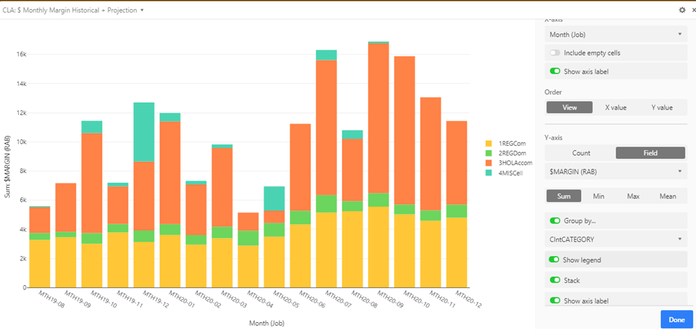
Note the order and the coour of the grouping categories in the above.
And here is the stacked line chart that is a result of simply transforming the copied chart type to stacked line:
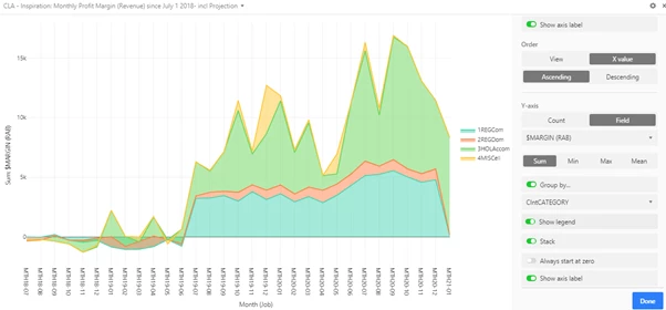
Note the order and colour of those categories has been changed.
Can I control this? -
Consistent order and colour of categories across two different charts which use Views of the same table that are virtually identical, and where the order of the data presented in the charts is identical. Airtable again seems to take control of the colour and arbitrarily applies new order and colour to a new chart regardless of the fact that the order of data in the Table Views are the same.
Is there something simple I have missed? If so, would you please help me to control the order and colour of the groups across a range of charts regardless of the chart type?
Thanking you,
Carol