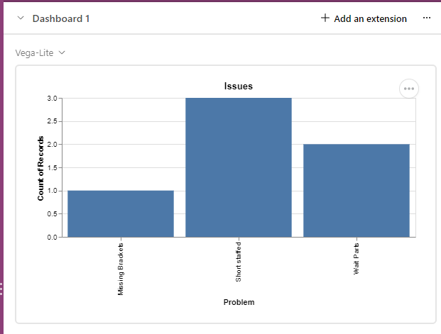
Hello Airtable community,
Wondering if it's possible to make a pareto chart in Airtable. I'd appreciate your help!

 +1
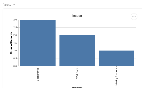
+1Hello Airtable community,
Wondering if it's possible to make a pareto chart in Airtable. I'd appreciate your help!
Enter your E-mail address. We'll send you an e-mail with instructions to reset your password.