
Hello everyone,
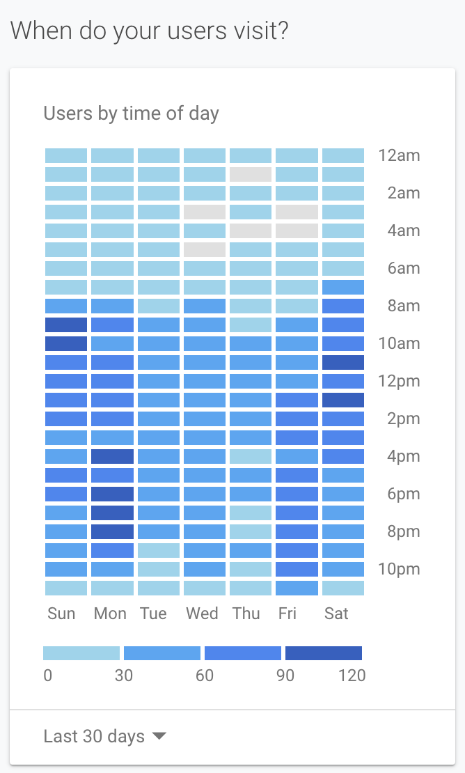
I was wondeing if there was anything like a heatmap app where i can see what time of the day/week is the most popular order times, please see my screenshot for extra clarification (this was taken from google analytics).

Many thanks!
Matt

Hi John, and welcome to the community!

No, not a native feature in Airtable, but there are ways to build these.

The new Vega-Lite block is able to display horizontal bar charts set to 100% scale which causes every bar to be the same hight. By plotting the data this way, you can simulate a heatmap.

You can also build these in a Script Block using a grid display. And lastly, a Custom App is able to render pretty much any kind of display from Airtable data.


Thanks Bill! i will take a look.