Question

Production Scheduling Capacity Visualization


Forum|alt.badge.img+2

I am in the process of building an order entry and work center scheduling system using Airtable, and I have the base functionality working well.  The basis of the data structure is that Orders are created with one or more Line Items to be produced.  Next, one or more Jobs are created and linked to each line item.  Each Job is assigned to a single Work Center and has a start and end date.

I am experimenting with the various views and interface options in Airtable to find a good way to visualize the number of jobs scheduled for each work center by day (or week) for a given time frame, with the goal of identifying if any work centers are overloaded for any given day (or week).  I created a formula column in the Job table that calculates the Year and Week # for each job (ie.  2025-13   for the 13th week of 2025).  This allows me to group/sort/total chronologically by week.

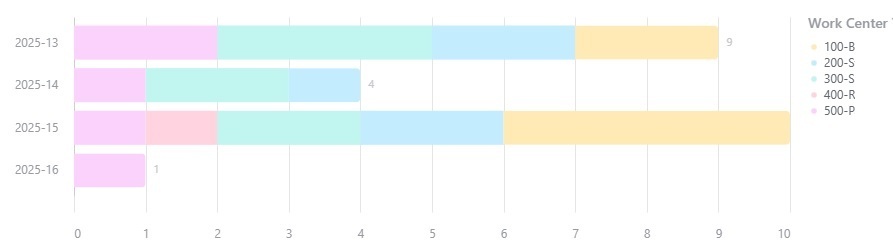
The best I came up with so far is a bar chart that has the week number on the Y axis and the Work Center on the X access, with each bar showing the number of jobs for each week and work center.  See image 1 below.  While it gives me a visual, I’m thinking there is a better way to get a high-level view of the jobs by work center.

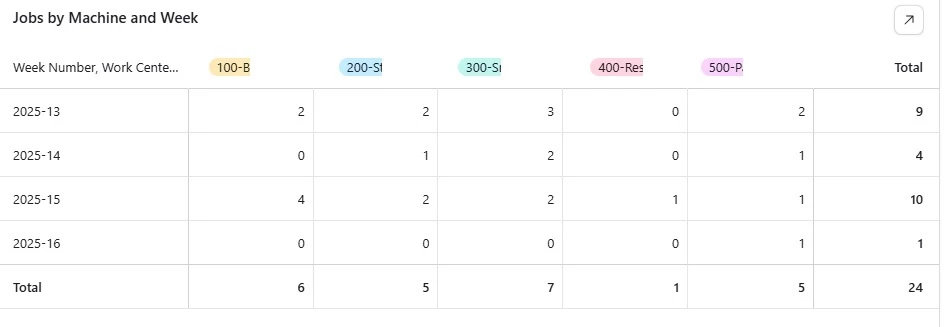
I also created a grid with the week numbers for rows and work centers for columns, with the number of jobs by work center in the grid.  While this is nice...it’s not very visual since it’s a lot of numbers.  See image 2 below.

I’ve tried the calendar, but only having one line per even (job) is very limiting and makes it pretty much useless (unless I’m missing something).

I’ve tried the job timeline, which is nice, but too granular to get a high-level view of the overall schedule.

I’ve also looked into integrating Airtable with 3rd party tools that could provide better scheduling visualizations but not seeing much there either.

I’ve only been using Airtable for about 2 weeks, and I have a lot to learn, so I’m open to any suggestions that may help.

Thank you in advance.


2 replies

TheTimeSavingCo
Forum|alt.badge.img+28

Hmm, what if instead of creating a visualization to alert you to an overload, we created a system to notify you of overloads / prevent you from assigning Jobs that would overload a Work Center instead?  (I was trying to figure out how we could get a graph to quickly alert you to an overload but couldn’t think of anything, hopefully someone else has an idea in that direction!)


I was tinkering and came up with this:

The idea is you end up with a third table where each record represents a Work Center <> Week Year combination, then you use an automation to populate the link, which in turn will pull the status back into your main view


Works, but it’s kind of slow because you’d have to wait for the automation each time before you saw the resulting Status

---

As an alternative, I was thinking maybe you could try creating a system that would assign the Job to an available Work Center for you based off the date?  That would require you to have pre-created each of the Work Center <> Week Year records, but that’s easy enough to do with a formula field / script really


Forum|alt.badge.img+2
  • Author
  • New Participant
  • 1 reply
  • April 10, 2025

Thank you for the prompt response.  I definitely would not have thought of any of those ideas myself and will look into your suggestions to see what I can come up with.  Much appreciated!

I was playing around a bit more with the calendar view as well and may have gotten a little closer to a visual representation by filtering the calendar to a single work center and setting the calendar to “Expanded” instead of “Compact”.  That way, it shows all jobs for a day and not just 2 jobs and a “+3 more” indicator with the days all being the same height.  Having the expanded view selected will visually identify any days that are overloaded by the height of the day on the calendar.


Reply