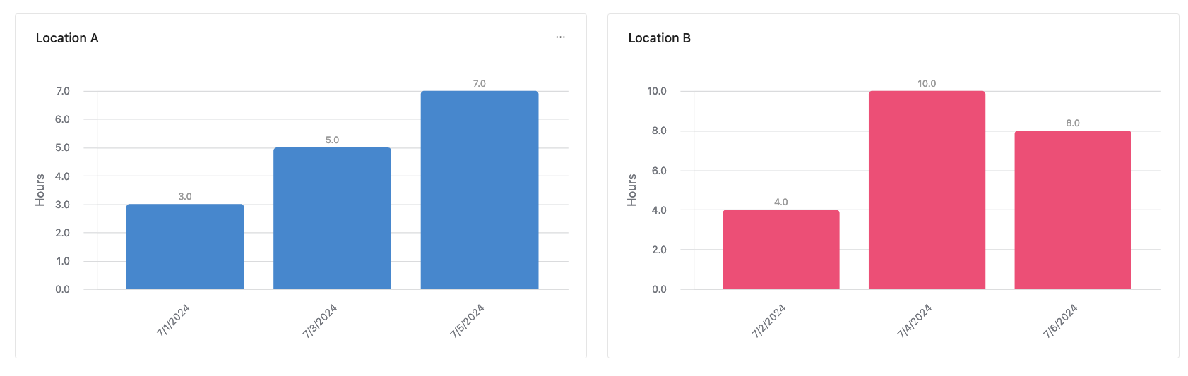
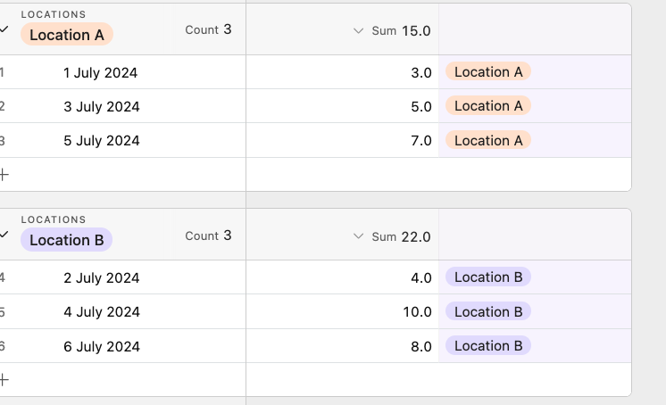
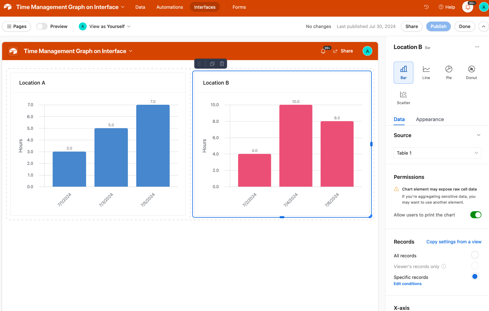
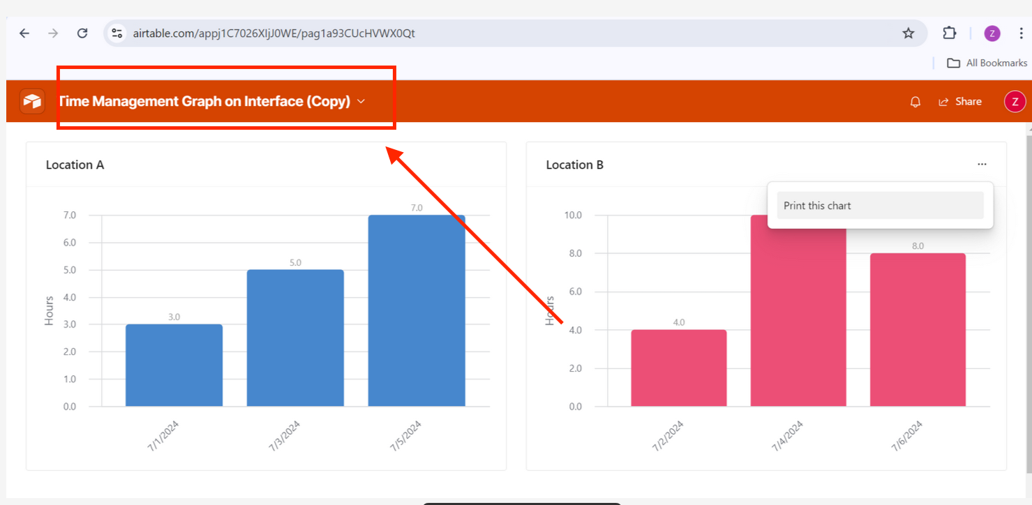
My Interface goals are stalled because I can not figure out how to create my desired bar graph. I created a bar graph example in R to show that I would like to have the number of hours on the Y and the dates on the X. They do not necessarily have to be color coded but they should be separated by the location. In my own attempts to create this bar graph I have only been able to create a count of the number of hours logged. For example, 2 hours has been logged twice for two different dates. This does not provide any substantial information on time and the number of hours spent traveling per location. If anyone is willing to help me figure out how to create this bar graph, please reach out! I would really appreciate it.

Solved
Time Management Graph on Interface
 +4
+4Best answer by TheTimeSavingCo
This topic has been closed for replies.

Enter your E-mail address. We'll send you an e-mail with instructions to reset your password.