Hey all!
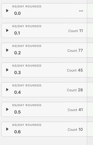
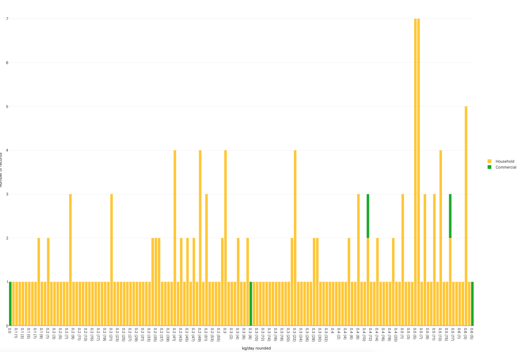
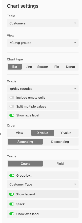
I have a simple bar chart I want to show the total count (Y axis) for a given formula field. My view grouping does this very well, but when represented as X-axis in my chart, the chart app adds a parenthesis value to the label unexpectedly, growing the number of X-axis values significantly. Attached is view of values (only 7 unique values for X) and how they’re being messed with in the chart. Chart settings added as well.
Any advice is greatly appreciated in advance, thanks!