
New: Visual Refresh


Phil_Rose
Forum|alt.badge.img+8

Hello! I'm Phil and I'm a Product Manager at Airtable. I'm excited to let you know about some visual design updates we've made across the Airtable product (which some eagle-eyed members of the community may have already noticed!)


We released a number of visual updates in the last day with the goal of making it easier and more intuitive for you to build  powerful apps that are not only delightful to use but impactful as well. Most of these changes have rolled out in the last day, and here's a summary of what's changed visually:

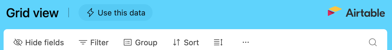
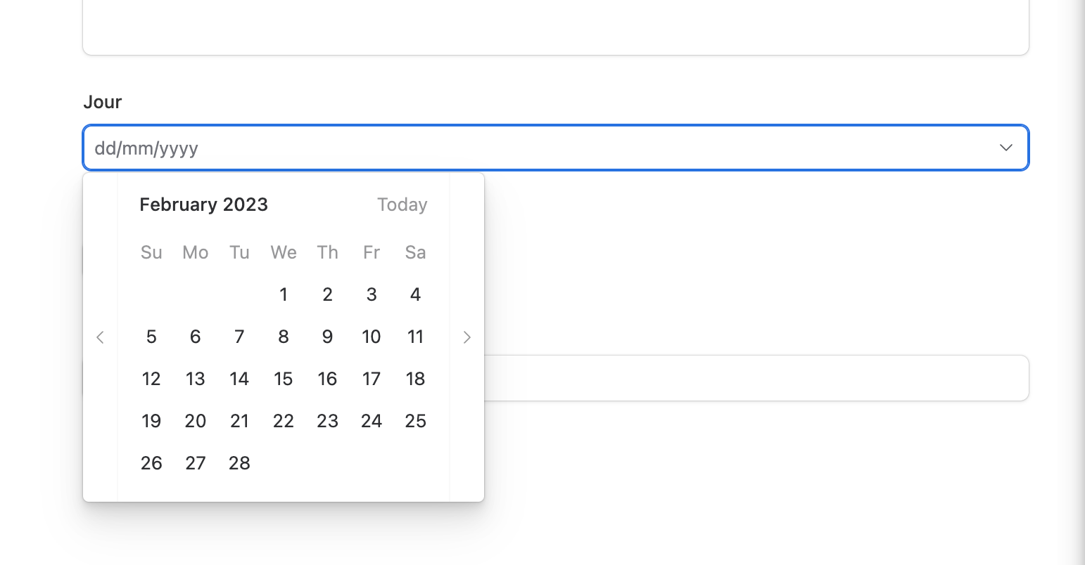
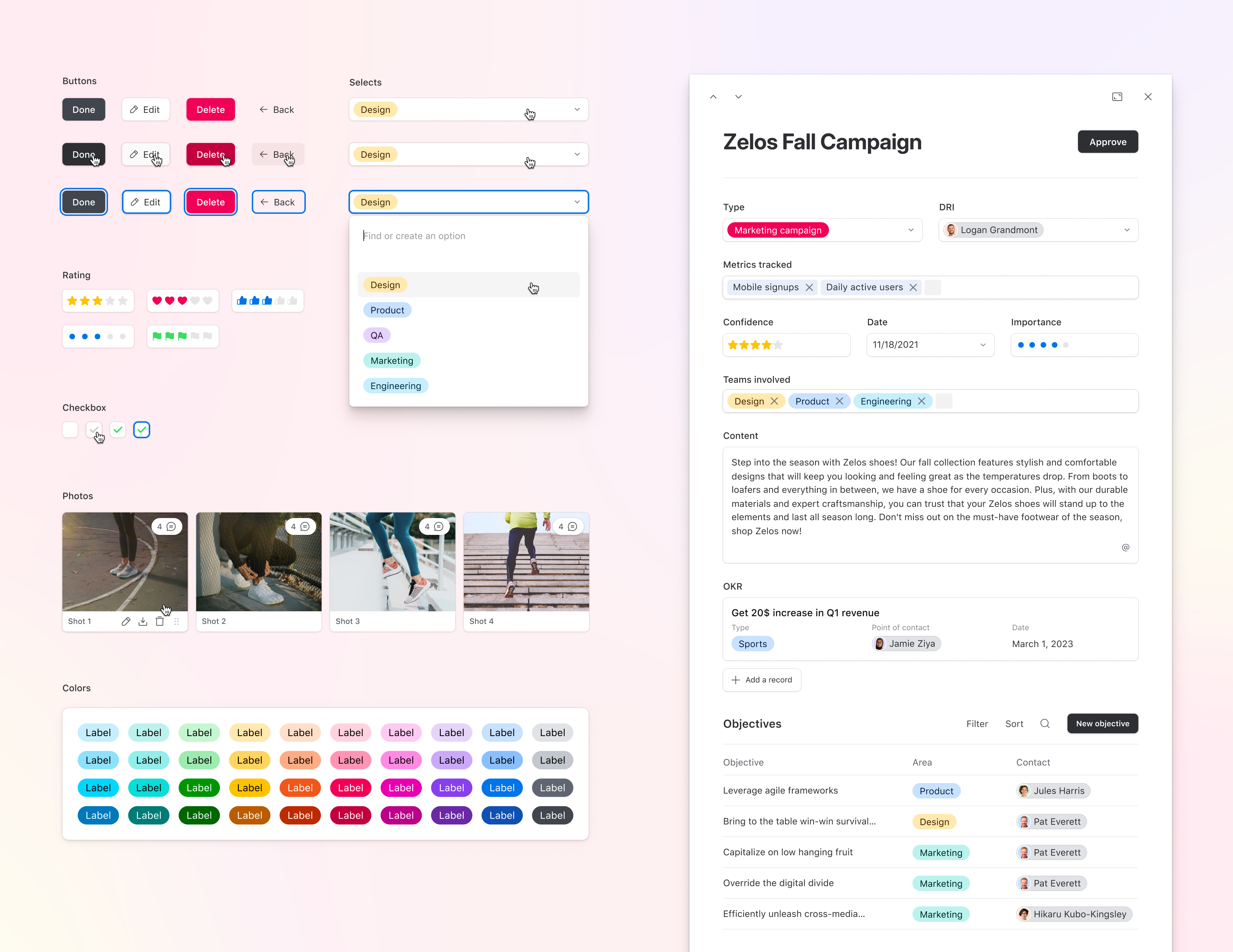
  • Fonts used for headings in Views and Interfaces
  • Icons
  • Buttons and form elements
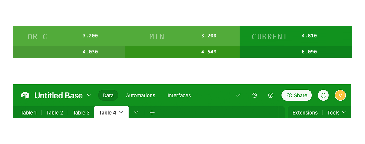
  • Charts in Interfaces
  • Comments in Interfaces (coming soon)
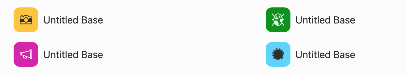
  • Color palette used for Base headers and Single select options

The updates to colors are notable, and I want to highlight why we've made these changes. We adjusted our colors because many of the existing colors are considered "inaccessible" when text is displayed on top of them. This means customers with visual impairments may not be able to read the text. Our updated colors help those customers better use apps built on Airtable, make Airtable a more inclusive product, and position Airtable well to meet important accessibility standards in the future.

We hope these changes improve your overall Airtable experience and make it easier for everyone on your team to use your apps. Thank you for working with us to build better experiences together. If you have any questions or general feedback, let the team and I know here! We're eager to know what you think.

Update (February 23rd) Hi everyone, we’d like to thank you for your thoughtful responses to our visual design updates. Among the feedback, we heard concerns about some of the changes and we’re using your feedback to improve the experience further. We've tested the accessibility of our colors, and will continue to carefully and extensively test colors to strike an optimal balance between contrast and vibrancy. Like you, we care deeply about our product and strive to design a better experience for everyone. We’ll keep you posted on updates and share more information in the coming weeks.

34 replies

Forum|alt.badge.img+3
  • New Participant
  • 3 replies
  • February 16, 2023

As a colorblind individual I now find the updated color palette harder to use. Many of the existing fields in my base now have colors that are indistinguishable to me and I've had to go back through to make edits because of this. Surely there's a better solution to this?


Forum|alt.badge.img+10
  • Participating Frequently
  • 31 replies
  • February 16, 2023

I agree.  The old palette was easier to read.  It is also more difficult to distinguish between the lighest shades of a color now.  


Forum|alt.badge.img+5
  • Participating Frequently
  • 6 replies
  • February 16, 2023

Some of the "Labels" are harder to read for me now, too, especially the white text on most of the third line.

Personally, I would like a colour wheel option to be able to make my own label colours rather than just having the, in my opinion, very limited defaults. But I'm not sure how easy it would be to code such a thing.


Forum|alt.badge.img+8
  • Known Participant
  • 27 replies
  • February 16, 2023

I'd be interested to know if these changes are evidenced as being more accessible, or if that is just a nice statement without backing

I want to believe the best of the product managers of course, but giving a little evidence may help. 


It's the same with the community forum – the UX changes have actually been negative


Forum|alt.badge.img+2
  • New Participant
  • 1 reply
  • February 17, 2023

The new blue does not play well with the colored logo in shared views


ScottWorld
Forum|alt.badge.img+33
  • Brainy
  • 8763 replies
  • February 17, 2023

@Phil_Rose In my personal opinion, this new color scheme isn't a "refresh". It actually feels like "destruction" of the entire product line to me, so I feel like "damage" would be a better term to use than "refresh".

Airtable used to feel fun. Now it feels drab, lifeless, depressing, gross, and it makes me feel like I'm swimming in a swamp when I use Airtable. I'm not a crocodile.

Really, really, really disappointed that you guys actively decided to spend your time & energy & resources on this.

And, in regards to the colorblind user above who now can't distinguish between many of the colors in Airtable, I thought that Airtable wanted to democratize software by making it more accessible to people? Now you're just shutting out all colorblind users?

Please give us the ability to reverse back to the previous color scheme.

Also, here's the most shocking thing of all:

Not sure that you guys realize that Airtable became popular across hundreds of thousands of customers SPECIFICALLY BECAUSE OF ITS FUN, LIGHT, AND PLAYFUL COLOR SCHEME. 

Which part of this color scheme do you think is going to attract customers now?

Please give us a way to undo this change. 


Forum|alt.badge.img+11
  • Known Participant
  • 26 replies
  • February 17, 2023

I support the intention.  I really do.  But I wish there were a way to be socially responsive without hurting something central to Airtable's success.

The loss of the bold, bright, fun colors that made the Airtable experience feel enjoyable and approachable compared to traditional operational software is a big deal.  My main Base, previously a friendly wake-up green, is now a somber evergreen - the same color as Excel.  My accounting software (Quickbooks) now has a brighter green than Airtable (with white type). Combined with the other desaturated and darkened colors, the creative, visually-fun Airtable vibe is gone for me, or at least seriously diminished. There is also more unwelcome visual noise and unpredictability.  Why do some of these colors use white foregrounds and some black.  What happened to the feeling of tonal consistency between the colors that made the old UI pleasing?

Airtable is not as simple to use as it used to be.  Do we really want every new user, already intimidated by the growing complexity of the UI, forced to confront a Navy Blue Grid, or a Rust Kanban that looks like their 401K provider's portal page (oh wait, my Fidelity portal uses a bright green).  it just doesn't seem like a good direction for user growth.

The most accessible version of the UX would simply maximize contrast in all cases and use predominantly Black and White.  But accessibility is about trade-offs, not hard rules.  I hope there are other ways to support it that don't kill such an important aspect of the Product.


Forum|alt.badge.img+12
  • Known Participant
  • 28 replies
  • February 17, 2023

The calendar field in interface form used to be prefilled with today date, right ? 
now.... let's guess


Forum|alt.badge.img+5
  • New Participant
  • 3 replies
  • February 17, 2023

Would have preferred additional options as opposed to changing the existing. People use the colors in select fields to be a quick visual reference so their brains don't have to do extra work to read. We now have to rewire those pathways. Generally not a fan of going more neon on some of these colors - not super easy on the eyes.
One of our bases that used to be yellow is now lilac. wth.


BenGreen
Forum|alt.badge.img+11
  • Participating Frequently
  • 6 replies
  • February 17, 2023

I have only heard negative things from my clients about the new colors. More dull. Their colorblind employees are struggling. We miss the old colors! Command Z the new colors


Forum|alt.badge.img+5

Our team is absolutely mortified by this change. Our "Orange Airtable," as we would lovingly call it colloquially, was one of the core pinnacles of our operations, and a joy to use... and now our only choices are Depressed Carrot or Puke Yellow, with it defaulting to Puke Yellow?! We're lucky we weren't sharing any now-Puke-Yellow embeds or Interfaces with clients, which would have negatively impacted our brand identity in a massive way. Depressed Carrot is the best we can do now, but make no mistake, it won't be nearly as joyful and sunny for our team to wake up to.

We had trusted Airtable for an ability to create experiences that are consistent with our brands, both for internal and external-facing tools - even if the color palette had been limited, we could rely on its predictable ability to bring joy to our users. There's been a lot of trust lost with this change, and I hope that we're at least given the escape hatch of legacy colors to be able to repair the damage.


Forum|alt.badge.img+2
  • New Participant
  • 1 reply
  • February 17, 2023

As someone who is color deficient, I can say that it's always been hard for me to tell the difference between some of the colors - so the change didn't really effect me anymore than usual. **hover labels for colors please**

I will say that I LOVE the better icons used on the views. It was really hard to tell the difference between the Timeline and Gantt views. It was the first thing I noticed when I logged in to my bases. Great job to the team on the updates. 


Forum|alt.badge.img+5

Sorry to pile on with everyone else, but just want to share my overall disappointment with this update. Forcing us to change the colors is definitely an odd choice, as opposed to giving us more to choose from, it was a huge visual shift overall.

My biggest gripes are the new icons, which are much harder to distinguish from each other due to their thin lines; they don't feel crisp or clear at all, and despite having used Airtable for 6+ years now, I found myself having to double check the field type several times. The design feels very weak and deja-vu in other platforms, almost like this came from an attempt to align with other competitors, as opposed to being clearly set apart. 


ScottWorld
Forum|alt.badge.img+33
  • Brainy
  • 8763 replies
  • February 17, 2023

“My biggest gripes are the new icons, which are much harder to distinguish from each other due to their thin lines; they don't feel crisp or clear at all, and despite having used Airtable for 6+ years now, I found myself having to double check the field type several times.”

This is such a great point! 

The new field type icons are impossible to see, but even worse, they are impossible to distinguish from each other.

For example, can anybody even tell the difference between multi-select fields and linked record fields anymore?

@Phil_Rose, I am very upset that you & your team have made Airtable so unusable.


Forum|alt.badge.img+12
  • Known Participant
  • 28 replies
  • February 17, 2023

Maybe airtable could explain why they change the icons

There is a rational reason.

My big concern is that it's a global release... 

So I don't think they see a roolback as an option...

At least for the horrible homepage 2.0 where interfaces and bases look the same... The release is partial and they can rollback. 

Please work on real issues, like the impossibility to prefill creation form in records view interface (especially a " link to" field with the current record).


I am not sure airtable employees are still airtable users... 


Forum|alt.badge.img+13

If this change really did make accessibility for color blind people worse, that's a problem.

But presuming they tested for that, I really wish we could all be a bit less hyperbolic about changes like this. If all Airtable hears from this community is "OMG THIS IS THE WORST THING EVER!" every time they do something slightly off-putting, or even just different, they're just going to tune us out. 

In the end, they're visually simplifying the UI to keep it feeling lightweight and approachable. It's a laudable goal. Maybe the aesthetics aren't everyone's cup of tea -- I don't mind it personally -- but it's not the end of the world and I bet most people will find they're used to it quickly. 


Databaser
Forum|alt.badge.img+19
  • Inspiring
  • 866 replies
  • February 18, 2023

"I am not sure airtable employees are still airtable users... "

They never were. And they obviously don't care with this being example 101 of bad decissions. Democratize software means nothing anymore. Everything is aimed for Enterprise user and the request those users make. 


Forum|alt.badge.img+1

The formatting of the design updates over the past few months have worked well on all our devices and for sure have simplified the user experience and mobile is getting much better. Great job there. Things are feeling much less bulky - the updated menus, tab sizing, view icons - there are really some great changes here.

The base colors are odd and feel like we accidentally installed an older version of the same software. The colors are glaringly "Heavy"; particularly when inside a base.

Combine the new base colors, looming at the top, with all the icon and selection colors inside a base having been muted and desaturated there seems to be a large visual weight issue. Our team has actually started setting the top of the Airtable app off-screen to reduce its visual weight.

In trying to put it in words the color scheme seems opposite of what would be wanted. The data inside the base seems like it should have bold differentiation and the base color would call for more subtle color "guidance". 

The ever-so-subtle decrease in vibrancy in the "Single Select" fields is challenging. 

Looking at each color individually they are very nice choices and the text and BG combo are pleasing and more cohesive. But when placed in a database next to hundreds of other entries their consistency and sharper text for some reason makes it harder to know what to look at.  

It's a very small change. Going from having the text share some of the BG colors to now all being the same unified color makes the text stand out more, but so much so that my eyes seem to not know what to look at, the color or the text. It's hard to explain, but it does not feel very intuitive anymore.


Forum|alt.badge.img+11
  • Known Participant
  • 26 replies
  • February 19, 2023

I looked into the applicable W3C Accessibility Guidelines for background color.  I'm not an expert in this area, but there's something called a Success Criterion that seems to have motivated some of the changes:

The visual presentation of text and images of text has a contrast ratio of at least 4.5:1, except for the following: Large Text  Large-scale text and images of large-scale text have a contrast ratio of at least 3:1;  Incidental Text or images of text that are part of an inactive user interface component...

Here are 3 versions of the color scheme for an example Green Base: Original, Current and a middle ground variation (MID).  Each version shows the contrast ratio of white text over the color:

The new scheme passes the 4.5:1 ratio and then some.  But by my reading, the Upper header, at least, could keep the old green which passes the 3:1 ratio test.  The upper header contains: Large text (Untiled Base), and Incidental Text (Inactive - Automations, Interfaces).  Data text is backed by the darker color. The History and Help elements could be re-designed to add some darker backing as well.  Viola. Criterion achieved.

I'm probably missing some valid complications, but it just seems like dropping the old color scheme may have been overkill.


Forum|alt.badge.img+10
  • Participating Frequently
  • 31 replies
  • February 20, 2023

There are Chrome extensions out there to fix accessibility issues exactly like this, although some configuration and css knowledge are needed to set everything up.  Just tried one out and it worked well for calendar record field and base header colors.

This does require giving a browser extension permissions to read/edit web pages though, so use at your own risk.  


Karlstens
Forum|alt.badge.img+20
  • Inspiring
  • 601 replies
  • February 22, 2023


Forum|alt.badge.img+9
  • Known Participant
  • 15 replies
  • February 23, 2023

Some presets would be nice. 

A 'Suggested' color palette with this color scheme is fine, but let us choose from the old colors or even *shock* let us choose our own!


Karlstens
Forum|alt.badge.img+20
  • Inspiring
  • 601 replies
  • February 23, 2023


Phil_Rose
Forum|alt.badge.img+8
  • Author
  • Inspiring
  • 10 replies
  • February 23, 2023

@krs021, thank you for sharing your feedback about the new colors. We’ll take this into account as we continue to test and refine our swatches. Please let us know about specific color swatches you are having trouble with.


Phil_Rose
Forum|alt.badge.img+8
  • Author
  • Inspiring
  • 10 replies
  • February 23, 2023

UpdateHi everyone, we’d like to thank you for your thoughtful responses to our visual design updates. Among the feedback, we heard concerns about some of the changes and we’re using your feedback to improve the experience further. We've tested the accessibility of our colors, and will continue to carefully and extensively test colors to strike an optimal balance between contrast and vibrancy. Like you, we care deeply about our product and strive to design a better experience for everyone. We’ll keep you posted on updates and share more information in the coming weeks.