Help

Applying different colors of color scheme in Charts

Topic Labels: Interface Designer
1548 1
cancel
Showing results for 
Search instead for 
Did you mean: 
OCC_SamaritansP
5 - Automation Enthusiast

Hello Community,

I’m testing the interface designer to setup a dashboard.

My question is, I want to set different colors for each bars.
if i change the color scheme only one color is applied where i want different colors in the color scheme to be applied.
Even if i choose color scheme, it doesn’t change automatically nor by me trying to click each bar and change.
image

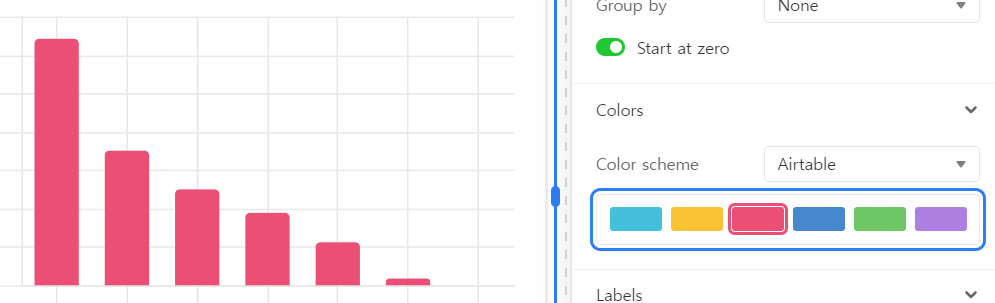
Can anyone give suggestions or advice how to do this?

1 Reply 1
MFAB
6 - Interface Innovator

A more robust "Appearance" tab for choosing the specific color of individual bars or pie wedges in charts  would be helpful.   Currently it appears we are at the mercy of which ever colors Airtable chooses for the "Group By" selection for the Y-Axis appearance settings.

In my case it would be ideal to allow the Interface Chart to match the Color Scheme of the table from which it is pulling the data.

I have a "Projects" table where each project is assigned a color from a drop down list field.  Any table that links the Project has a Lookup field to pull in the color of each Project to that table.  That allows those tables to be color coded by project using "Color Lookup from Project" field to control the color scheme.  For instance, in my Time Sheet table grouped by date I have a great visual color scheme so its easy to see which projects I worked on that day.  I would love to have the Interface Chart match that same color scheme e.g. if the bar chart shown above were hours worked each week on the Y-Axis grouped by linked Project on the X-Axis the bar color for each project would match the color scheme I am using in the table where the chart is deriving its data.

P.S.  Is there a moderator who can move this thread to "Product Ideas" tagged with "Interface Designer"?