
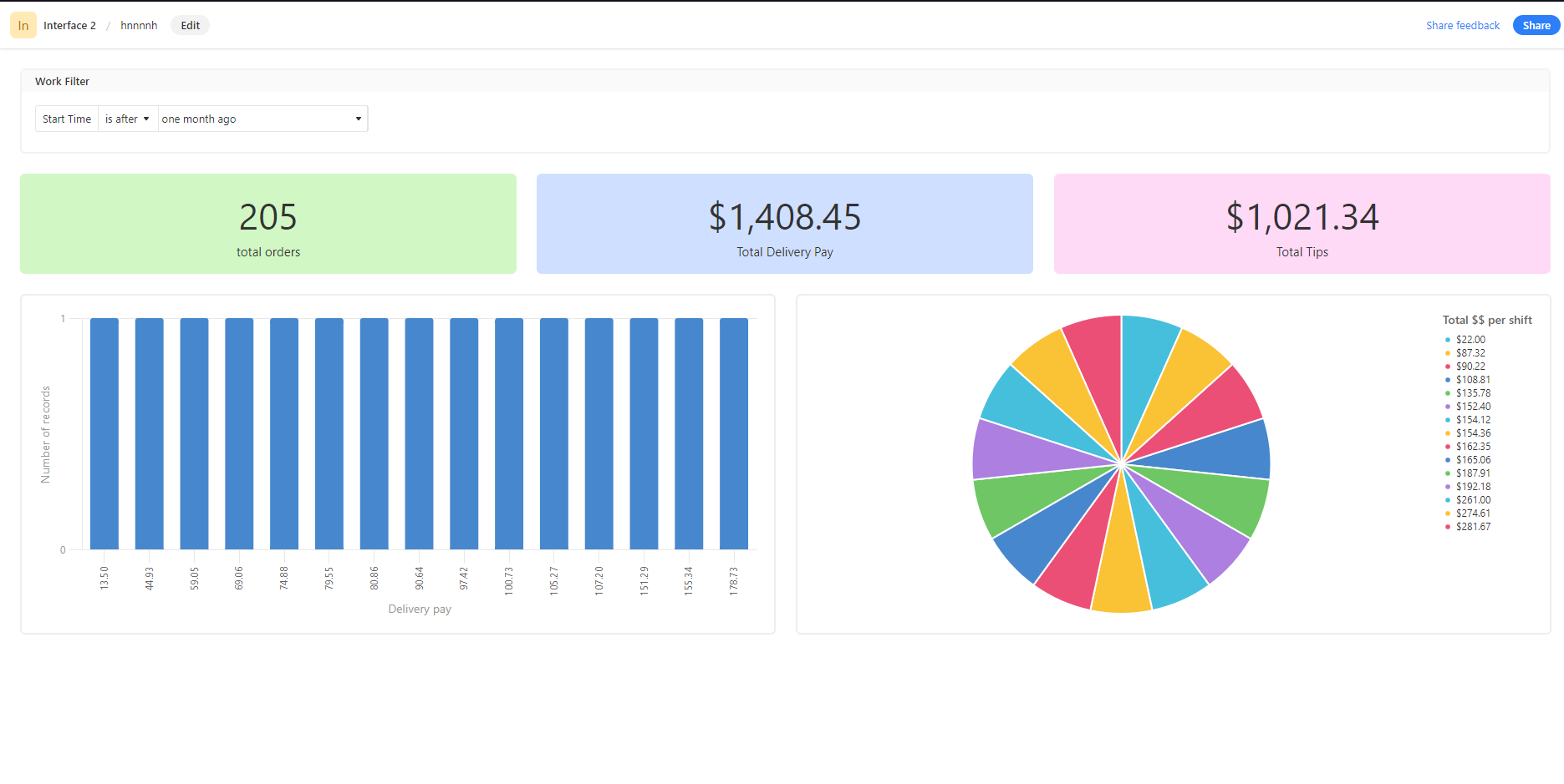
Trying out interfaces for the first time by creating a summary for my delivery earnings base. Starting pretty simple. I want to create a bar graph and pie chart comparing the sums from two different fields: the delivery pay and tips fields. So far I can only figure out how to make charts with just one of the fields, like this:


Is there a way to do this?? I can’t find anything but I feel like there must be a way to do this.

@mars_b, a lot of us are looking for this kind of functionality as you can see from this thread (along with others, I’m sure).


No response from Airtable so far. :-/


@mars_b, a lot of us are looking for this kind of functionality as you can see from this thread (along with others, I’m sure).


No response from Airtable so far. :-/


Ah, thank you! I figured there must be other people talking about this, but I couldn’t Google this in a way that anything came up.


Reply