Help

Time Management Graph on Interface

Solved
Jump to Solution
1549 7
cancel
Showing results for 
Search instead for 
Did you mean: 
AirtableCave
4 - Data Explorer
4 - Data Explorer

My Interface goals are stalled because I can not figure out how to create my desired bar graph. I created a bar graph example in R to show that I would like to have the number of hours on the Y and the dates on the X. They do not necessarily have to be color coded but they should be separated by the location. In my own attempts to create this bar graph I have only been able to create a count of the number of hours logged. For example, 2 hours has been logged twice for two different dates. This does not provide any substantial information on time and the number of hours spent traveling per location. If anyone is willing to help me figure out how to create this bar graph, please reach out! I would really appreciate it.

1 Solution

Accepted Solutions
TheTimeSavingCo
18 - Pluto
18 - Pluto
7 Replies 7
TheTimeSavingCo
18 - Pluto
18 - Pluto

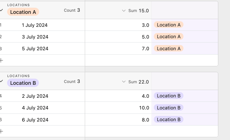
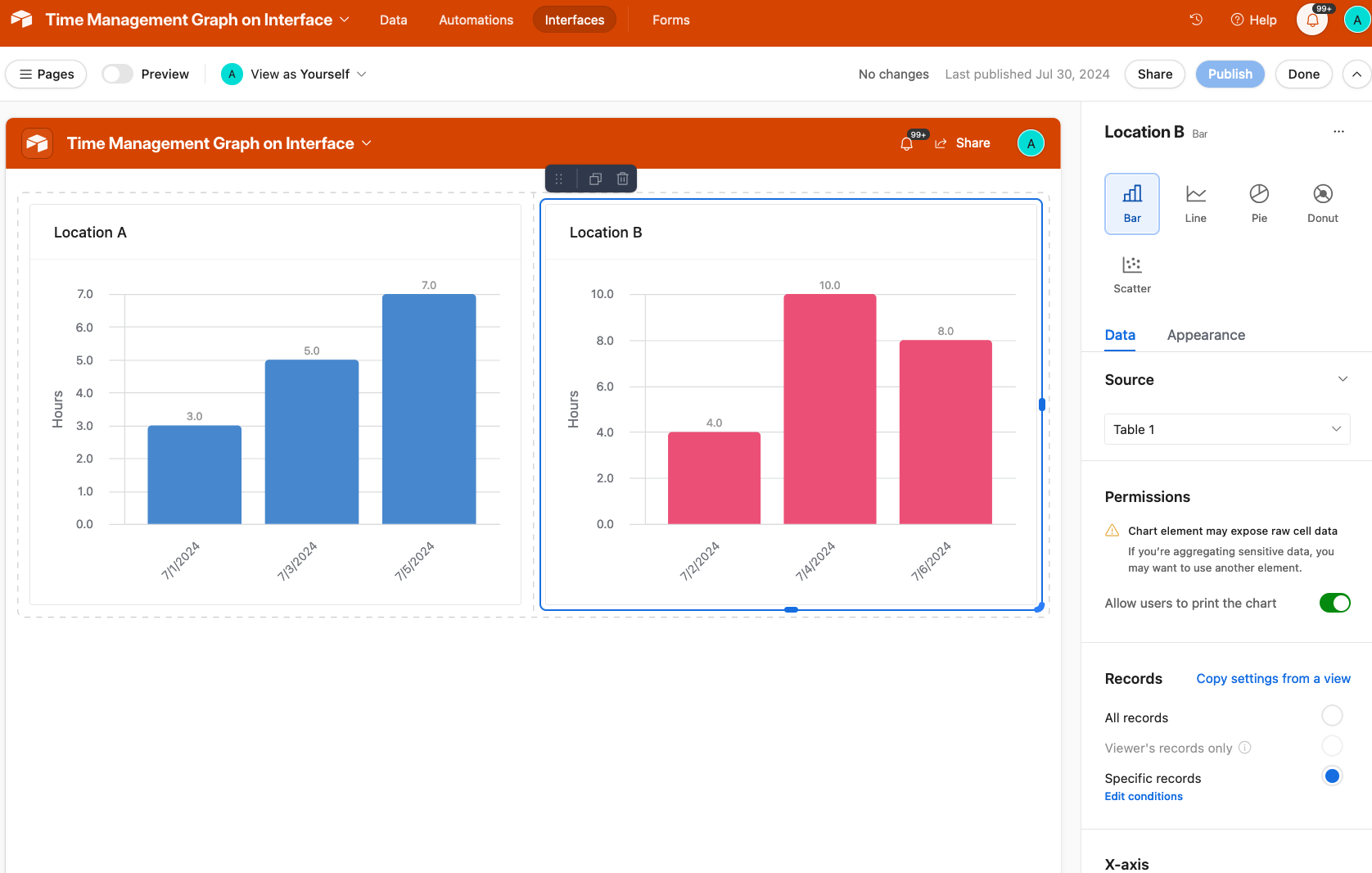
Hmm how does this look?

Screenshot 2024-07-30 at 11.34.51 AM.png

Screenshot 2024-07-30 at 11.35.21 AM.png

Link to base

Yes! How can I replicate this?

Once you duplicate the base to your workspace you'll be able to see all the chart settings!

Hello Adam.

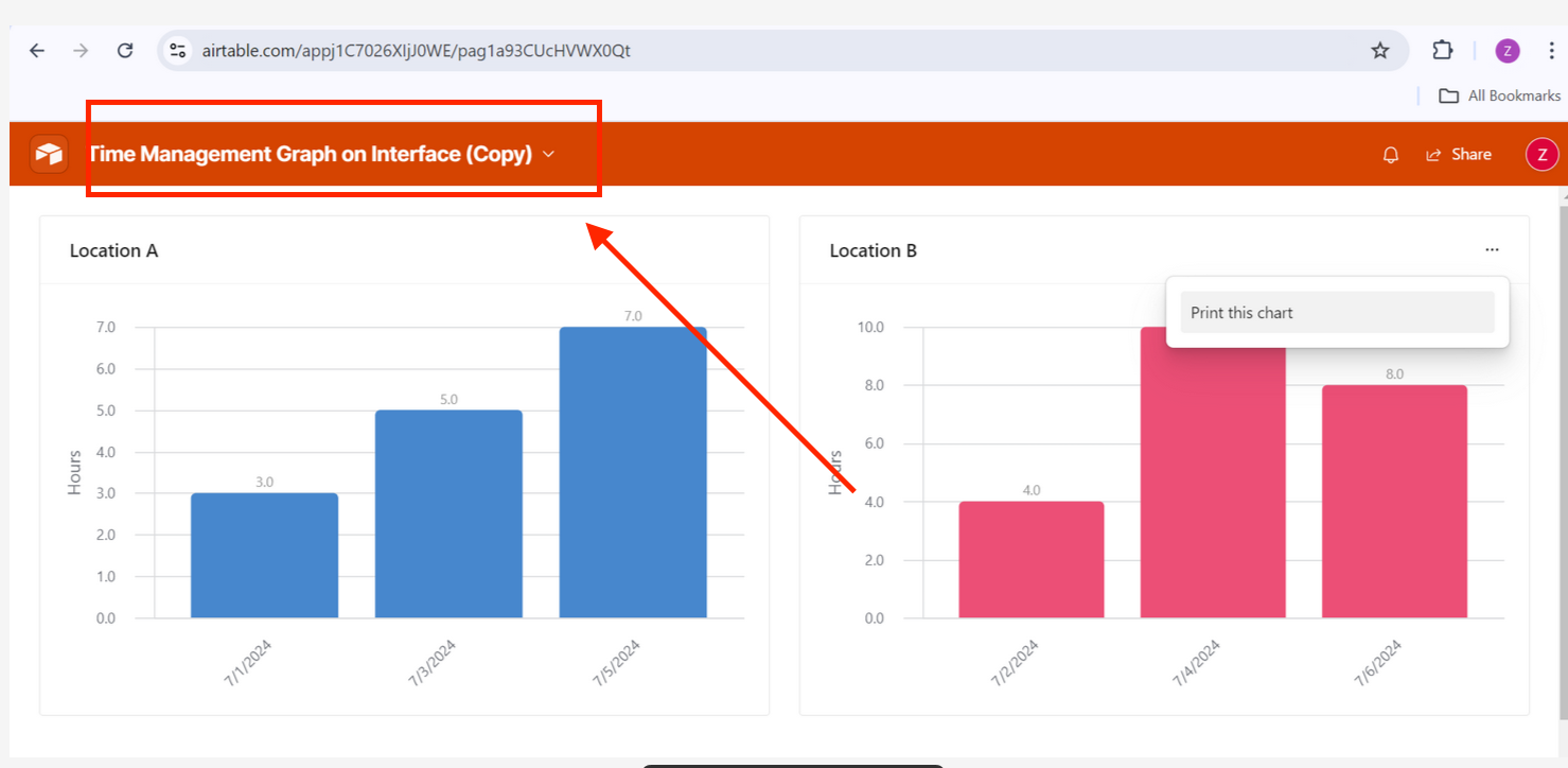
I duplicated the base and still can not find the chart settings. My only option is to go to the three dots on the corner and print the chart. This does not allow me to see the chart settings.

Hm, could you provide a screenshot of your duplicated base with the Interface page open?

Screenshot 2024-08-03 at 12.28.44 PM.png

This is what my view looks like.


Ah, I see!  You're looking at the published Interface, not the editor

Try clicking on the title and then clicking  "Edit" afterwards:

Screenshot 2024-08-09 at 1.26.28 PM.png
I'd also suggest checking out the Interface docs on how to get started: https://support.airtable.com/docs/getting-started-with-airtable-interface-designer