Solved

Help with Vega-lite line chart


Karlstens
Forum|alt.badge.img+20

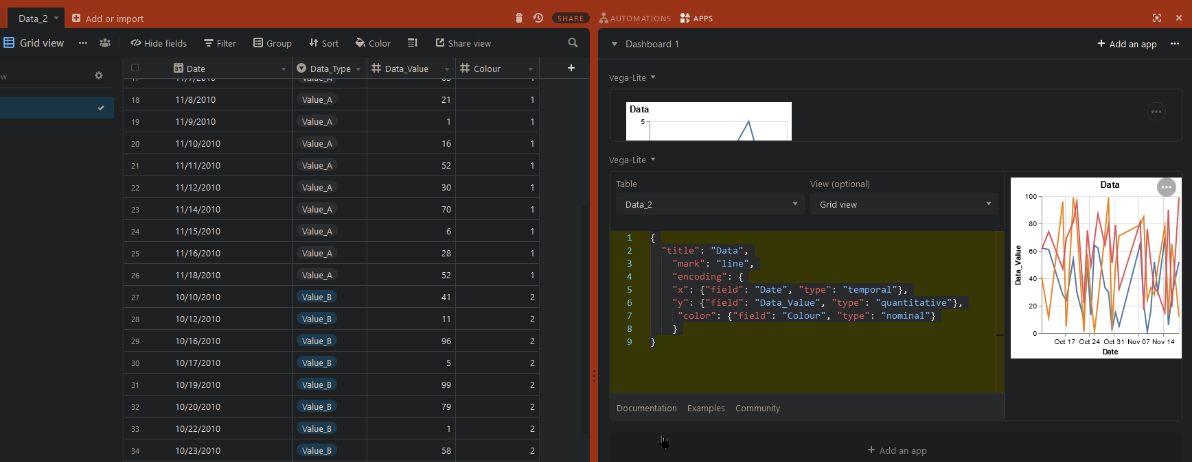
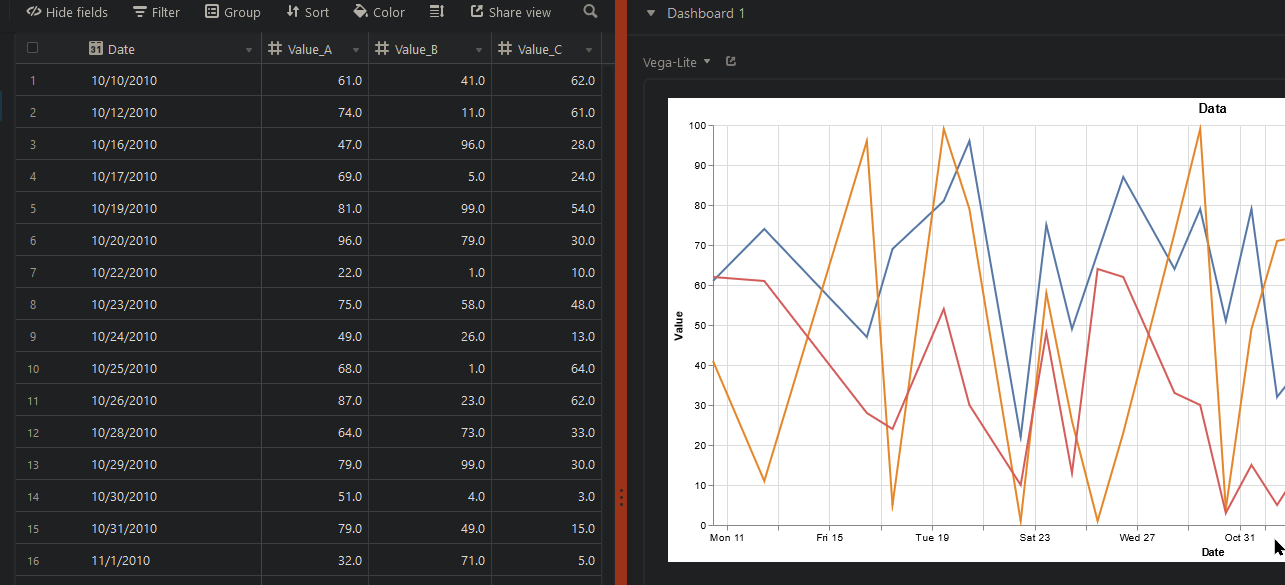
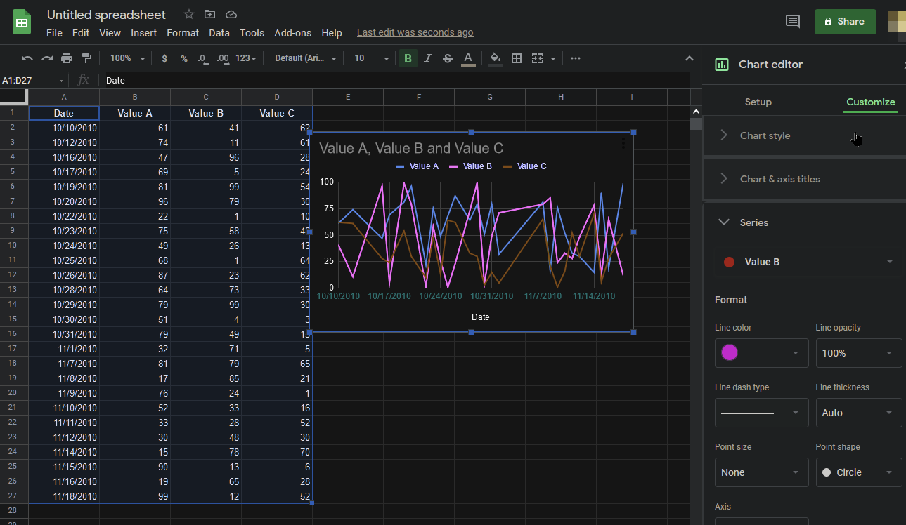
I’m struggling to get my head around how to draw a line chart in Vega-lite that displays multiple fields. I can get one field working, but am hoping someone can post an example of syntax required to do something like this (example from random values in Google Sheets);

Appreciate any help on this. Reading through the Vega-lite documentation is leaving me cross-eyed. :frowning:

Extra points to show how a line can change colour as its value gets highter or lower. :grinning_face_with_big_eyes:

EDIT:
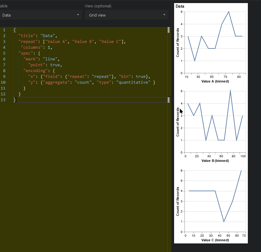
Ok, making progress… point data in 3 different graphs. Now to see if I can layer them.

{
  "title": "Data",
  "repeat": ["Value A", "Value B", "Value C"],
   "columns": 1,
  "spec": {
    "mark": "line",
      "point": true,
    "encoding": {
      "x": {"field": {"repeat": "repeat"}, "bin": true},
      "y": {"aggregate": "count", "type": "quantitative" }
    }
  }
}

Best answer by Karlstens

Karlstens wrote:

OK, I have made some progress. If I place all data in one values column, then tag it with a type column and add a colour switch, things start to work.

{
  "title": "Data",
    "mark": "line",
    "encoding": {
    "x": {"field": "Date", "type": "temporal"},
    "y": {"field": "Data_Value", "type": "quantitative"},
     "color": {"field": "Colour", "type": "nominal"}
    }
}

But as I’m not keen on pre-formatting my data, I’ll appreciate if anyone can help out with the original structure - I’ll continue to learn as time allows and will post here.

EDIT: I’m sure I’m close, in that I just have to format/layer the data with transform… just wish the doco had some simple examples to follow. :frowning:

{
   "repeat": 
    {
    "layer": ["Value_A", "Value_B", "Value_C"]
    },
  "title": "Data",
    "width": 400,
    "height": 400,
    "mark": "line",
    "encoding": {
    "x": {"field": "Date", "type": "temporal"},
    "y": {"field": {"repeat": "layer","type": "quantitative"}
      }
    }
}

Omg I think I finally have this sorted…

{  "title": "Data",  
   "width": 1000,
   "height": 400,
  "repeat": {
    "layer": ["Value_A", "Value_B","Value_C"]},
  "spec": {
    "mark": "line",
    "encoding": {
      "x": {"field": "Date", "type": "temporal"},
      "y": {
        "aggregate": "mean",
        "field": {"repeat": "layer"},
        "type": "quantitative",
        "title": "Value"},
        "color": { "datum": {"repeat": "layer"}, "type": "nominal" }
    }
  }
}

View original
Did this topic help you find an answer to your question?

4 replies

Karlstens
Forum|alt.badge.img+20
  • Author
  • Inspiring
  • 601 replies
  • July 10, 2021

OK, I have made some progress. If I place all data in one values column, then tag it with a type column and add a colour switch, things start to work.

{
  "title": "Data",
    "mark": "line",
    "encoding": {
    "x": {"field": "Date", "type": "temporal"},
    "y": {"field": "Data_Value", "type": "quantitative"},
     "color": {"field": "Colour", "type": "nominal"}
    }
}

But as I’m not keen on pre-formatting my data, I’ll appreciate if anyone can help out with the original structure - I’ll continue to learn as time allows and will post here.

EDIT: I’m sure I’m close, in that I just have to format/layer the data with transform… just wish the doco had some simple examples to follow. :frowning:

{
   "repeat": 
    {
    "layer": ["Value_A", "Value_B", "Value_C"]
    },
  "title": "Data",
    "width": 400,
    "height": 400,
    "mark": "line",
    "encoding": {
    "x": {"field": "Date", "type": "temporal"},
    "y": {"field": {"repeat": "layer","type": "quantitative"}
      }
    }
}

Karlstens
Forum|alt.badge.img+20
  • Author
  • Inspiring
  • 601 replies
  • Answer
  • July 10, 2021
Karlstens wrote:

OK, I have made some progress. If I place all data in one values column, then tag it with a type column and add a colour switch, things start to work.

{
  "title": "Data",
    "mark": "line",
    "encoding": {
    "x": {"field": "Date", "type": "temporal"},
    "y": {"field": "Data_Value", "type": "quantitative"},
     "color": {"field": "Colour", "type": "nominal"}
    }
}

But as I’m not keen on pre-formatting my data, I’ll appreciate if anyone can help out with the original structure - I’ll continue to learn as time allows and will post here.

EDIT: I’m sure I’m close, in that I just have to format/layer the data with transform… just wish the doco had some simple examples to follow. :frowning:

{
   "repeat": 
    {
    "layer": ["Value_A", "Value_B", "Value_C"]
    },
  "title": "Data",
    "width": 400,
    "height": 400,
    "mark": "line",
    "encoding": {
    "x": {"field": "Date", "type": "temporal"},
    "y": {"field": {"repeat": "layer","type": "quantitative"}
      }
    }
}

Omg I think I finally have this sorted…

{  "title": "Data",  
   "width": 1000,
   "height": 400,
  "repeat": {
    "layer": ["Value_A", "Value_B","Value_C"]},
  "spec": {
    "mark": "line",
    "encoding": {
      "x": {"field": "Date", "type": "temporal"},
      "y": {
        "aggregate": "mean",
        "field": {"repeat": "layer"},
        "type": "quantitative",
        "title": "Value"},
        "color": { "datum": {"repeat": "layer"}, "type": "nominal" }
    }
  }
}


Karlstens
Forum|alt.badge.img+20
  • Author
  • Inspiring
  • 601 replies
  • July 12, 2021

Does anyone know the method of linking up line data if there’s gaps?

Example below - where you can see the Vegalite chart showing multiple line plots from my data, and the Airtable chart plot is still only limited to one (and everyone, please vote with Airtable support to see this improved!) - but note how the Vegalite data is broken and not continuous…


Forum|alt.badge.img+3
Karlstens wrote:

Omg I think I finally have this sorted…

{  "title": "Data",  
   "width": 1000,
   "height": 400,
  "repeat": {
    "layer": ["Value_A", "Value_B","Value_C"]},
  "spec": {
    "mark": "line",
    "encoding": {
      "x": {"field": "Date", "type": "temporal"},
      "y": {
        "aggregate": "mean",
        "field": {"repeat": "layer"},
        "type": "quantitative",
        "title": "Value"},
        "color": { "datum": {"repeat": "layer"}, "type": "nominal" }
    }
  }
}


I couldn't get ChatGPT to do this. You are an absolute beast, sir. A gentleman and a scholar. 🎊


Reply