Agreed. Need Colors. For spreedsheets colors are very important !! I second your request !!
Conditional colors please thank you
We’ve gotten a lot of requests for the ability to color/highlight fields and it’s something we’re considering. Here’s an article on how to approximate color-coding, in the meantime.
Related to the above support article, I would say that there are two general reasons for which our users have requested colors (which aren’t really the same request, and thus require different solutions and different approaches from a product standpoint):
- Manually color individual cells/rows/columns to “tag” something (e.g. every vegetarian in this list of dinner attendees has a green background)
- Conditional formatting to color a certain record given a certain condition (e.g. make it so that every overdue project automatically appears with a red background)
For users who want colors for the first purpose, a colorful single select field may be the best bet, and for users that want colors for the second purpose, a formula field combined with emoji is a good alternative.
How would you all like to use colors in your workflows? Something more manual and freeform, or something like conditional formatting? What specific benefits would it bring you? Would you want to highlight entire fields or records, or just individual cells? If you have any feedback, please let us know!
I use colored fields and text in Excel to denote progress of an order. For example:
Each line in my spreadsheet represents a customer’s order, with the most recent orders added to the bottom. Columns represent stages of design & manufacture. As each part of the design process is completed (ex: the customer approves a design proof), the date it happened is entered into the column. We want to color-code a field based on whether it’s been requested, is in-progress, or has been completed. We can’t use color-coded drop-down options because the content of the field is going to be a unique date.
Also, we submit batches of orders for manufacturing on a weekly basis. The “Dye-Sub Purchase Order Submitted” column (the content is a date) is then colored either light blue or light pink, with each weekly batch alternating colors so they’re very easy to pick out visually. (last week’s batch was pink, this week is blue, next week will be pink, etc.) That’s important, as we deal with entire batches from that point forward, not individual orders.
Basically, we just need the ability to color-code individual cells at will. It seems a very simple feature to incorporate, and strikes me as the type of thing that would have been available in the earliest versions of this software. Honestly, I’m testing other similar pieces of software right now only because I can’t color-code cells in Airtable.
Likewise, we should be able to color text, and have access to really basic formatting options, like boldface. I know this isn’t Excel, but those sorts of things are really, really commonly used by pretty much everyone who uses a spreadsheet for anything beyond calculations. People who use Airtable want it to behave like a spreadsheet.
I would love to have the ability to color different portions of my table (different sections of groups of fields).
For instance, if I have a table within a base, and it has 100 fields, some of those fields may be related to “Spring” programs, some to “Summer” and some to “Fall”. If I could group the fields that belong to different seasons, it would make viewing them on mobile devices much easier. The reason this becomes an issue on mobile, is due to the user not moving thru the table starting at the beginning and moving to the end, in many situations, the user in the field, will use their mobile device, but need to jump around within the table, and the color coding provides a very fast reference for “where” in the table you are currently viewing on that small mobile screen.
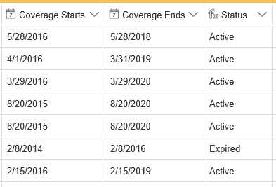
I think this would be a very big help in a number of different circumstances, and with the right varied set of options for utilizing it, everyone could be happy. I built a table for tracking warranties and have a couple columns for start/end dates and then a formula field for whether that warranty is active or expired. Because this isn’t a single select column, I can’t color code it to show Active as green and Expired as red; additionally, I had to add a column for this Status info when conditional formatting would allow me to highlight a record already based on criteria in the Coverage Ends column (if passed, red, if not, green).
I know columns can be added with these formulas, but since right now hiding columns only works in the grid view and not the expanded view, this isn’t a huge help. I have quite a few bases filled with hidden columns used for formulas and lookups that then clutter up the expanded view if someone tries to look there. I think this builds on the request to add true hidden columns since the answer to this request is often to create a column with a formula and then hide it.
Just my two cents. :slightly_smiling_face: Would love to see something like this someday.
I would love to be able to have a visual distinction on fields where the field is calculated or populated by a method other than data entry. Seeing formula fields in a different font style or color would really be helpful for understanding tables where a small amount of user inputs calculate a large amount of fields. Differentiating between input fields and fields that are auto-generated by calculations would be very useful.
We’ve gotten a lot of requests for the ability to color/highlight fields and it’s something we’re considering. Here’s an article on how to approximate color-coding, in the meantime.
Related to the above support article, I would say that there are two general reasons for which our users have requested colors (which aren’t really the same request, and thus require different solutions and different approaches from a product standpoint):
- Manually color individual cells/rows/columns to “tag” something (e.g. every vegetarian in this list of dinner attendees has a green background)
- Conditional formatting to color a certain record given a certain condition (e.g. make it so that every overdue project automatically appears with a red background)
For users who want colors for the first purpose, a colorful single select field may be the best bet, and for users that want colors for the second purpose, a formula field combined with emoji is a good alternative.
How would you all like to use colors in your workflows? Something more manual and freeform, or something like conditional formatting? What specific benefits would it bring you? Would you want to highlight entire fields or records, or just individual cells? If you have any feedback, please let us know!
Hello,
I would love to have colours enabled in Calendar view, like maybe having them coloured by type of post or so. Because I use airtable as editorial calendar mainly.
Thanks
Hello,
I would love to have colours enabled in Calendar view, like maybe having them coloured by type of post or so. Because I use airtable as editorial calendar mainly.
Thanks
Couldn’t agree more; color for the calendar view would be a HUGE add for me. I’m using AirTable for project management, and I am trying to dispatch technicians from it. I would love to be able to color code appointments by which technician was scheduled for it so I could look at the calendar and quickly see whether my “blue” technician was scheduled for anything that day.
I would also really love to have the ability to color whole entries and columns. I love Airtable so far and this is really the only thing missing for me. Thanks so much!!
One thing also in particular is when you have a lookup or linked cell in a table. Since the colors don’t come across. I would like to easily visualize which rows have a particular value in a linked cell (say status of an element i am referencing)
Would be very powerful. Am interested to investigate the IF workflow with lookups?
agree, need colors please
Totally agree, the ability to be able to colorize / highlight certain individual fields I think is essential
Fantastic idea! Even being able to color the text would be helpful.
Heartily concur. I’m using AirTable as an editorial calendar across seven or eight platforms. Despite having a field for platform in the spreadsheet view, the only way to distinguish between platform in the calendar visually is to the image attachment field to upload an icon, which makes the Kanban view unproductive as I can’t show the photo asset for the content.
If we could assign a field in the spreadsheet to dictate the background color of the entry int he calendar field, this would be perfect.
Could you clarify what you mean by not being able to “show the photo asset for the content” in kanban view? (Perhaps you meant calendar view? You can put a cover photo on a kanban card.)
As a workaround to make records more easily visible in the calendar view, you could try appending a conditional emoji to the beginning of the record name in the primary field using some of the techniques laid out in this support article. You could set it up so that (for example) a record which has the value “Twitter” in the platform field will have a :bird: at the beginning of its name.
Hi Katherine,
That was a little unclear. What I meant was if I used the attachment field to upload an icon to identify a social media platform, that became the primary image in the calendar field, as well as the new Gallery and Kanban views, which means I couldn’t show the approved editorial photo/art/graphic for the post.
I’ve constructed a formula to append an emoji to the primary field as per your suggestion. Thank you for the feedback and suggestion.
Hi Just to add my bit: I am using Airtable to assess daily data and attribute a number to the resulting range for the daily data. I want to use say bright red for very negative numbers, through amber for around 0 to very green for very positive numbers. This will give me the ability to create a heat map down a column. Therefore the colour would be dependent upon where the value sits in the range. i.e this would be option 2 in @Katherine_Duh 's description of choices.
1+ to this kind of request
This would be a great feature. +1
+1 for coloring. I’m sharing a grid view and want to call out the new column that I just added with the notes from the meeting for each each of the items.
We’ve gotten a lot of requests for the ability to color/highlight fields and it’s something we’re considering. Here’s an article on how to approximate color-coding, in the meantime.
Related to the above support article, I would say that there are two general reasons for which our users have requested colors (which aren’t really the same request, and thus require different solutions and different approaches from a product standpoint):
- Manually color individual cells/rows/columns to “tag” something (e.g. every vegetarian in this list of dinner attendees has a green background)
- Conditional formatting to color a certain record given a certain condition (e.g. make it so that every overdue project automatically appears with a red background)
For users who want colors for the first purpose, a colorful single select field may be the best bet, and for users that want colors for the second purpose, a formula field combined with emoji is a good alternative.
How would you all like to use colors in your workflows? Something more manual and freeform, or something like conditional formatting? What specific benefits would it bring you? Would you want to highlight entire fields or records, or just individual cells? If you have any feedback, please let us know!
While I agree with other users that I could use the abilities to color code to indicate a tag or conditional parameter, I’d also like the ability to black out a cell to indicate that the cell is intentionally empty (as opposed to the information just being missing) - particularly for multi-select or single-select columns.
Hi Katherine,
That was a little unclear. What I meant was if I used the attachment field to upload an icon to identify a social media platform, that became the primary image in the calendar field, as well as the new Gallery and Kanban views, which means I couldn’t show the approved editorial photo/art/graphic for the post.
I’ve constructed a formula to append an emoji to the primary field as per your suggestion. Thank you for the feedback and suggestion.
Hi Steven,
Would you mind sharing how you constructed the formula to do this? I’m trying to do the same but struggling!
Thanks,
Cassie
Cassie, the article listed above shows how to do it, but I’ll try and walk you through it:
-
Create a column with a multi-select for each of the options available - in this case, I named it platform for different social media accounts
-
I created a second column named Platform Icon and set it to a formula:
IF({Platform} = “Facebook”, " :grinning_face_with_big_eyes: ",IF({Platform} = “Twitter”, " :bird: ",IF({Platform} = “Pinterest”, " :round_pushpin: ",IF({Platform} = “Instagram”, " :camera_flash: ",IF({Platform} = “Facebook News”, " :newspaper: ",IF({Platform} = “Twitter News”, " :penguin: ",IF({Platform} = “CEO POst”, " :thinking: ",IF({Platform} = “Blog Post”, " :pencil2: ️ ",IF({Platform} = “LinkedIn”, " :link: ",IF({Platform} = “External”, " :evergreen_tree: ", “”))))))))))
Replace Emoji
Selecing the platform changes the emoji for the record
- In the Campaign Name/Record column, I set up another formula:
CONCATENATE({Platform Icon}, {Campaign / Post Name})
This tells Airtable to take the platform icon result and add it to the front of the Campaign /Post name
If you don’t mind the colour implementation occasionally breaking due to code updates in the AirTable HTML, you can use something like Stylish/Stylus to apply a custom CSS to your tables.
For example, this is what I use to colour linked and calculated fields (to show that they can’t be manually edited):
div.cell[data-columntype~=“lookup”],
div.cell[data-columntype~=“count”],
div.cell[data-columntype~=“rollup”] {
background-color: aliceblue;
}
div.cell[data-columntype~=“formula”] {
background-color: ivory;
}
You can also use div.cell[data-columnid="(column id)"] to target a specific field.
If you want to highlight particular records, you’ll need to use something that’ll run custom JS, like Greasemonkey/Tampermonkey. Since it’s a bit more involved and has the potential to cause problems with site function, I won’t go into depth on the topic.
To give you an idea of what that looks like, here are two screenshots from my own base:
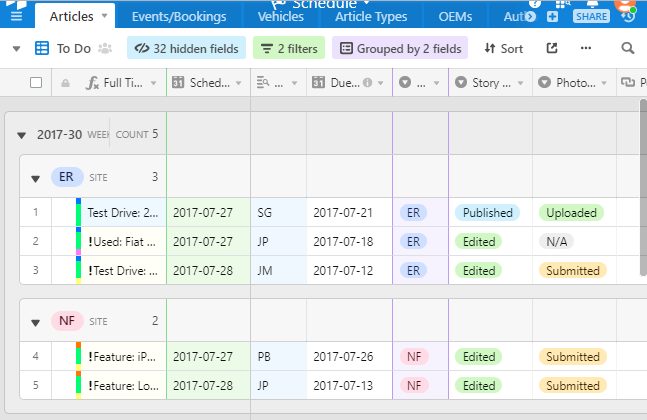
This is a grid view of our publication calendar. The first field {Full Title} is a formula field so it’s coloured “ivory” by default, but record #1 is blue because I’ve parsed the content using Tampermonkey and set a custom attribute on the cell, which then gets picked up by the CSS. The third column is coloured “aliceblue” because it’s a lookup field. The coloured bar at the start of each row is based on the last three fields in the screenshot: {Site}, {Story}, {Photos}. The green and purple columns are part of AirTable’s filter and grouping functions, not part of the custom CSS.
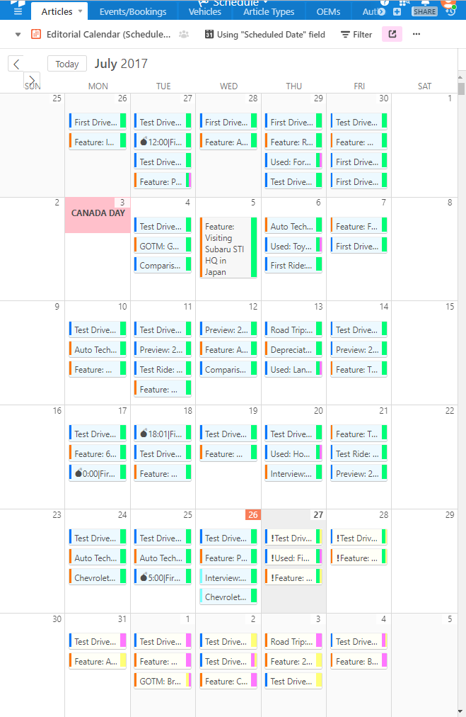
This is a calendar view of the same data as the grid. Items that are “completed” are coloured blue. The coloured bars are again based on {Site}, {Story}, {Photos}.* Holidays are displayed without borders and have a pink background and negative margins (to overflow the regular cell position). There are a few other tweaks as well, such as hiding the sidebar, or displaying the full entry content on hover (see July 5).
Note that this is very much a hack and any changes to the AirTable backend will probably break the code. (The calendar view code, for example, was significantly altered sometime in June, IIRC. It used to be coded as a table with each calendar entry nesting logically within each day, and each day nesting within a week (so you could easily do things like shrink or hide the weekends). Now the entries “float” over top of the calendar grid, so when you resize a particular “day” column, it has no effect on the entries that supposedly fall within it. One interesting side effect is that you can easily hack entries to span multiple days, just by changing their width, which is set in fixed percentages. I haven’t done so here, since I’m too lazy to figure out how to handle overlaps and spanning across weeks.)
*Note that you can’t actually access those fields from the calendar view unless they’re displayed. One workaround is to pass the information onto the {Full Title} primary field by tacking on a “code” to the end to indicate the state of those three fields (I used Unicode superscript numbers because we never use them in story titles). Then use Greasemonkey to parse the “code” and inject the appropriate divs and attributes, and then delete the “code” from the div content.
