Hello! I’m Ayesha, a Product Manager here at Airtable. We’re so excited to share a new feature with you that allows you to add a Kanban element to your Interfaces:

What is this?
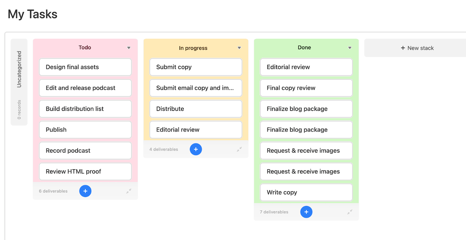
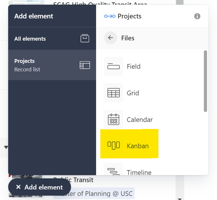
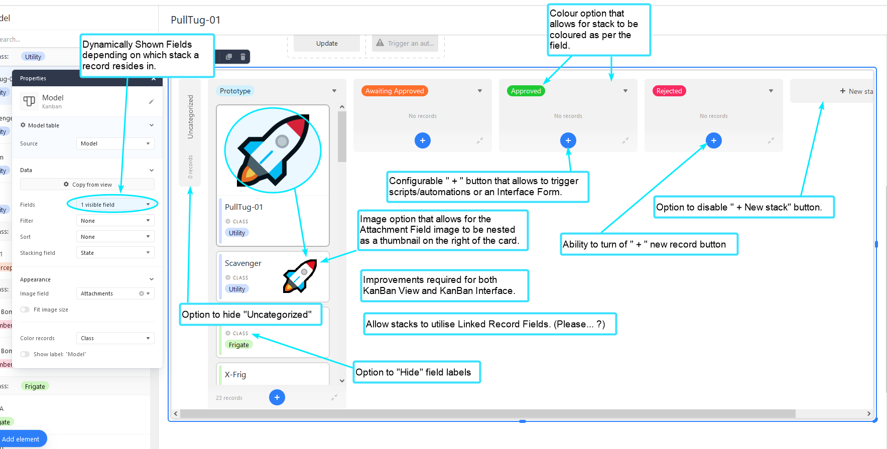
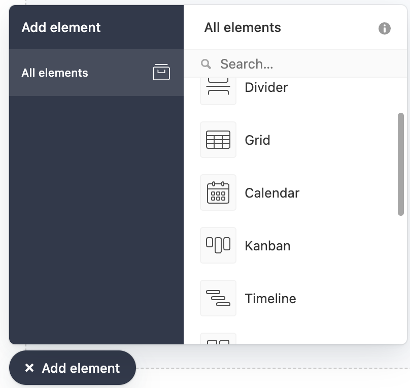
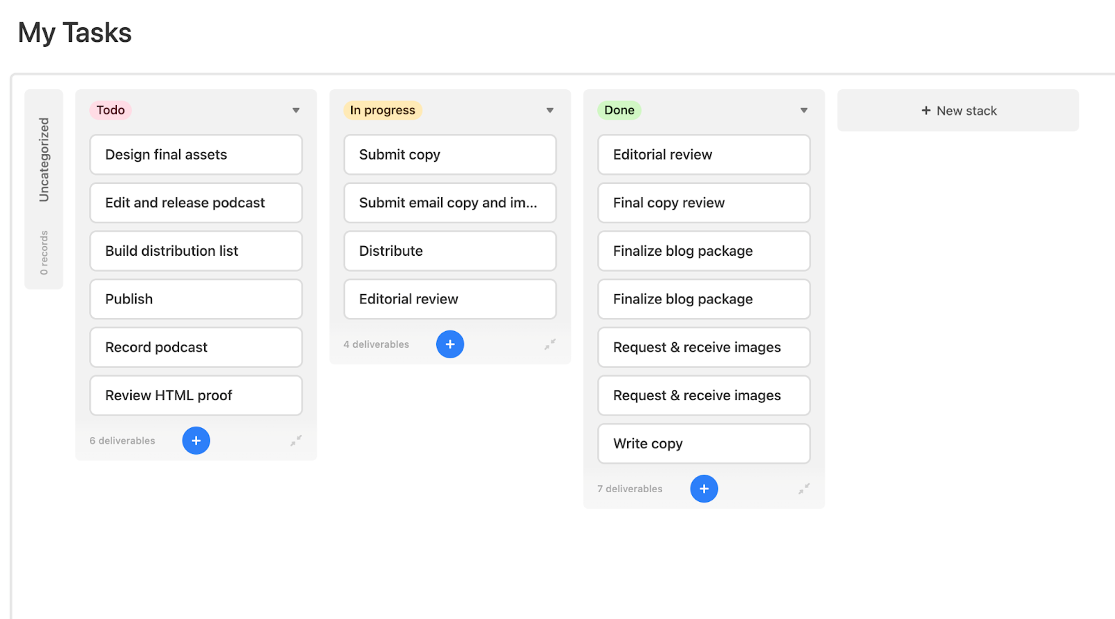
You can now add a Kanban element to your Interface pages from the All elements list. This is very similar to the Kanban view that you see inside a base today.

What can you configure for the Kanban element?
- Data Source: you can select which table you want to use for this element
- View-only / Editable: after you publish your Interface, you can keep this view read-only or editable
- Filter / Sort: you can filter the records you display here and choose any sort options,
- Stack: you can configure which field you want to stack by
- Appearance: you can customize the fields that appear on each card, show colors, and toggle the view’s name on/off
—
We’re looking forward to hearing what you think, please let us know if you have any questions. We’re also thinking about future improvements to the Kanban element overall, like better text wrapping, and will cycle back with updates as we have them.
This update is available now. If you aren’t seeing these changes reflected, please try clearing your cache.
I’ve seen quite a few requests for using non-single select fields as the grouping field in Kanban views. For instance, Formulas or Record Link fields. Obviously drag-n-drop wouldn’t work on Formula grouping, but we can group by formulas in other views, it would be just as useful in Kanban as well. With Record Links I know there is the possibility of having thousands of buckets since tables can have thousands of records, but that’s a headache people will simply deal with themselves: simply group by a field/table with only a manageable number of potential buckets.
Thanks @Ayesha_Bose and team.
My initial feedback is to think of users who need better colour aids to navigate an interface. Plus, better colouring makes it far, FAR easier for us consultant to train our Airtable users.
Here’s a 2 second mock-up of what I’m thinking;

Our biggest issue with Airtable is the problems caused by the quite useless kanban design. For years, we pleaded with you to basically just do some CSS fixes
As much as I love new Interface features, please address some core Airtable issues first.
How come the background for the Kanban view in the Base has changed? It’s how harder on the eyes to separate them from the background
The Canban element would really help me IF… (and perhaps I am missing something)
- I want to show data from another table (linked records).
- But I want to only see (filter) records that are linked to the record I am currently working on in the interface.
(How) can I do that?
The Canban element would really help me IF… (and perhaps I am missing something)
- I want to show data from another table (linked records).
- But I want to only see (filter) records that are linked to the record I am currently working on in the interface.
(How) can I do that?
Select the Link Field you want to pull records from, and choose the Kanban option.

The Canban element would really help me IF… (and perhaps I am missing something)
- I want to show data from another table (linked records).
- But I want to only see (filter) records that are linked to the record I am currently working on in the interface.
(How) can I do that?
100% on the second bullet point. Dynamic filtering is key.
Select the Link Field you want to pull records from, and choose the Kanban option.

Thank you very much. That’s it
This is exciting but completely unusable for my use case until we can create new records from a linked record field. Any idea on when this will be available?
I have 3 important feature for me that will change my life on how I use Kanban, they all concern the ease of finding the right information (Both in Interface and Base) :
Only show stack with Records : On a Kanban view were I want to see all tasks assigned by collaborator, I have many collaborators and the list is way too big. I would like to be able to ONLY see the collaborator column that has task in it
Custom selection of the stack to be shown : On a Kanban view, I would like to be able to chose specifically wich stack to show/hide within this view. So on a “Development Feature” record I would have only 1 field for the stages but then I would use 3 kanban views to show only their relative stack, such as “Idea Design”, “Development”, “Quality Assurance”. Example, for a “feature stage” :
- Idea Design Kanban = New Idea, Benefit analysis, Technical faisability, Design, Ready for development
- Development = Ready for development, To-Do, In development, Testing/Review, Merged to development, Ready for QA
- Quality Assurance = Ready for QA, Developing test, Ready for Master, Merged to Master
Kanban Card Field Look : On a Kanban Card, often the vertical stacked information is anoying when having a lot of small data. For each field displayed on a card it would really help to have the folowing choices per field :
- Show/Hide Label : Either Show/hide the title
- Title position Left/Top : Either show the field title above the value or left to the value
- Field Position : Segment horizontaly the field view to display multiple informations. It will follow the field order where the field #2 will go to the right of field #1 if it has space (or left, depending on it’s allignement)
- Size : Big (full width), medium (50%), small (33%)
- Allignement (Left, Center, Right) : From where the text and field box is alligned.
- New line (Yes/No) : Even if this field could fit horizontaly with the above field(s), will be added bellow instead
Our biggest issue with Airtable is the problems caused by the quite useless kanban design. For years, we pleaded with you to basically just do some CSS fixes
As much as I love new Interface features, please address some core Airtable issues first.
Absolutely. I mean, I know there’s a ton of requests Airtable is trying to get through, but these issues make Kanbans basically useless.
Is there a world in which we can request making the Kanban interface element an active record picker as well? The record picker dropdown element and the record review interface template are OK, but with lots of records can be overwhelming. The Kanban layout helps us clean up the visuals of our records, and I’d love to be able to create a blank interface, add a filtered Kanban view at the top, then if a record is clicked in that kanban, the rest of the interface elements display the details from the selected record.
Thanks!
Good morning @Ayesha_Bose and team,
I’ve finally sat down to have a look at the recent addition of an Interface Kanban element. Please find my feed back below;

In Summary, I can’t use this until;
- Fields are dynamically shown depending on what stack the card/record resides in.
- Field labels can be hidden, so only their content is shown (with bold, underline and italic option).
- Better nesting options for attachment images that utilise the already available card whitespace.
- “Uncategorized” can be completely hidden.
- More options for the Record creation buttons, such as triggering automations, scripts, a form, new records and also completely hide the option altogether.
- Option to Hide “New Stack”
- Both the View and the Interface Kanban have the same features. (I can’t stress enough how this is also needed for Interface Forms and View Forms too)
And please, do read and acknowledge the existing ideas requested previously in other threads for KanBan view.
Thanks for the oppurtunity for feedback. I’d really love to use KanBan view - just not with its current limitations.
Hi Karlstens! Thanks for taking the time to write this up and share this diagram, it’s really helpful. We’ve also been following along with the suggestions in the other thread and appreciate you flagging them.
We’ll discuss this more as a team and I’ll work on prioritizing this in our roadmap. Will let you know as we. have updates.
For some additional feedback, I wanted to link to my unresolved post here outlining my Airtable Kanban's inability to sort cards in a column. It appears they automatically sort cards by the date-entered but I'm unable to change or customize the order the cards appear in for other priorities.
I'm glad for the addition of the Kanban feature, and it has a lot of promise for my personal use once I can order cards.
As mentioned in the post, I did submit a bug ticket today.
TIA
Being able to edit the form for the "+" and also decoupling being able to edit and adding records would be huge improvements!