
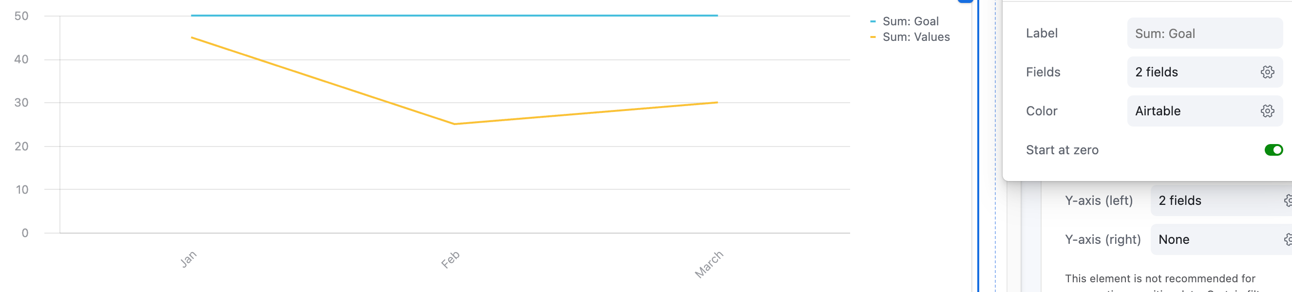
I’m trying to display metrics on claims details on a line or bar chart.  I would like to be able to insert a “goal” line so we can see easily if we are above or below our goal.  


Is there a way to do this, or is there anything in the works that could accommodate this request?

You can simulate a goal line using a separate field that always holds your goal value. On the Y-axis, you can plot data from multiple fields. In this case, you want to display values from both your actual data field and your goal field.


Taha, Airtable Advisor


What’s your data look like / what’re you trying to track?  In the best case scenario, Taha’s suggestion of adding a new field should sort you out

If not, you’re going to need to build specific tables to collate data to display the graph and build automations to power those tables I’m afraid, and then in that table have the goal as one of the fields / records


I’ve put something together here for you to poke at in case a new field isn’t sufficient


Hey ​@Showdown Displays!

Did you get to solve this?

Both workarounds around will work. It will depend on what your setup looks like, and what exactly it is that you are trying to show, but Scott’s suggested architecture might be more robust than what you actually need.

If you have only one “Payments” table for example, if you have a Type field with “Data” and “Goal” as shown by Scott, and as long as you use such table as the source for the graph, you can still shown both lines!

Let me know if you need further help with this.

Mike, Consultant @ Automatic Nation


Reply