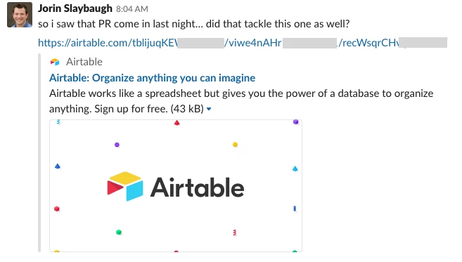
When sharing in external places like iMessage or Slack that support a rich preview, it would be much more helpful if links to specific records or specific bases/views actually said in the preview what the name of the card or base/view was rather than every link always just saying “Airtable works like a spreadsheet but gives you the power of a database to organize anything. Sign up for free.”

That way someone can see what we’re talking about before having to click the link. Alternately more readable url’s would be nice.

Yes yes yes. We’re moving to airtable for issue tracking and sharing links in Slack is a pretty bad experience.


Yes yes yes. We’re moving to airtable for issue tracking and sharing links in Slack is a pretty bad experience.


Please! Especially when sharing forms. Our organisation uses a LOT of different forms, and with Google Forms we get a nice clean preview that helps people tell them apart. With Airtable every single one looks exactly the same when sharing via Slack or Facebook, and people are getting confused.


Yes, please! This could be a so much better experience, especially for sharing records. I’d like to see a preview of an attachment when sharing a record, ideally also have a direct link to the attachment. Or when I share a research insight, I’d like to see the name of the record and ideally some tags.


This is absolutely needed. I understand AirTable wants to make sure their brand is represented but they have some heavy hitters using their services recently, more and more. Not sure they will continue to do so if their posts all look the same (both internally and with others on social media using AirTable). For examples, I know some FEMA affiliates using it to track mask/sanitizer distributions and I saw that Alexandria Ocasio-Cortez is using AirTable in their hiring process for the team - and every time they link about the applications or something on Facebook the AirTable branding is glaring and it makes their posts look generic. I understand if the free version of AirTable defaults to this, but PAID customers should really be able to customize this. @Airtable_IT @Airtable_agency


This one small change will encourage a lot of users to switch from Google Forms to Airtable


The Airtable URL preview in Slack is distracting and useless (just the logo and a byline for Airtable). It would be so much more helpful if it actually previewed the view that is being shared or did not display at all.

+1


This is a major pain point for my organization. Not only is the preview useless, but airtable has done something so that blocking all airtable.com previews in slack doesn’t work! (works fine for other sites in slack)


+1!

This would make Airtable interactions on Slack much more usable.


+1, specifically for the Slack integration.


Another +1 on this - also specifically for Slack. This preview is actually distracting, so I have to remove it from every Slack message it’s on – it serves no purpose when sharing views or form links and actually hinders communication with the generic way it shows.


I would love to see the preview be the actual base page and title.


Strong +1! This is a really easy feature to implement too, should be a very quick fix. (I'd do it myself if Airtable were open source.) This is one of the things that makes me tempted to switch back to Google Forms.


Any movement on this Airtable developers???? It makes me crazy to not have link previews. 


Please Airtable!  Fix this issue.  


+1


Reply