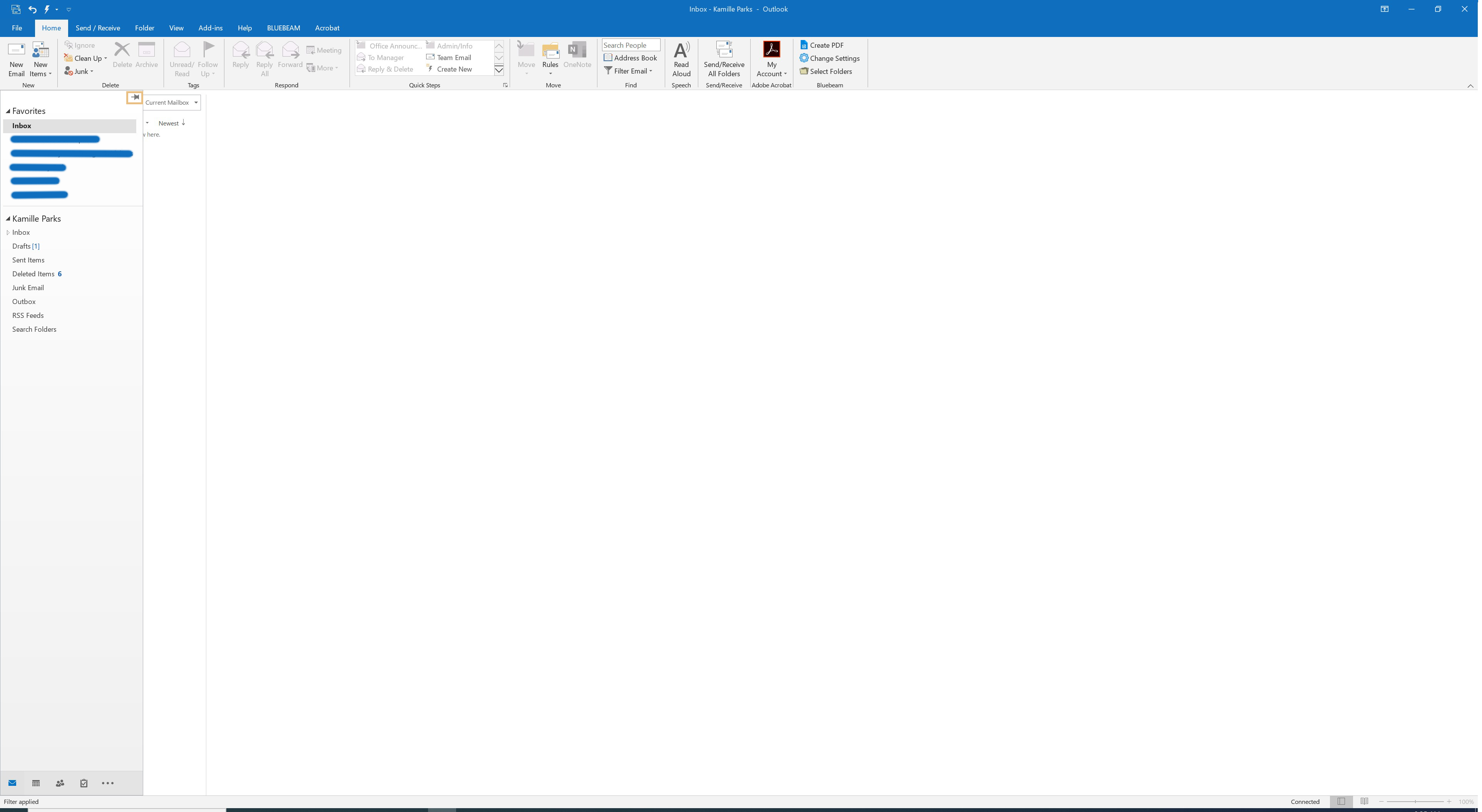
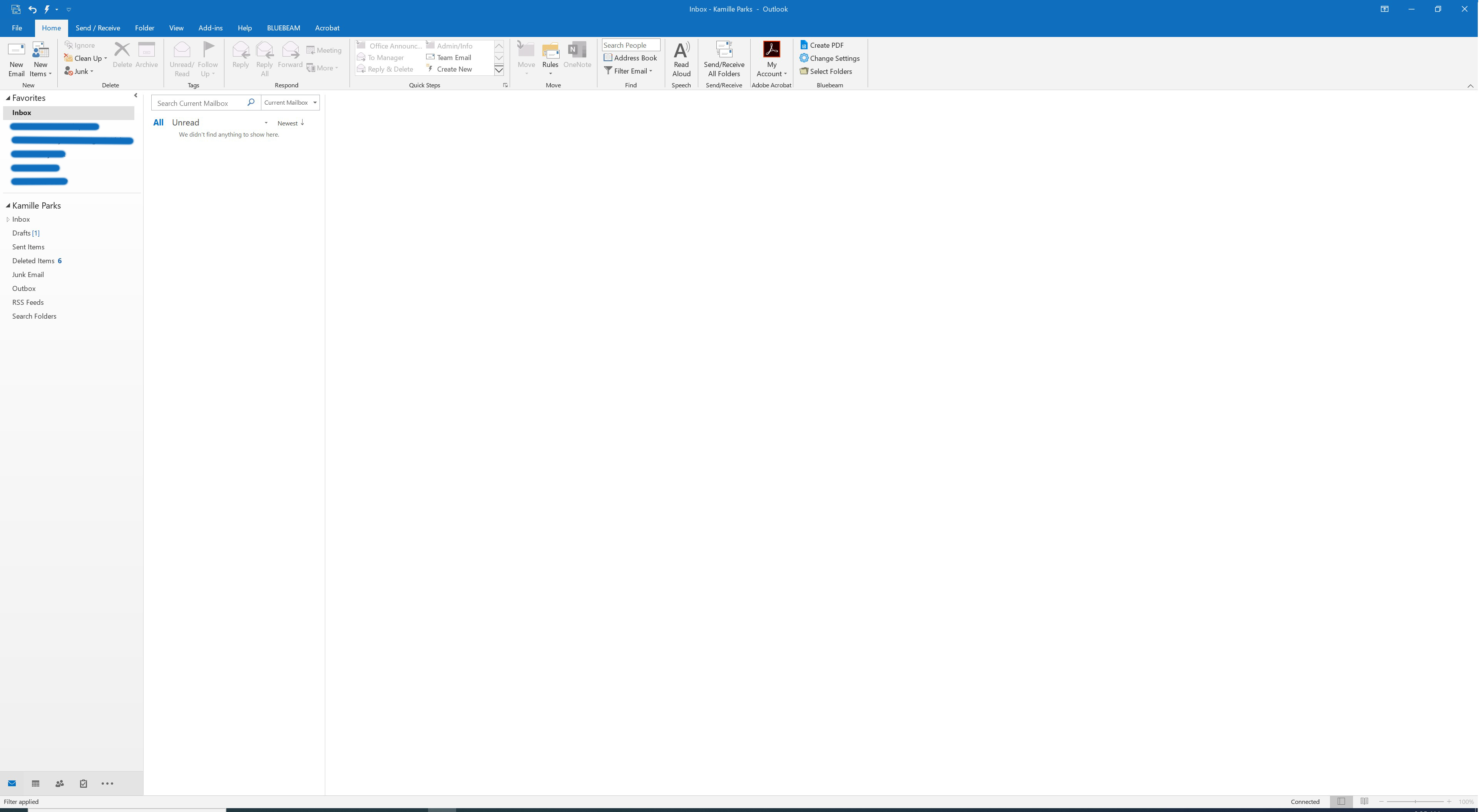
Product Suggestion: Please stop showing new View Sidebar


Show first post

85 replies

  • New Participant
  • 2 replies
  • June 8, 2020

+1! It’s annoying having to close it every time.

i guess keeping it open makes us get used to new option. but this is really really annoying

Please make it closed by default!!!


Forum|alt.badge.img+18
  • Inspiring
  • 90 replies
  • June 8, 2020

I think the new sidebar is awesome! I do switch between views constantly when troubleshooting and this is a big help. I agree it should remember you’ve closed it if you choose to, but I can imagine leaving it open for an hour or more at a time while hoping through views.

I admit, I have multiple screens. They aren’t huge, but definitely larger than a typical laptop.


  • Known Participant
  • 11 replies
  • June 8, 2020

+1 Came here for this. Let me toggle this on/off so that I can toggle it OFF.


  • New Participant
  • 1 reply
  • June 8, 2020

In a productivity app it’s so annoying for it to constantly shift back and forth, and have to close it every time. It feels so much slower.


  • New Participant
  • 1 reply
  • June 8, 2020

This is truly awful, please revert this change… Or, better yet, maintain two versions: A stable branch that companies who depend on Airtable can use every day and some kind of experimental version people can opt into to noodle around with whatever features you’re developing.


I hate this new thing. I have a list of items with about 100 blank lines at the bottom so I don’t have to keep adding a line whenever I need it and having blank lines at the bottom allows me to scroll the last entry higher up the screen (if that makes sense?).

Anyway, now every time I open Airtable, I get that ‘grid view’ thingy and all my blank lines move to the top of my sheet. I have to ‘sort by date’ then cancel out of ‘sort by date’ to get the spreadsheet looking like I left it last time, with all the blank lines back at the bottom again. It’s the only way to shake it out of it’s new default setting, I have to ‘sort’ then cancel the ‘sort’ to move my blank lines back to the bottom.

Every.

Time.

Talk about extra clicks!! I’m not doing this every time, they can stick it, I’ll go back to using excel or google sheets if this isn’t fixed in a hurry. If this is beta, then I want out of the beta, I’m paying too much money for this.


  • Participating Frequently
  • 10 replies
  • June 8, 2020
Britt_Myers wrote:

From Airtable support:

Thank you for your feedback. As a company, we’re always seeking to improve the product experience; the new view sidebar is an experimental product change that some (but not all) of our users have access to right now. Depending on the results of the experiment and customer feedback, we may either roll out this new view sidebar to all customers or revert back to the old view switcher.

If you have any more thoughts about this change, please let us know!

Take me out of this ridiculous experiment.

Their AB testing metrics will show my engagement is the same, but cannot show how every time I type command-shift-K, I now think about how much I dislike Airtable.


Another bad aspect of this from a UX perspective is the inconsistency of the presence of the views panel. Previously it only appeared when it was called on, so it was there for a specific action, then closed.

Now, it’s maybe there, maybe not there.

As I’m working, if it’s there, I stop paying attention to it. It’s eating up my screen real estate and I don’t really need it, and that sucks, but I gotta get work done. But when I do need it, I enter the keyboard shortcut to quickly search and find a view, without using the mouse. But I’ve forgotten the view panel is fixed there, so command-shift-K now closes the view list. I then continue instinctively typing the next view I want to see following the key command, but now I’m typing into a cell and overwriting my data instead of typing into the search bar. There is now no way to quickly search for a view without having to take a second to see if the view panel is there. If the view panel is there, I have to type command-shift-K twice to enter the view search (crazy). If the view panel is not there, I have to type command-shift-K once. It is a major disruption to the workflow, and frankly really terrible design principles.

It’s amazing how a year of using Airtable every day, and all of my positive feelings about the service and the brand, can be so completely undone by this boneheaded move. Even as an AB test, it’s just a terrible solution to whatever problem they are trying to solve - whether it shows better metrics for them or not. It’s bad product management run amok.


Forum|alt.badge.img+8
  • Participating Frequently
  • 6 replies
  • June 8, 2020

I’m glad I found this thread! I was pretty upset to have the Views UI change on me without warning last week and not have any way to change back to the old way. It doesn’t feel or behave in the way that the rest of Airtable feels for me. (It’s clunkier and requires more effort.)

I looked up the other threads that were linked to requesting sidebars, and it doesn’t seem to me that this new Views “sidebar” provides any kind of experience like what was being asked. I’ve sent a message to Airtable support and also posted here in the hopes it will help get this feature rolled back.

Over 2 years of using Airtable, this is the first time I’ve felt so frustrated by the UI, so it seemed worthwhile to post.


ScottWorld
Forum|alt.badge.img+33
  • Author
  • Brainy
  • 8860 replies
  • June 8, 2020
Britt_Myers wrote:

Another bad aspect of this from a UX perspective is the inconsistency of the presence of the views panel. Previously it only appeared when it was called on, so it was there for a specific action, then closed.

Now, it’s maybe there, maybe not there.

As I’m working, if it’s there, I stop paying attention to it. It’s eating up my screen real estate and I don’t really need it, and that sucks, but I gotta get work done. But when I do need it, I enter the keyboard shortcut to quickly search and find a view, without using the mouse. But I’ve forgotten the view panel is fixed there, so command-shift-K now closes the view list. I then continue instinctively typing the next view I want to see following the key command, but now I’m typing into a cell and overwriting my data instead of typing into the search bar. There is now no way to quickly search for a view without having to take a second to see if the view panel is there. If the view panel is there, I have to type command-shift-K twice to enter the view search (crazy). If the view panel is not there, I have to type command-shift-K once. It is a major disruption to the workflow, and frankly really terrible design principles.

It’s amazing how a year of using Airtable every day, and all of my positive feelings about the service and the brand, can be so completely undone by this boneheaded move. Even as an AB test, it’s just a terrible solution to whatever problem they are trying to solve - whether it shows better metrics for them or not. It’s bad product management run amok.


Wow, I think this is pretty much the #1 reason to get rid of this new sidebar. I totally get what you’re saying here, and it makes 100% perfect sense. Now you’re accidentally overwriting data in your Airtable database because of this new UI decision.


  • Participating Frequently
  • 6 replies
  • June 9, 2020

Yes, the new view-bar is really annoying.
What I think would be nice is:

  • The old view bar by default
  • Then there should be a pin option per table to keep it open if needed.

This way we can have the new bar if the table have a lots of view.


  • Participating Frequently
  • 10 replies
  • June 11, 2020
Nimesh wrote:

Yes, the new view-bar is really annoying.
What I think would be nice is:

  • The old view bar by default
  • Then there should be a pin option per table to keep it open if needed.

This way we can have the new bar if the table have a lots of view.


Airtable product team… hello? Your silence feels like a deer in headlights. When is this going to be reversed? Every single day I’m reminded of how horrible bad product management can be. It’s almost inspiring me to work harder using something besides Airtable to build great products. Thanks!!


  • New Participant
  • 3 replies
  • June 11, 2020

I think it is a great idea - to be able to see all view options at once in a sidebar…WHEN we WANT to. We should be able to set our preferences to leave it toggled off or on. I would go for off. Then occasionally open it when working on multiple view for a team or something.
So, keep the new option, just give us some control over it please.


Just adding my voice to those feeling frustrated by this change. Please please please make it possible to turn it off completely. While I realize it’s just a keystroke to get it to hide, I switch between bases a ton during the day and to have them all revert to the sidebar that I was not using is very distracting. Please give us the option to turn this off. Pretty please. With your choice of fruit on top. Thank you for your consideration.


Forum|alt.badge.img+1
  • Participating Frequently
  • 7 replies
  • June 15, 2020

+1 for NOT forcing the views pane to appear by default. I could go with several of the proposed solutions - eg, sliding, remembering past setting, or being able to set as off by default


  • New Participant
  • 1 reply
  • June 15, 2020

Signed up just to add my +1 here.

I can well imagine that for someone going back and forth between views on a frequent basis, the sidebar is very useful. I can get behind that.

Yet, in its current incarnation, the new sidebar is quite an obtrusive design.

What bothers me especially is that the sidebar sticks around between tables in my base. There are tables where I can accept displaying such sidebar all the time, but others that I don’t, especially when I use gallery views.

That the width of the sidebar cannot be changed is also rather irksome.

An option to switch between dropdown and sidebar seems to me the best option, especially considering that right now the sidebar design is too incomplete.


It should never be ON by default. Bad design.
Let people decide to have it on or off by default. I hate it and it’s driving me mad.


Forum|alt.badge.img+3
  • New Participant
  • 3 replies
  • June 18, 2020

Agreed. Sometimes I want it there, sometimes I don’t. I would like the option to set the preference on a base-by-base, or even table-by-table basis.


Kamille_Parks11
Forum|alt.badge.img+25

I think Microsoft Outlook has a good implementation of the suggested changes to the view sidebar. In outlook, the Folders panel comes in three states: collapsed, slide out, and pinned.


In the collapsed state it takes up next to no screen space, with folder names visible/clickable


In the slide out state, the panel appears as an overlay without pushing content over


In the pinned state, the panel remains fixed in full width to the left of the screen and content is pushed over to the right. With all three states, Outlook remembers which state the user chose between sessions.

I think if Airtable should use this approach for the views panel instead of its current iteration.


ScottWorld
Forum|alt.badge.img+33
  • Author
  • Brainy
  • 8860 replies
  • June 18, 2020
Kamille_Parks11 wrote:

I think Microsoft Outlook has a good implementation of the suggested changes to the view sidebar. In outlook, the Folders panel comes in three states: collapsed, slide out, and pinned.


In the collapsed state it takes up next to no screen space, with folder names visible/clickable


In the slide out state, the panel appears as an overlay without pushing content over


In the pinned state, the panel remains fixed in full width to the left of the screen and content is pushed over to the right. With all three states, Outlook remembers which state the user chose between sessions.

I think if Airtable should use this approach for the views panel instead of its current iteration.


This is a fantastic approach to solving this problem!


Forum|alt.badge.img+7
  • Participating Frequently
  • 5 replies
  • June 19, 2020

Also, it doesn’t work properly! :frowning:
CTRL+SHIFT+K opens the pane but when I should be in the search box and I input text to search between views, it creates a new record instead.
Please fix this, it worked just fine earlier.


  • New Participant
  • 2 replies
  • June 19, 2020

I’m experiencing the same prob as many others where the Views pane defaults to and open state whenever I open an existing base. It’s incredibly annoying to have to continuously close this view. If it’s supposed to be defaulting to a closed state, it’s not working, at least not for me. I’d much prefer that it default to closed. If I want to change the view, I can easily open the pane myself.


ScottWorld wrote:

That’s a great idea — the sidebar should remember its setting for each table. That makes the most sense!

Yes, I’ve noticed that people have been asking for Sidebars for a long time, although my interpretation of this was that they wanted to see both their tables and their views in the left margin, which is how the Airtable Universe does it.

However, I think that Airtable’s current implementation of only showing views in the sidebar is much much better than the Universe, because if the tables were shown in the sidebar, then we would always be forced to keep that sidebar open.


I agree! Most of the time I don’t need the Views panel. The new behavior of it being open by default is very irritating. Please fix this ASAP. Don’t require the views panel to be open so that I need to close it. Thank you!


ScottWorld
Forum|alt.badge.img+33
  • Author
  • Brainy
  • 8860 replies
  • June 22, 2020

Everyone who has posted in this thread: Thank you for voicing your concerns here, and please continue to do so! :slightly_smiling_face: Additionally, please be sure to share your concerns with support@airtable.com, because it’s unknown how frequently the Airtable team checks this thread, and I know that we’d all like to see this issue resolved as quickly as possible.


ScottWorld
Forum|alt.badge.img+33
  • Author
  • Brainy
  • 8860 replies
  • June 23, 2020
Michael_Rogawsk wrote:

I agree! Most of the time I don’t need the Views panel. The new behavior of it being open by default is very irritating. Please fix this ASAP. Don’t require the views panel to be open so that I need to close it. Thank you!


For me personally, I feel like one of the biggest problems with this new feature is that instead of the old “View” menu which was super-easy & quick & functional (because we could just switch to a new view), now we have to take 3 steps:

  1. Open the sidebar (which shifts the entire database to the right) by moving your mouse all the way up to the “View” menu.
  2. Choose the new view, which may be all the way down below.
  3. Close the sidebar (which shifts the entire database back to the left again) by moving your mouse all the way up to the “View” menu again.

So, now it’s 3 lengthy steps, when this used to be just 1 easy step that didn’t interfere with the screen at all! It used to be just a simple drop-down menu!


Forum|alt.badge.img+8
  • Participating Frequently
  • 6 replies
  • June 24, 2020
ScottWorld wrote:

For me personally, I feel like one of the biggest problems with this new feature is that instead of the old “View” menu which was super-easy & quick & functional (because we could just switch to a new view), now we have to take 3 steps:

  1. Open the sidebar (which shifts the entire database to the right) by moving your mouse all the way up to the “View” menu.
  2. Choose the new view, which may be all the way down below.
  3. Close the sidebar (which shifts the entire database back to the left again) by moving your mouse all the way up to the “View” menu again.

So, now it’s 3 lengthy steps, when this used to be just 1 easy step that didn’t interfere with the screen at all! It used to be just a simple drop-down menu!


Just today, I noticed that the sidebar was no longer automatically opened when I switched to a new table. However, the interaction cost noted above by @ScottWorld is still a big impact.

Additionally, long titles/names of views get cut off and there is literally NO OPTION for me to see the entire name for certain views. Which is super frustrating, because in some instances I have very specific names for indicating what I’ve filtered/grouped/etc.


Reply