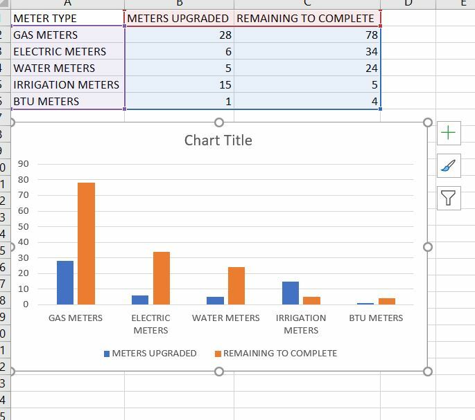
Hello, I am relatively new to Airtable and I am having difficulty creating a simple clustered bar chart in the chart block. In excel my table and chart looks like this…
Any suggestions?
Hi @Chris_McMahon1,
Welcome to Airtable Community!
Airtable does not do charts from 2 different fields in one graph (unless you want to use the Vega Lite block which needs some coding skills).
The way around that is to have each record duplicated, mark one as Meters Upgraded and one as Remaining To Complete (using a single selecet option for example).
If that helps, please mark this as Solution so others can see it.
BR,
Mo
Thanks for the response Mo, I will give it a try.
Chris
Thanks for the response Mo, I will give it a try.
Chris
Hey, there is no way to do this with the Chart extension and Vega-Lite requires you to write JSON. But it's easy to do with our new extension, Charts & Reports - you can add multiple bars for each x-axis value and customize the color of each.
Hi. Is the "Charts & Reports" extension available within Interfaces?
Reply
Enter your E-mail address. We'll send you an e-mail with instructions to reset your password.