Hi you, 💚
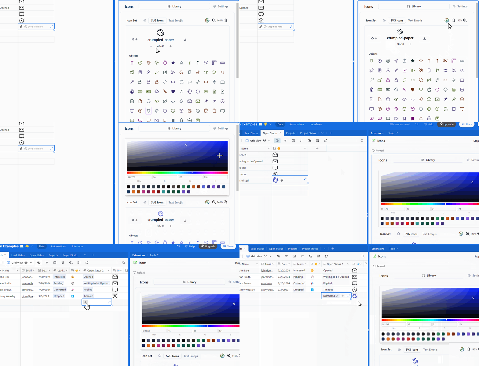
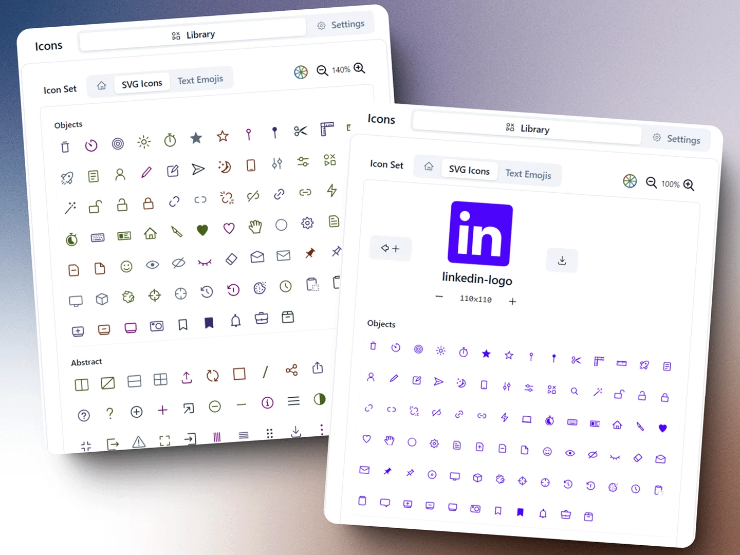
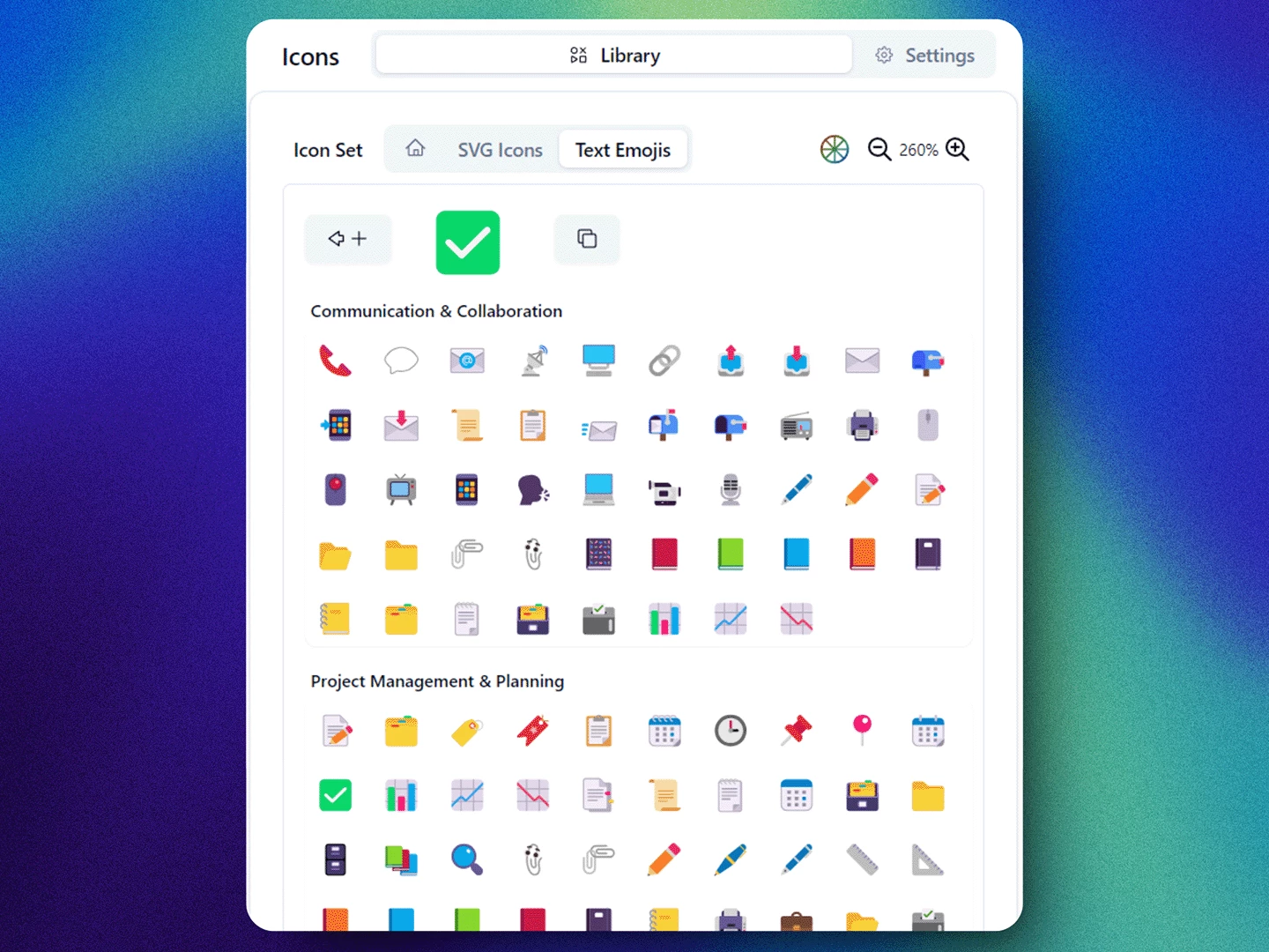
I had a question - why do Airtable bases need to be this visually unappealing? I know Airtable is loved for its functionality first, but I felt I could so something about it. So I launched Icons just to make it a bit more pretty: https://airtable.com/marketplace/blkQR3ZxqdeVppXgL/icons-silver-taza
There was a challenge in working around Airtable limitations, but I think I did an OK job navigating these, and ended up with something actually usable. I hope people find it valuable so I can continue adding more icons & visuals.


