Hi everyone, I’m Simon, a manager at Airtable on Product Design, overseeing our new Design Systems team. I’m excited to share some updates that we’ve recently made to colors on the platform, designed to improve the Airtable experience. These updates include:
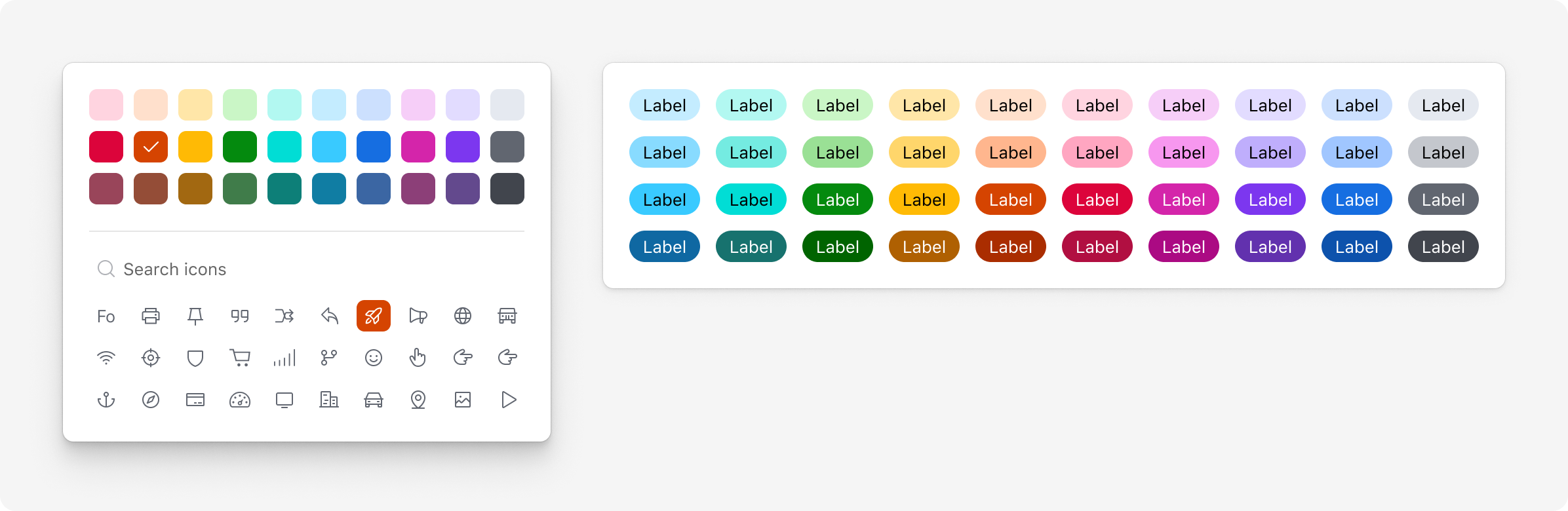
- Increased vibrancy and contrast of core colors. We’ve refined both the contrast of text and colors against backgrounds.
- A dark, high-contrast color palette: 10 brand-new colors available to Pro and Enterprise teams.
- Greater distinction between color combinations, such as those used to indicate status in multiple select fields.
- Improved support for people with anomalous trichromatic and dichromatic color vision.
We hope these updates help your daily workflows, and we’ll continue to refine and make improvements over time. Thanks to the community for your continued, thoughtful feedback, and as always, we welcome you to submit new product ideas to help us shape the future of Airtable.
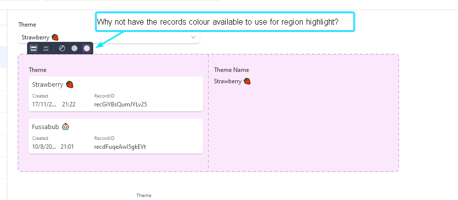
To learn more about applying color in Airtable, see these Airtable Community resources:
Update (6/1/23): It was previously stated that the high contrast color palette was available to Plus users. We’d like to make the correction that this color palette is available only to Pro and Enterprise teams. We apologize for any inconvenience.