Hi all,
Have been playing around with the Airtable Interface designer for a bit and am stuck on showing aggregated data on a line chart. The sketch out the situation:
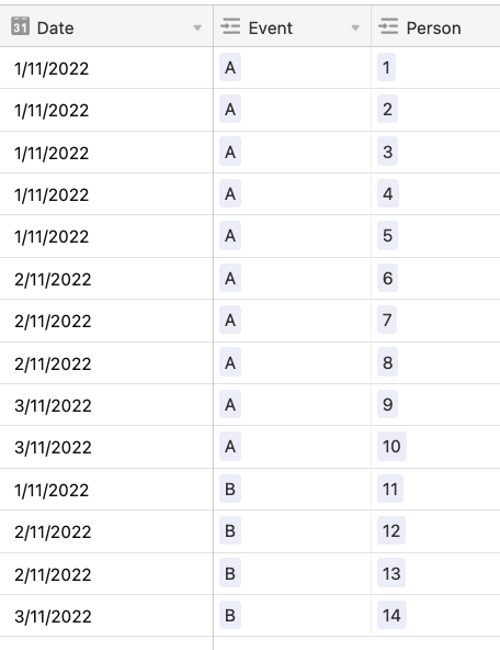
- I have a table of events.
- I have a linked table of people who registered for an event. These records have a ‘created’ time field.
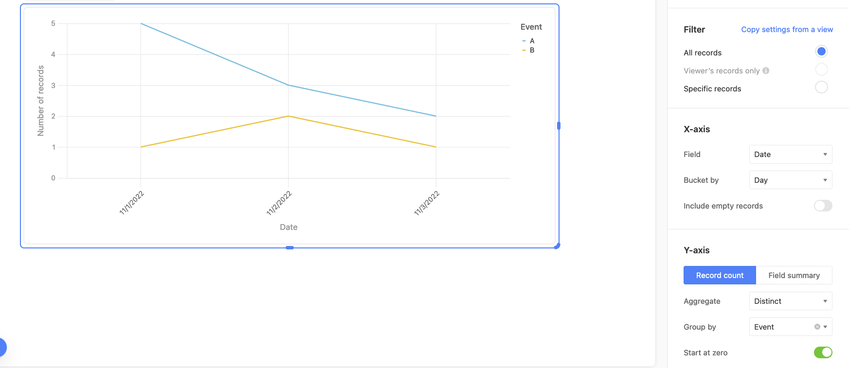
I want to show the growth in registrations for an event. So I want to line chart to show the total registrations for that event on a certain day, not just the amount of registrations of that single day.
Any clue if this is possible or just somehting that hasn’t been implemented yet?