Hi all!
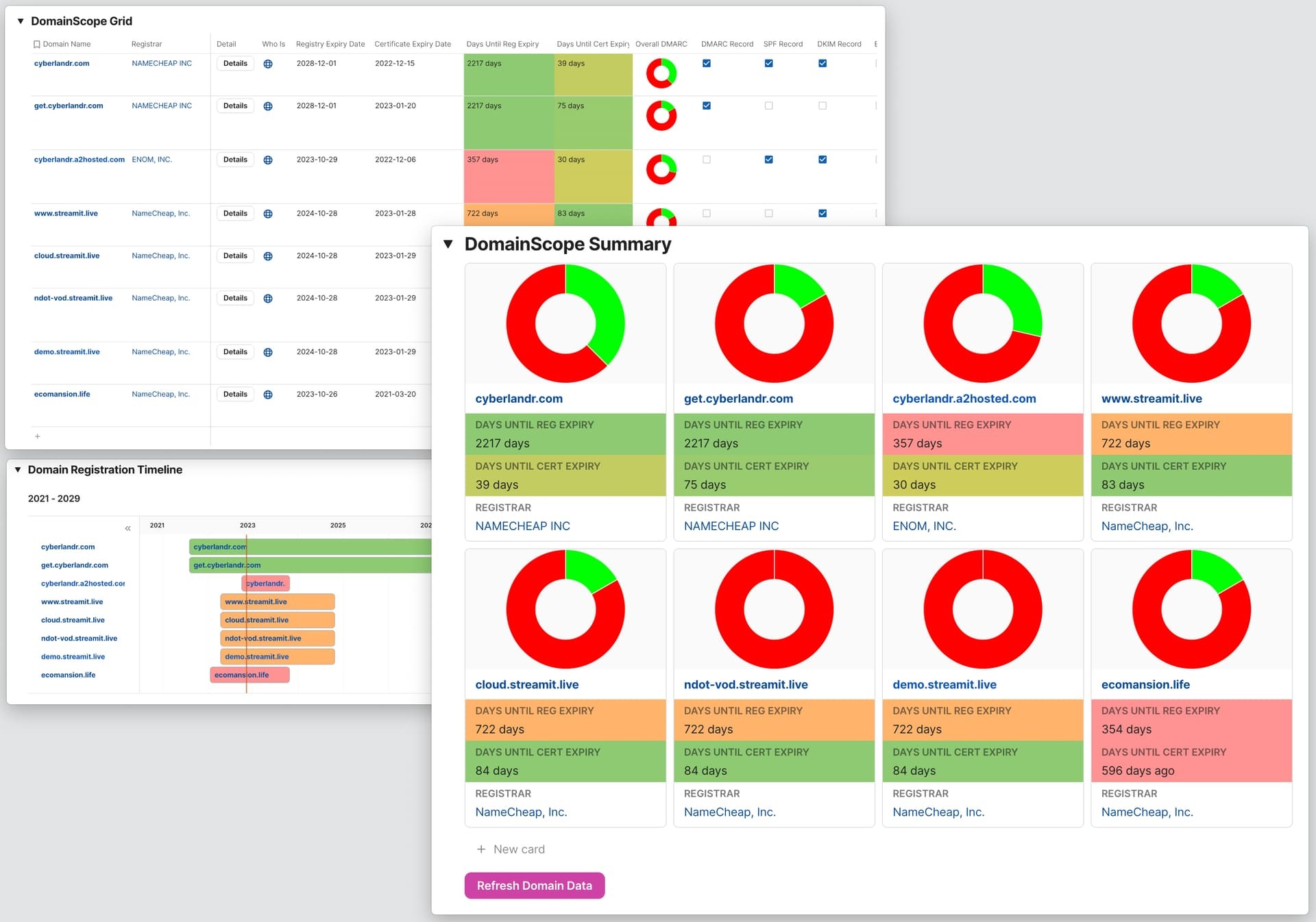
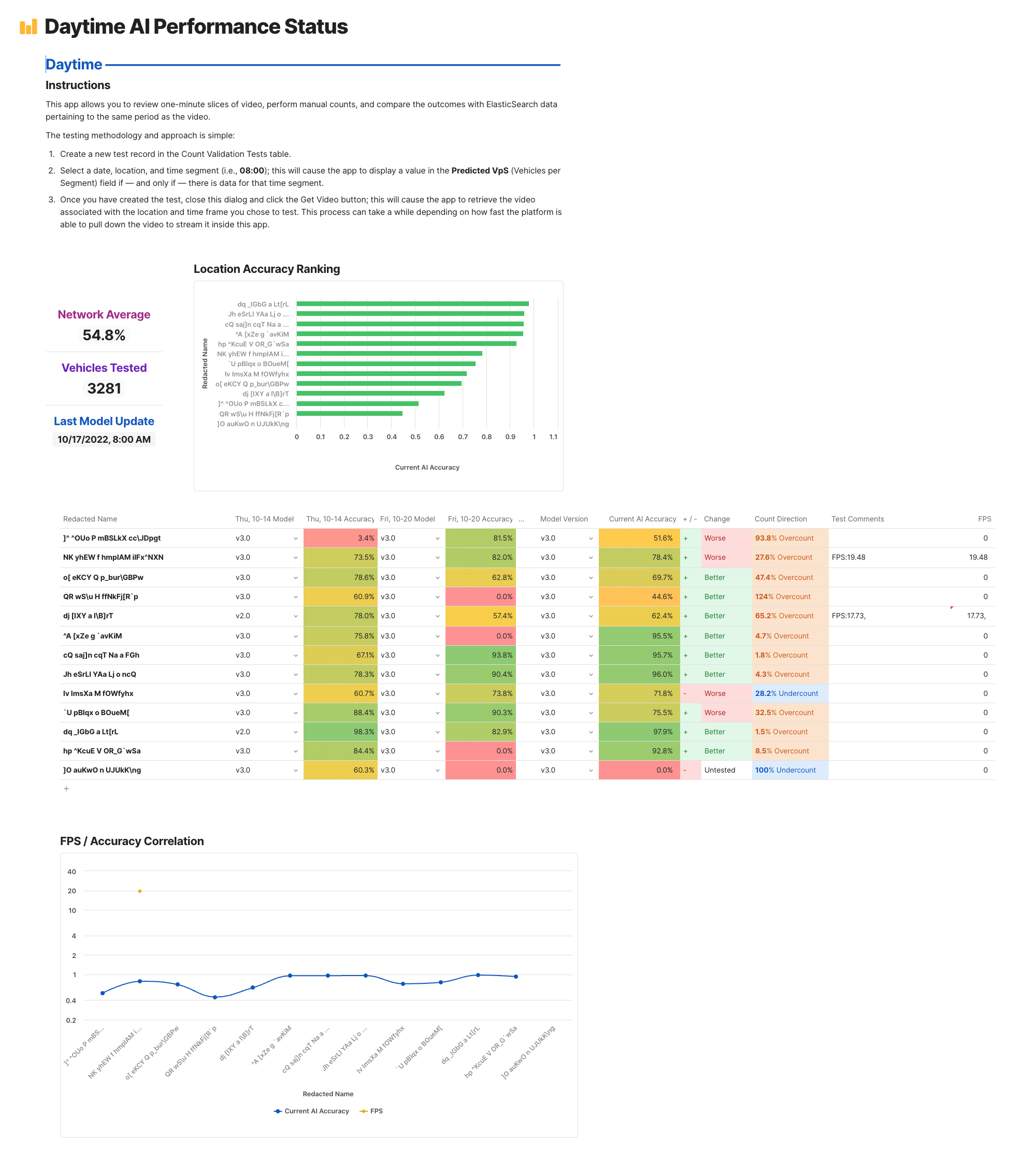
I’m using Airtable as a repository for a bunch of business data and am starting to think about how I present that data back to parts of our business so that we can make decisions from it.
To do that, I’m imagining creating a few different dashboards that use various segments of the data. Each dashboard will need different charts and tables that are based on the data (sometimes straight up, sometimes in aggregate – e.g. added across days). Ideally, I can somehow manage permissions across those reports, so that certain users can see some reports but not others.
I’ve tried using Airbase’s Interface Designer (too limited in terms of data presentation) and Data Studio (super slow and janky). Has anyone else been able to achieve something like this?