I just tried the new “improved Home Screen” This time, the UX team reached a new level of make things worse.
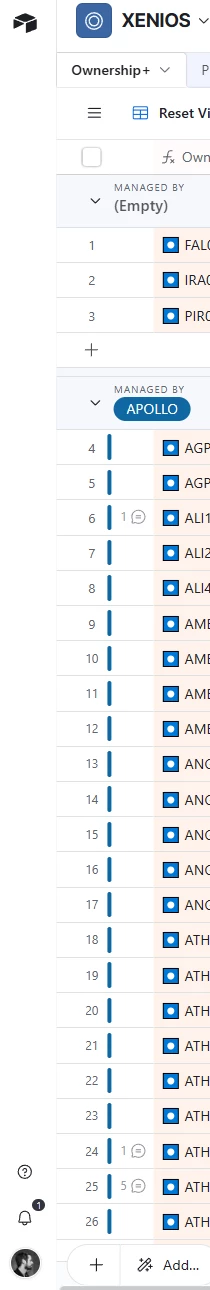
1. Why do you need this column on the left with so much dead space just for Home Buton, a Help shortcut, Notifications and your profile??? Really Why?
Colors tables dont respond to the color base...it is just a light hue of the color you choose. Horrible at least.
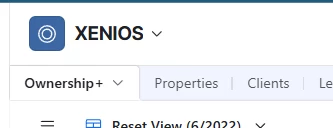
What is the point of moving the toolbar on the right? what’s wrong with the previous one?
Icons, graphics, looks sharper and cleani have to say and create a visually pleasant experience. But Honestly, moving things just for the sake of refreshing the UI< is ridiculous.
This seems to be the shared opinion re: new UI. I’d suggest you fill out this Product Idea form, and maybe reach out to support@airtable.com also. alread